How Fast is the Earth Warming?
We’ve already studied the rate of global warming in the GISS surface-temperature data and the two best-known satellite lower-troposphere data sets. We even removed approximations of the impact of exogenous factors (namely, the el Nino-southern oscillation (ENSO) and volcanic eruptions) on the data, for a clearer comparison. Now that GISS, NCDC and HadCRU have reported their year-end figures, let’s repeat the exercise using all five major global temperature records: GISS, NCDC, HadCRUT3v, RSS, and UAH. Also, let’s include another exogenous factor in our analysis: variations in solar output.
Just as before, we’ll use MEI (multivariate el Nino index) to characterize el Nino, and the volcanic forcing data from Ammann et al. (2003) to characterize volcanic influence. Also as before, we’ll allow for an annual cycle in the data (a residual annual cycle) by including a 2nd-order Fourier fit.
We’ll characterize solar fluctuation by the international sunspot numbers. I selected sunspot numbers because most reconstructions of TSI (total solar irradiance) are annual values rather than monthly, and the satellite-based estimates of TSI don’t start until about 1979 — but we’d like to fit surface-temperature data from 1975 to the present. So, we’ll use sunspot numbers as a proxy for solar activity, and see whether or not the temperature time series show correlation with that index.
We’ll also allow for a lag in the influence of el Nino, volcanic forcing, and sunspot numbers. For each of these exogenous variables, we’ll try a range of lags (from 0 to 24 months for el Nino and volcanic, from 0 to 120 months for sunspot numbers) and use the lags which give the best fit.
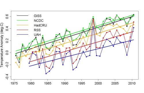
First let’s see what the data look like when they’re not set on the same scale, or compensated for exogenous factors. Here are all 5 records (annual averages with trend lines) from 1975 to the present (the satellite records don’t start until about 1979):
The GISS and NCDC data show 2010 tied for hottest year with 2005, while HadCRU, RSS, and UAH still have 1998 as the hottest year on record. The reason they’re offset from each other is, of course, that they’re all using a different baseline (i.e., a different “zero point” for temperature). After we remove the estimated influence of exogenous factors, we’ll use the same baseline (1980.0 to 2010.0) for all 5 data sets.
If we estimate the global warming rate without accounting for exogenous factors, we get this (numbers in parenthese are 1-sigma standard errors in the final digits):
| Data Set | Rate (°C/yr) |
| GISS | 0.0176(23) |
| NCDC | 0.0171(20) |
| HadCRU | 0.0169(23) |
| RSS | 0.0163(41) |
| UAH | 0.0141(43) |
All the rates are comparable, although the UAH lower-troposphere data give a noticeably slower warming rate than the others. Also, the satellite data sets (RSS and UAH) have larger standard errors than the surface-temperature data sets (GISS, NCDC, and HadCRU).
When we do a multiple regression of temperature on MEI, volcanic forcing, sunspot numbers, a linear time trend, and an annual cycle, the fits are quite impressive. Here, for example, is the result for GISS data:
[NOTE: in this graph, the thin black line is the GISS data while the thicker red line is the model based on el Nino, volcanic forcing, solar variation, a residual annual cycle, and a time trend.]
The multiple regression enables us to do two useful things. First, it gives us a direct estimate of the rate of linear time increase, i.e., the rate of global warming. The estimates are:
| Data Set | Rate (deg.C/yr) |
| GISS | 0.0172(13) |
| NCDC | 0.0172(10) |
| HadCRU | 0.0171(11) |
| RSS | 0.0183(13) |
| UAH | 0.0159(15) |
Second, it enables us to remove the estimated impact of el Nino, volcanic eruptions, solar variation, and the residual annual cycle, leaving only the global warming trend and any remaining natural variation. This gives us an adjusteddata set for each source. Here they are, for monthly data, for all five data sources:
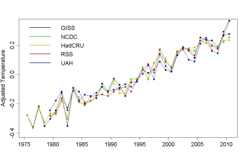
We can also compute annual averages of the adjusted data sets, which shows just how strongly the different sources agree with each other:
One thing of note is that although the satellite lower-troposphere data indicate slower warming when using the raw data, when they’re compensated for all three exogenous factors the RSS data shows the fastest rate of warming. This is primarily because the lower-troposphere data show a much stronger response to the exogenous factors than the surface-temperature records, and the exogenous factors are tending to reduce the estimated RSS trend — when these factors are removed, what remains is stronger warming in the RSS data set. Also, the trend in adjusted UAH data is similary higher than in the raw UAH data, but even with this increase the UAH data still show the least warming of all 5 data sets.
Also noteworthy is that when compensated for exogenous factors, the 3 surface-temperature records (GISS, NCDC, and HadCRU) indicate nearly identical warming rates since 1975.
Another interesting point is that in the adjusted data sets, all 5 sources have 2010 as the hottest year on record. In fact, 4 out of 5 (all but NCDC) also have 2009 as the 2nd-hottest year — quite the 1-2 punch. Of course all trends are statistically significant — strongly so. The conclusion is inescapable: the globe is warming, and shows absolutely no sign whatever of stopping or even slowing its warming. Any talk of “cooling” or even a “levelling off” of global warming over the last decade is absolute nonsense.
All 5 major global temperature indices are in oustanding agreement not only about the overall rate of warming, but about the year-to-year fluctuations as well.
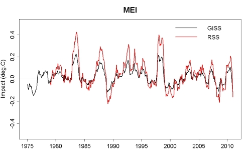
The lower-troposphere data (both RSS and UAH) really do respond much more strongly to exogenous factors than surface temperature data. Their response to volcanic forcing is about 50% bigger, and their response to both el Nino and solar variations is just about twice as large as that of the surface temperature records. In fact, for the surface temperature data the response to solar variation is not quite statistically significant, but for lower-troposphere data the solar response is definitely significant.
To answer the question posed in the title of this post: presently, Earth is warming at about 1.7 deg.C per century. There’s good reason to believe that it’ll be warming even faster in the upcoming decades. And there’s good reason to believe that this spells trouble for life on earth — including human life.
Update
A lot of good questions were posed in comments, so I’ll try to answer some of them. If I don’t respond to your individual question, please don’t take it personally — life’s too short.
Do you have graphs for the removed solar, volcanic, and el nino forcings? Are there any other regional patterns which can explain the rest of the short term variability?
Yes (see below), and I don’t know.
… I’m rather more interested in the ‘best fit’ magnitude and lag of the solar influence.
As the above graph shows, the peak-to-peak influence on surface temperature is about 0.07 °C, on lower-troposphere it’s about 0.15 °C. Those are eyeball estimates of the “smoothed” values, the absolute range for solar influence is 0.08 °C surface, 0.18 °C lower-troposphere (but I suspect some of that fluctuation is just an artifact of the curve-fitting).
The lags were very small (which surprised me), only about 2 months for solar, but this analysis is really looking for rapid fluctuations so it seems that it’s capturing the rapid response.
It would be nice to know more of the fitted parameters, such as lags and amplitudes for the exogenous factors. Does the temperature lag all the exogenous factors? Are the lags similar? If you estimate a conversion factor from sunspot number to total solar irradiance, you can estimate sensitivity of temperature to TSI for the fitted sunspot amplitude. Is it reasonable?People (Roy Spencer, for example) have included other multi-year indices in such fits and they have found that these can remove most of the linear trend. How do you justify including or excluding any particular index?
Best-fit lags are different for different data sets, but the lag for el Nino is 3 or 4 months surface, 5 months lower-troposphere. For solar, 2 months except GISS 3 months. For volcanic, 8 or 9 months surface, 3 or 5 months lower-troposphere. Hence the lower troposphere temperature responds sooner to volcanic eruptions, later to el Nino, and at about the same time to solar.
Just a rough guesstimate: the variation in TSI during a solar cycle is about 1 W/m², but correcting for geometry and albedo that’s a variation in climate forcing of about 0.18 W/m². Since the surface response is about 0.07 °C, that indicates a sensitivity of about 0.39 °C/(W/m²). In the lower troposphere the response is about 0.15 °C so the sensitivity is around 0.83 °C/(W/m²). This is the prompt response, and is higher than the Stefan-Boltzmann response would be, so it appears there’s some amplification of the prompt response to solar variation. But all this is, of course, tentative — based as it is on a statistical rather than physical model.
Oscillations don’t create trends. Temperature increase is energy which, as we all know, doesn’t appear from nothing. But of course with enough degrees of freedom you can model anything you want (including an elephant). Spencer’s attribution of the trend is nothing but wishful thinking on his part.
Just curious – of the (apparent) peaks and troughs that are left how much of that variation could reasonably end up suffering the same fate of being legitimately attributed to specific climate processes and phenomena and end up subtracted in a similar way to this to reveal, undisguised, the underlying trend?
Again, I don’t know. This is a question best posed to a genuine climate scientist. I will mention that whatever set of exogenous factors is included, there will always remain some unaccounted-for noise.
Still like to see the cross-validated version though!
All things come to him who waits.
What is the remaining rms difference between the different datasets there?
Just as an example, I took the difference between the adjusted GISS and adjusted RSS data. The r.m.s. difference in monthly data is 0.13 °C. The r.m.s. difference in annual averages is only 0.05 °C.


No comments:
Post a Comment