Blog Archive

Showing posts with label 2010 temperatures. Show all posts

Friday, September 5, 2014

In Washington, DC, the Summer of 2010 Was So Hot It Only Seemed Like This Year Was Super Cool

summertemps.jpg

Via Climate Central.
by Sarah Anne Hughes, dcist, August 29, 2014
Because we live in a city of extremes, it's easy to feel only one of two ways about summers in D.C.: That it was as if a portal to Hell had opened up and enveloped the town, or as if Heaven had graced our citizens with the cool breath of angels.
It was the latter kind of year in D.C., or at least that's the way it felt. As a graphic prepared byClimate Central shows, this summer was on the warmer end of historical records. They note:
There were a lot of people in the Northeast who thought this was such a cool summer. And in Baltimore, temperatures were well below average. But that was the exception for big Northeast cities. Richmond, Va., Washington D.C., Philadelphia, and Boston all came in warmer than average while New York City was close to average. Those areas, as well as the Southeast, are going to get one last blast of heat this weekend.
It seems that the summers of 2010, 2011 and 2012 — the hottest on record a.k.a. Hell portal years, have skewed our perception a bit.

Monday, March 10, 2014

"Increase of extreme events in a warming world," by S. Rahmstorf & D. Coumou, PNAS 108 (2011); doi: 10.1073/pnas.1101766108

Proceedings of the National Academy of Sciences, 108(44) (November 1, 2011) 17905-17908; doi: 10.1073/pnas.1101766108

Increase of extreme events in a warming world

Stefan Rahmstorf and Dim Coumou

Potsdam Institute for Climate Impact Research, PO Box 601203, 14412 Potsdam, Germany

Abstract

We develop a theoretical approach to quantify the effect of long-term trends on the expected number of extremes in generic time series, using analytical solutions and Monte Carlo simulations. We apply our method to study the effect of warming trends on heat records. We find that the number of record-breaking events increases approximately in proportion to the ratio of warming trend to short-term standard deviation. Short-term variability thus decreases the number of heat extremes, whereas a climatic warming increases it. For extremes exceeding a predefined threshold, the dependence on the warming trend is highly nonlinear. We further find that the sum of warm plus cold extremes increases with any climate change, whether warming or cooling. We estimate that climatic warming has increased the number of new global-mean temperature records expected in the last decade from 0.1 to 2.8. For July temperature in Moscow, we estimate that the local warming trend has increased the number of records expected in the past decade five-fold, which implies an approximate 80% probability that the 2010 July heat record would not have occurred without climate warming.

http://www.pik-potsdam.de/~stefan/Publications/Nature/rahmstorf_coumou_2011.pdf

Monday, January 27, 2014

RealClimate: Hottest years rankings: (1) 2010, (2) 2005, (3) 2007/1998, (4) 2013/2009/2003/2002, (5) 2013/2006/2003/1998

by Stefan Rahmstorf, RealClimate, January 27, 2014

The global temperature data for 2013 are now published. 2010 and 2005 remain the warmest years since records began in the 19th century. 1998 ranks third in two records, and in the analysis of Cowtan and Way, which interpolates the data-poor region in the Arctic with a better method, 2013 is warmer than 1998 (even though 1998 was a record El Nino year, and 2013 was neutral).

The end of January, when the temperature measurements of the previous year are in, is always the time to take a look at the global temperature trend. (And, as the Guardian noted aptly, also the time where the “climate science denialists feverishly yell [...] that global warming stopped in 1998.”) Here is the ranking of the warmest years in the four available data sets of the global near-surface temperatures (1):

Rank
1
2010
2010
2010
2010
2
2005
2005
2005
2005
3
2007
1998
1998
2007
4
2002
2013
2003
2009
5
1998
2003
2006
2013

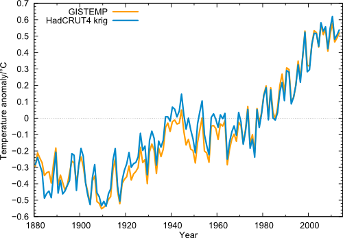
New this year: for the first time there is a careful analysis of geographical data gaps – especially in the Arctic there’s a gaping hole – and their interpolation for the HadCRUT4 data. Thus there are now two surface temperature data sets with global coverage (the GISTEMP data from NASA have always filled gaps by interpolation). In these two data series 2007 is ranked 3rd. Their direct comparison is shown in the figure below.

had4_v2_giss
Figure 1 Global temperature (annual values) in the data from NASA GISS (orange) and from Cowtan & Way (blue), i.e., HadCRUT4 with interpolated data gaps.

One can clearly see the extreme year 1998, which (thanks to the record-El Niño) stands out above the long-term trend like no other year. But even taking this outlier year as starting point, the linear trend 1998-2013 in all four data sets is positive. Also clearly visible is 2010 as the warmest year since records began, and the minima in the years 2008 and 2011/2012. But just like the peaks are getting higher, these minima are less and less deep.

In these data curves I cannot see a particularly striking or significant current “warming pause”, even though the warming trend from 1998 is of course less than the long-term trend. Even in Nature, there was recently a (journalistic) contribution that in its introduction strongly overstated this alleged “hiatus”. It makes a good story that perhaps some cannot resist. (“Warming trend is somewhat reduced, but within the usual range of variation” simply does not make good headline.)

The role of El Niño and La Niña

The recent slower warming is mainly explained by the fact that in recent years the La Niña state in the tropical Pacific prevailed, in which the eastern Pacific is cold and the ocean stores more heat (2). This is due to an increase in the trade winds that push water westward across the tropical Pacific, while in the east cold water from the depths comes to the surface (see last graph here). In addition, radiative forcing has recently increased more slowly (more on this in the analysis of Hansen et al. – definitely worth a read).

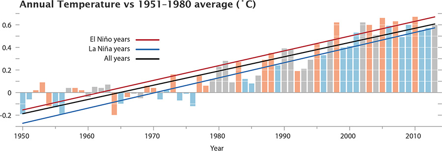
NASA shows the following graphic, where you can see that the warmer years tend to be those with an El Niño in the tropical Pacific (red years), while the particularly cool years are those with La Niña (blue years).

gistemp_nino_100
Figure 2. The GISS data, with El Niño and La Niña conditions highlighted. Neutral years like 2013 are gray. Source: NASA.

Quality of the interpolation

How good is the interpolation into regions not regularly covered by weather stations? In any case, of course, better than simply ignoring the gaps, as the HadCRUT and NOAA data have done so far.  The truly global average is important, since only it is directly related to the energy balance of our planet and thus the radiative forcing by greenhouse gases. An average over just part of the globe is not.  The Arctic has been warming disproportionately in the last ten to fifteen years.

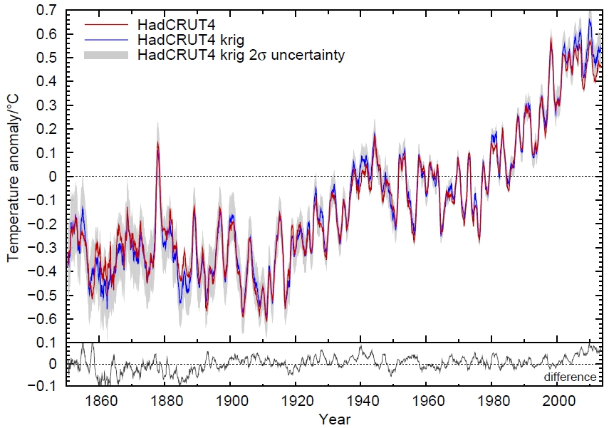
But how well the interpolation works we know only since the important work of Cowtan and Way. These colleagues have gone to the trouble of carefully validating their method. Although there are no permanent weather stations in the Arctic, there is intermittent data from buoys and and from weather model reanalyses with which they could test their method. For the last few decades and Cowtan and Way also make use of satellite data (more on this in our article on underestimated warming). I therefore assume that the data from Cowtan and Way is the methodologically best estimate of the global mean temperature which we currently have. This correction is naturally small (less than a tenth of a degree) and hardly changes the long-term trend of global warming – but if you look deeper into  shorter periods of time, it can make a noticeable difference. The comparison with the uncorrected HadCRUT4 data is shown in the figure below.

CowtanWay3
Figure 3. Comparison of interpolated and non-interpolated HadCRUT4 data, as moving averages over 12 months. Source: Kevin Cowtan, University of York.

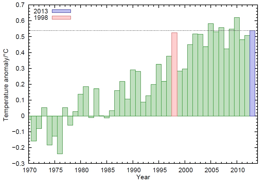
And here’s a look at the last years in detail:

Cowtan2
Figure 4. The interpolated HadCRUT4 data (annual average) from 1970. Source: Kevin Cowtan, University of York.

Following this analysis, 2013 was thus even warmer than the record El-Niño-year 1998.

Conclusion
  • In all four data series of the global near-surface air temperature, the linear trend even from the extreme El Niño year 1998 is positive, i.e. shows continued warming, despite the choice of a warm outlier as the initial year.
  • In all four data series of the global near-surface air temperature, 2010 was the warmest year on record, followed by 2005.
  • The year 1998 is, at best, rank 3 – in the currently best data set of Cowtan & Way, 1998 is actually only ranked 7th. Even 2013 is – without El Niño – warmer there than 1998.
The German news site Spiegel Online presents these facts under the headline Warming of the air paused for 16 years (my translation). The headline of the NASA news release, NASA Finds 2013 Sustained Long-Term Climate Warming trend, is thus completely turned on its head.

This will not surprise anyone who has followed climate reporting of Der Spiegel in recent years. To the contrary – colleagues express their surprise publicly when a sensible article on the subject appears there. For years, Der Spiegel has acted as a gateway for dubious “climate skeptics” claims into the German media whilst trying to discredit top climate scientists (we’ve covered at least one example here).

Do Der Spiegel readers know more (as their advertising goes) – more than NASA, NOAA, Hadley Centre and the World Meteorological Organization WMO together? Or are they simply being taken for a ride for political reasons?

Footnotes

(1) In addition to the data of the near-surface temperatures, which are composed of measurements from weather stations and sea surface temperatures, there is also the microwave data from satellites, which can be used to estimate air temperatures in the troposphere in a few kilometers altitude. In the long-term climate trend since the beginning of satellite measurements in 1979, the tropospheric temperatures show a similar warming as the surface temperatures, but the short-term fluctuations in the troposphere are significantly different from those near the surface. For example, the El Niño peak in 1998 is about twice as high as in the surface data in the troposphere, see Foster and Rahmstorf 2011. In their trend from 1998 , the two satellite series contradict each other: UAH shows +0.05 °C per decade (a bit more than HadCRUT4), RSS shows -0.05 °C per decade.

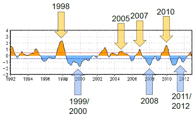
(2) Another graphic (Figure 5) illustrates the change between El Niño and La Niña: the Oceanic Niño Index ONI, the standard index of NOAA to describe the seesaw in the tropical Pacific.

ONI
Figure 5. The ONI index. The arrows added by me point to some of the globally warm or cool years (compare Figure 1 or 4). Source: NOAA.

Weblinks


http://www.realclimate.org/index.php/archives/2014/01/global-temperature-2013/

Wednesday, August 1, 2012

"Climate extremes and climate change: The Russian Heat Wave and other Climate Extremes of 2010," by Kevin Trenberth & John Fasullo, JGR; doi:10.1029/2012JD018020


Journal of Geophysical Research, doi:10.1029/2012JD018020
Climate extremes and climate change: The Russian Heat Wave and other Climate Extremes of 2010
Kevin E. Trenberth and John Fasullo
Abstract

A global perspective is developed on a number of high impact climate extremes in 2010 through diagnostic studies of the anomalies, diabatic heating, and global energy and water cycles that demonstrate relationships among variables and across events. Natural variability, especially ENSO, and global warming from human influences together resulted in very high sea surface temperatures (SSTs) in several places that played a vital role in subsequent developments. Record high SSTs in the Northern Indian Ocean in May 2010, the Gulf of Mexico in August 2010, the Caribbean in September 2010, and north of Australia in December 2010 provided a source of unusually abundant atmospheric moisture for nearby monsoon rains and flooding in Pakistan, Colombia, and Queensland. The resulting anomalous diabatic heating in the northern Indian and tropical Atlantic Oceans altered the atmospheric circulation by forcing quasi-stationary Rossby waves and altering monsoons. The anomalous monsoonal circulations had direct links to higher latitudes: from Southeast Asia to southern Russia, and from Colombia to Brazil. Strong convection in the tropical Atlantic in northern summer 2010 was associated with a Rossby wavetrain that extended into Europe creating anomalous cyclonic conditions over the Mediterranean area while normal anticyclonic conditions shifted downstream where they likely interacted with an anomalously strong monsoon circulation, helping to support the persistent atmospheric anticyclonic regime. This set the stage for the "blocking" anticyclone and associated Russian heat wave and wild fires. Attribution is limited by shortcomings in models in replicating monsoons, teleconnections and blocking.

Key Points
  • Climate extremes in 2010 relate to high sea surface temperatures
  • The Russian heat wave has a climate change component
  • A global perspective is essential
Received 27 April 2012; accepted 25 July 2012.
Trenberth, K. E. and J. Fasullo (2012), Climate extremes and climate change: The Russian Heat Wave and other Climate Extremes of 2010, J. Geophys. Res., doi: 10.1029/2012JD018020, in press.

Wednesday, May 16, 2012

WMO: 2001-2010 warmest decade since records began in 1850


2001-2010 warmest decade on record: WMO
GENEVA — Climate change has accelerated in the past decade, the UN weather agency said Friday, releasing data showing that 2001 to 2010 was the warmest decade on record.
The 10-year period was also marked by extreme levels of rain or snowfall, leading to significant flooding on all continents, while droughts affected parts of East Africa and North America.
"The decade 2001-2010 was the warmest since records began in 1850, with global land and sea surface temperatures estimated at 0.46 degrees Celsius above the long term average of 14.0 degrees Celsius (57.2 degrees Fahrenheit)," said the World Meteorological Organisation.
Nine of the 10 years also counted among the 10 warmest on record, it added, noting that "climate change accelerated" during the first decade of the 21st century.
The trend continued in 2011, which was the warmest year on record despite La Nina -- a weather pattern which has a cooling effect.
The average temperature in 2011 was 0.40 degrees Celsius above the long term average, said the WMO.
"This 2011 annual assessment confirms the findings of the previous WMO annual statements that climate change is happening now and is not some distant future threat," said WMO Secretary-General Michel Jarraud.
"The world is warming because of human activities and this is resulting in far-reaching and potentially irreversible impacts on our Earth, atmosphere and oceans," he added.
The UN weather agency noted that during the decade, "numerous weather and climate extremes affected almost every part of the globe with flooding, droughts, cyclones, heat waves and cold waves."
Historical floods hit Eastern Europe in 2001 and 2005, Africa in 2008, Asia and Australia in 2010. Global precipitation -- including rain or snow -- reached the second highest average since 1901. The highest average was recorded for the decade 1951-1960.
Meanwhile for the North Atlantic basin, the 10 years marked the highest level of tropical cyclone activity, including Hurricane Katrina which struck the United States in 2005 and Cyclone Nargis which hit Myanmar in 2008.

Tuesday, March 20, 2012

Met Office: World warmed even more in last ten years than previously thought when Arctic data added. 2010 now hottest year

Met Office: World warmed even more in last ten years than previously thought when Arctic data added


The world warmed more in the last ten years than previously thought, according to a new global temperature series updated by the Met Office


The controversial record of climate change, put together by the Met Office Hadley Centre and the University of East Anglia, is one of only a handful of global temperature data sets stretching back since the end of the 19th century.
The temperature series was at the centre of the Climategate scandal in 2009, after hacked emails from the University of East Anglia showed scientist were unwilling to release original data.
Critics claimed that the whole argument for global warming could not be trusted if the data set was questioned.
However a series of inquiries found the science was correct, although the University of East Anglia was criticised for failing to share information.
Now a new analysis of land and sea temperatures, that includes new data from weather stations in the Arctic, has found the world is warming even more than previously thought.
Between 1998 and 2010, temperatures rose by 0.11C, 0.04C more than previously estimated.
The new data set also shifts around the hottest years on record, so that the new temperature series, known as HadCRUT4, is more in line with other global records held by NASA and NOAA in the US. The American series had already added Arctic temperatures from extrapolated information.
Before it was thought the hottest years were 1998 followed by 2010, 2005, 2003 and 2002. The updated series puts 2010 as the hottest year on record followed by 2005, 1998, 2003 and 2006.
The main conclusions of the new temperature series remains the same – that overall warming since 1850 has been around 0.75C and the 10 warmest years on record all occurred in the last 14 years.
All the data that that HadCRUT4 is based on will be publicly available online in the coming days.
Professor Phil Jones, director of CRU, who was at the heart of the Climategate scandal, said the temperature series is slightly warmer because it includes the new data from the Arctic, where the world is warming faster.
Most of the new data came from weather stations controlled by Russian scientists.
"HadCRUT is underpinned by observations and we’ve previously been clear it may not be fully capturing changes in the Arctic because we have had so little data from the area," he said.
"For the latest version we have included observations from more than 400 stations across the Arctic, Russia and Canada. This has led to better representation of what's going on in the large geographical region,” said Prof Jones.
Dr Peter Stott, Head of Climate Monitoring and Attribution at the Met Office, said the new series is "yet another piece of evidence that the world is warming".
“The scientific evidence is really strong that we are warming,” he said.

Friday, January 27, 2012

NASA Video Illustrates 130 Years of Global Warming, Hansen Expects New Global Temperature Record Within 3 Years

NASA Video Illustrates 130 Years of Global Warming, Hansen Expects New Global Temperature Record Within 3 Years


In 1880, when modern global temperature records began, atmospheric carbon dioxide levels were at 285 parts per million. In 2011, they are were over 390 parts per million. That has trapped a lot of extra energy on earth — see “The Radiative Forcing of the CO2 Humans Have Put in the Air Equals 1 Million Hiroshima Bombs a Day.”
As we’ve spewed greenhouse gas emissions into the atmosphere at at a faster pace, global temperatures have accelerated upward, particularly since the 1970s. To illustrate this rise, NASA’s Goddard Institute for Space Studies released this fascinating video of 131 years of temperature records edited into a 30-second video.
“We know the planet is absorbing more energy than it is emitting,” said GISS Director James E. Hansen. “So we are continuing to see a trend toward higher temperatures. Even with the cooling effects of a strong La Niña influence and low solar activity for the past several years, 2011 was one of the 10 warmest years on record.”
Hansen said he expects record-breaking global average temperature in the next two to three years….  “It’s always dangerous to make predictions about El Niño, but it’s safe to say we’ll see one in the next three years,” Hansen said. “It won’t take a very strong El Niño to push temperatures above 2010.”
http://thinkprogress.org/romm/2012/01/27/413227/nasa-video-global-warming/ 

Friday, January 6, 2012

Hansen et al.: “Extreme Heat Waves … in Texas and Oklahoma in 2011 and Moscow in 2010 Were ‘Caused’ by Global Warming”

Hansen et al.: “Extreme Heat Waves … in Texas and Oklahoma in 2011 and Moscow in 2010 Were ‘Caused’ by Global Warming”


“Climate dice,” describing the chance of unusually warm or cool seasons relative to climatology, have become progressively “loaded” in the past 30 years, coincident with rapid global warming.   The distribution of seasonal mean temperature anomalies has shifted toward higher temperatures and the range of anomalies has increased.  An important change is the emergence of a category of summertime extremely hot outliers, more than three standard deviations (σ) warmer than climatology.
This hot extreme, which covered much less than 1% of Earth’s surface in the period of climatology [1951-1980], now typically covers about 10% of the land area.  We conclude that extreme heat waves, such as that in Texas and Oklahoma in 2011 and Moscow in 2010, were “caused” by global warming, because their likelihood was negligible prior to the recent rapid global warming.  We discuss practical implications of this substantial, growing climate change.
That’s the finding of a detailed climatological analysis by NASA’s James Hansen along with Makiko Sato and Reto Ruedy in which they attribute some of the uber-extreme heat waves to global warming.
Here’s a key figure from “Perceptions of Climate Change: The New Climate Dice“:
Percent area covered by temperature anomalies in categories defined as hot (> 0.43σ), very hot (> 2σ), and extremely hot (> 3σ).  Anomalies are relative to 1951-1980.  A normal distribution of variability has 68% of the anomalies falling within one standard deviation (σ) of the mean value.  The tails decrease quite rapidly so there is only a 2.3% chance of the temperature exceeding +2σ.  The chance of exceeding +3σ is only 0.13% for a normal distribution of variability.
This analysis builds on some of the recent new papers on the subject, such as “Study Finds 80% Chance Russia’s 2010 July Heat Record Would Not Have Occurred Without Climate Warming” [see figure below]
The entire Hansen et al paper is a must-read.  The authors explain why they focus on summer:
Summer, when most biological productivity occurs, is the most important season for humanity and thus the season when climate change may have its biggest impact.  Global warming causes spring warmth to come earlier and it causes cooler conditions that initiate fall to be delayed.  Thus global warming not only increases summer warmth, it also protracts summer-like conditions, stealing from both spring and fall.  Our study therefore places emphasis on study of how summer temperature anomalies have been changing.
The paper also explains the ‘dice’ metaphor and why they are not fans of using a new climatological period, such as 1981-2010 in place of 1951-1980.  I will excerpt some key parts and post some key figures.
First, you may be wondering why the top chart of summer hot area percentage doesn’t have as clear a trend for the United States as it does for  North America or the globe.  As the authors explain:
The small area of the contiguous 48 states (less than 1.6% of the globe) causes temperature anomalies for the United States to be very “noisy.”  Nevertheless, it is apparent that the long-term trend toward hot summers is not as pronounced in the United States as it is in hemispheric land as a whole.  Also note that the extreme summer heat of the 1930s,  especially 1934 and 1936, is comparable to the most extreme recent years.
Year-to-year variability, which is mainly unforced weather variability, is so large for an area the size of the United States that it is perhaps unessential to find an “explanation” for either the large 1930s anomalies or the relatively slow upturn in hot anomalies during the past few decades.  However, this matter warrants discussion, because, if the absence of a stronger warming in recent years is a statistical fluke, the United States may have in store a relatively rapid trend toward more extreme anomalies.
Some researchers have suggested that the high summer temperatures and drought in the United States in the 1930s can be accounted for by sea surface temperature patterns plus natural variability (10, 11).  Other researchers (12-14), have presented evidence that agricultural changes and crop failure in the 1930s contributed to changed surface albedo, aerosol (dust) production, high temperatures, and drying conditions.  Furthermore, both empirical evidence and climate simulations (14, 15) indicate that agricultural irrigation has a significant regional cooling effect. Thus increasing amounts of irrigation over the second half of the 20th century may have contributed a summer cooling tendency in the United States that partially offset greenhouse  warming.  Such regionally-varying effects may be partly responsible for differences between observed regional temperature trends and the global trend.
They explain the “loaded climate dice” metaphor:
“Loading” of the “climate dice” describes the systematic shift of the frequency distribution of temperature anomalies.  Hansen et al. (2) represented the climate of  1951-1980 by colored dice with two sides colored red for “hot,” two sides blue for “cold,” and two sides white for near average temperatures.  With a normal distribution of temperatures the dividing point would be at 0.43σ to achieve equal (one third) chances of being in each of these three categories in the period of climatology (1951-1980).
A climate model was used (2) to project how the odds would change due to global warming for alternative greenhouse gas scenarios.  Scenario B, which had climate forcing that turned out  to be very close to reality, led to four of the six dice sides being red early in the 21st century based on global climate model simulations.
Fig. 5 confirms that the global occurrence of “hot” anomalies (seasonal mean temperature anomaly exceeding +0.43σ) has approximately reached the level of 67% required to make four sides of the dice red, with the odds of either an unusually “cool” season or an “average” season now each approximately corresponding to one side of the six-sided dice.  However, the loading of the dice over land area in summer is even stronger (Fig. 5, lower row).
Fig. 5. Area of the world covered by temperature anomalies in the categories defined as hot (> 0.43σ), very hot (> 2σ), and extremely hot (> 3σ), with analogous divisions for cold anomalies.
Probably the most important change is the emergence of a new category of “extremely hot” summers, more than 3σ warmer than climatology.  For practical purposes it is important to look at the changes over land areas, where most people live, rather than the global mean for which anomalies are more constrained by the ocean’s thermal inertia.  Fig. 6 illustrates that +3σ anomalies practically did not exist in the period of climatology (1951-1980), but in the past several years these extreme anomalies have covered of the order of 10% of the land area.
… Warming is larger in winter than in summer, but this tends to be more than offset by the much larger natural variability in winter (Fig. 2), which makes it harder for the public to notice climate change in winter.  Another factor affecting the public’s perception of winter warming is the fact that snowfall amounts increase with global warming (in regions remaining cold enough for snow), and there is a tendency of the public to equate heavy snowfall and harsh winter conditions, even if temperatures are not extremely low.
The increase, by more than a factor 10, of area covered by extreme hot anomalies (> +3σ ) in summer reflects the shift of the anomaly distribution in the past 30 years of global warming, as shown succinctly in Fig. 4.   One implication of this shift is that the extreme summer climate anomalies in Texas in 2011, in Moscow in 2010, and in France in 2003 almost certainly would not have occurred in the absence of global warming with its resulting shift of the anomaly distribution.  In other words, we can say with a high degree of confidence that these extreme anomalies were a consequence of global warming…
It is not uncommon for meteorologists to reject global warming as a cause of these extreme events, offering instead a meteorological explanation.  For example, it is said that the Moscow heat wave was caused by an atmospheric “blocking” situation, or the Texas heat wave was caused by La Nina ocean temperature patterns.  Certainly the locations of the extreme anomalies in any given case are related to specific weather patterns.  However, blocking patterns and La Ninas have always been common, yet the large areas of extreme warming have come into existence only with large global warming. Today’s extreme anomalies occur because of simultaneous contributions of specific weather patterns and global warming.
The paper notes that warming leads to drying (and heavy precipitation):
Changes of global temperature are likely to have their greatest practical impact via effects on the hydrologic cycle.  Amplification of hot, dry conditions by global warming is expected, based on qualitative considerations.  For example, places experiencing an extended period of high atmospheric pressure develop dry conditions, which we would expect to be amplified by global warming and by ubiquitous surface heating due to elevated greenhouse gas amounts.
See “Nature Publishes My Piece on Dust-Bowlification and the Grave Threat It Poses to Food Security” for  some of the recent literature on drying.  See also NOAA Bombshell: Human-Caused Climate Change Already a Major Factor in More Frequent Mediterranean Droughts; “The magnitude and frequency of the drying that has occurred is too great to be explained by natural variability alone,” said lead author Martin Hoerling, Ph.D. of NOAA’s Earth System Research Laboratory [see figure]:
Reds and oranges highlight lands around the Mediterranean that experienced significantly drier winters during 1971-2010 than the comparison period of 1902-2010.  [Click to enlarge.]
And, of course, Hansen et al. note that warming leads wet areas to get wetter
The other extreme of the hydrologic cycle, unusually heavy rainfall and floods, is also expected to be amplified by global warming.  The amount of water vapor that the atmosphere holds increases rapidly with atmospheric temperature, and thus a warmer world is expected to  have more rainfall occurring in more extreme events.  What were “100-year” or “500-year”  events are expected to occur more frequently with increased global warming.  Rainfall data reveal significant increases of heavy precipitation over much of Northern Hemisphere land and in the tropics (3) and attribution studies link this intensification of rainfall and floods to humanmade global warming.
Their bottom line:
If global warming approaches 3°C by the end of the century, it is estimated that 21-52% of the species on Earth will be committed to extinction (3).  Fortunately, scenarios are also possible in which such large warming is avoided by placing a rising price on carbon emissions that moves the world to a clean energy future fast enough to limit further global warming to several tenths of a degree Celsius (29).  Such a scenario is needed if we are to preserve life as we know it.
They don’t even contemplate the 4C to 5C+  warming we are projected to see if we stay anywhere near our current emissions path.
The time to act is now.