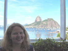
Katey Walter Anthony, aquatic ecologist and biogeochemist
I have been watching the work of this young scientist for sometime. Much of her research into methane releases presently being emitted from the thawing permafrost and bubbling from lakes in the far north of Alaska has passed under the radar of climate change discussions. This is very troubling as you’ll note that what is happening is not included in the IPCC models for upper levels of atmospheric concentrates of heat trapping greenhouse gases. Katey Walter Anthony’s work is detailed in the book ZERO Greenhouse Emissions and she is also featured in the Letters from 2030 series here.
I highly recommend we all start paying more attention to her work! Following is a recent article in National Geographic.
“It’s a worldwide responsibility to reduce our carbon footprint and its effects on the atmosphere. We’re researching the greenhouse gas that could have the most powerful affect of all on global warming.”
Deep below the glistening surface of a frozen Arctic lake, something is bubbling—something that could cause global warming to accelerate beyond all previous projections. Dr. Katey Walter Anthony steps onto the ice, to tell us why.
“The bubbles are methane, a strong greenhouse gas that’s 25 times more powerful than carbon dioxide,” Walter Anthony explains. It’s being released at an accelerating rate from thawing permafrost, frozen soil that holds vast amounts of carbon. When the Earth’s rising temperatures cause it to suddenly thaw, lakes form. “All that carbon was locked up safely in the permafrost freezer for tens of thousands of years,” Walter Anthony says. “Now the freezer door is opening, releasing the carbon into Arctic lake bottoms. Microbes digest it, convert it to methane, and the lakes essentially burp out methane.”
Scientists estimate that permafrost holds up to 950 billion tons of carbon. As it thaws, 50 billion tons of methane could enter the atmosphere from Siberian lakes alone. “That’s ten times more methane than the atmosphere holds right now,” Walter Anthony notes. “Since methane traps heat so efficiently, temperatures will rise higher, faster.” In the atmosphere methane spreads rapidly too, circling the globe in just one year.
Walter Anthony’s research in Alaska and Russia explores this dangerous, self-perpetuating cycle: thawing permafrost caused by global warming releases methane, which contributes to global warming. The bubbles she observes in the wilds of Siberia will soon be felt by the entire planet.
Walter Anthony’s comparative measurements of the speed of permafrost thaw and level of methane release reveal some Alaskan lakes eating into permafrost with exceptional speed. “We need to determine if this represents the near future of other regions like Siberia,” she says. Her data feed into scientific models that help predict global warming and ultimately inspire ideas to reduce it.
It’s a good thing Walter Anthony loves the solitude and stark beauty of Arctic landscapes. Her fieldwork is wet, risky, and very, very cold. “Just when temperatures dive, snow starts piling up, and everyone heads inside, we pack up our tents and go camping,” she smiles. Some areas she visits have been dubbed “drunken forests”—places where thawing permafrost has transformed woodlands into soggy wetlands dotted with dead and dying trees tilting at haphazard angles. “We get up in the morning, put on frozen-stiff clothes, and venture out onto thin lake ice,” she describes.
After shoveling off snow, Walter Anthony’s team hacks open holes in the ice and lowers plastic bubble traps into the water. “A valve allows us to take a sample and bring it back for lab analysis,” she says. But for on-the-spot confirmation of gas contents, Walter Anthony strikes a match. When flames leap—often as high as trees—she’s found methane.
Does the methane that threatens world climate have a silver lining? Walter Anthony seeks ways to harness it as an alternative energy source. “Capturing and burning it has already been done around the world on a small scale,” she says. Soaring over Alaska in a small plane, she looks for ways to fuel an entire village. “We knew methane seeps existed in this particular area, but weren’t sure where.” An aerial view revealed “fantastic seeps that looked like clusters of black grapes against the white snow. After landing we went out in snow machines, racing across the tundra to locate them.” Now her research and economic feasibility studies determine how to most efficiently bring the gas to the village for power and heat. “People living there would love to have local methane solve their energy crisis.”
Walter Anthony’s connection with Siberian people and places began when she was a high school exchange student and continued when she was a university graduate student in a far north science station. “Russian scientists led the way in connecting thawing permafrost with methane release. I really came to love and admire the people and country. Now, my long-term understanding of the unique capabilities of these scientists helps me arrange collaborations between Alaska and Russia to monitor climate change,” she says.
“I feel such a strong emotional tie with these extreme remote places. People who can last here love it. We chop firewood, collect berries, and fish. I like preserving those relationships with the land. When life is a little bit hard, it makes you appreciate the times you can come in and have a cup of soup.”
Link: http://greenhouseneutralfoundation.org/articles/2009/11/22/methane-the-ticking-time-bomb-will-go-off/


