26 March 2009
Michaels’ new graph
Every so often people who are determined to prove a particular point will come up with a new way to demonstrate it. This new methodology can initially seem compelling, but if the conclusion is at odds with other more standard ways of looking at the same question, further investigation can often reveal some hidden dependencies or non-robustness. And so it is with the new graph being cited purporting to show that the models are an "abject" failure.
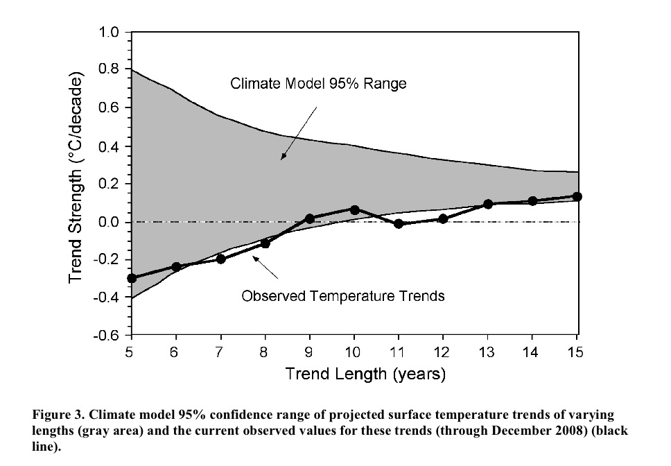
The figure in question was first revealed in Michaels' recent testimony to Congress:

The idea is that you calculate the trends in the observations to 2008 starting in 2003, 2002, 2001…. etc, and compare that to the model projections for the same period. Nothing wrong with this in principle. However, while it initially looks like each of the points is bolstering the case that the real world seems to be tracking the lower edge of the model curve, these points are not all independent. For short trends, there is significant impact from the end points, and since each trend ends on the same point (2008), an outlier there can skew all the points significantly. An obvious question then is how does this picture change year by year? or if you use a different data set for the temperatures? or what might it look like in a year's time? Fortunately, this is not rocket science, and so the answers can be swiftly revealed.
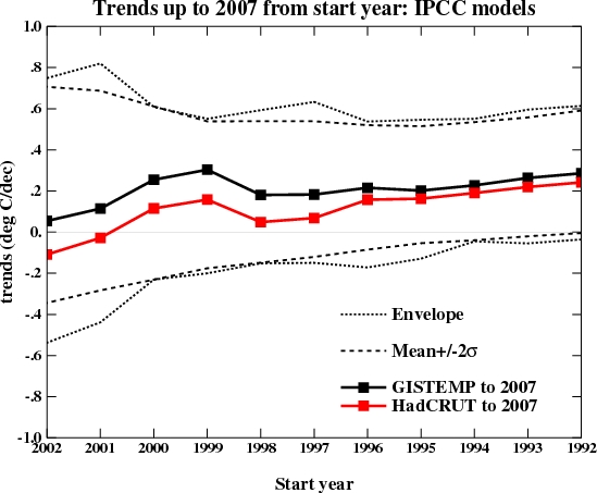
First off, this is what you would have got if you'd done this last year:

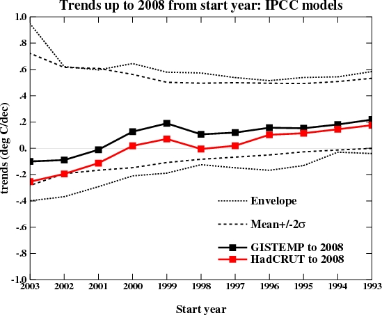
which might explain why it never came up before. I've plotted both the envelope of all the model runs I'm using and 2 standard deviations from the mean. Michaels appears to be using a slightly different methodology that involves grouping the runs from a single model together before calculating the 95% bounds. Depending on the details that might or might not be appropriate - for instance, averaging the runs and calculating the trends from the ensemble means would incorrectly reduce the size of the envelope, but weighting the contribution of each run to the mean and variance by the number of model runs might be ok.
Of course, even using the latest data (up to the end of 2008), the impression one gets depends very much on the dataset you are using:

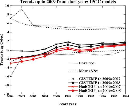
More interesting perhaps is what it will likely look like next year once 2009 has run its course. I made two different assumptions -- that this year will be the same as last year (2008), or that it will be the same as 2007. These two assumptions bracket the result you get if you simply assume that 2009 will equal the mean of the previous 10 years. Which of these assumptions is most reasonable remains to be seen, but the first few months of 2009 are running significantly warmer than 2008. Nonetheless, it's easy to see how sensitive the impression being given is to the last point and the dataset used.

It is thus unlikely this new graph would have seen the light of day had it come up in 2007; and given that next year will likely be warmer than last year, it is not likely to come up again; and since the impression of 'failure' relies on you using the HadCRUT3v data, we probably won't be seeing too many sensitivity studies either.
To summarise, initially compelling pictures whose character depends on a single year's worth of data and only if you use a very specific dataset are unlikely to be robust or provide much guidance for future projections. Instead, this methodology tells us a) that 2008 was relatively cool compared to recent years and b) short term trends don't tell you very much about longer term ones. Both things we knew already.
Next.
Link to Real Climate: http://www.realclimate.org/index.php/archives/2009/03/michaels-new-graph/


3 comments:
Why do the charts only show temperature anomalies? Is that to make the change look more dramatic than if the actual temperature data was shown say, in the Kelvin scale?
Dear Anon,
Please..
This comment shows that the methodology of statistics is somewhat beyond your ken.
The mathematics always requires the use of absolute temperatures and the changes in the absolute temperatures, thus the anomalies. This is the correct and normal way of doing things.
The drama is only in your head.
By the way, Patrick Michaels receives huge sums of money from the coal companies. This is a fact. Go look it up if you don't believe me.
He is a paid off shill, but Gavin Schmidt is way too polite to say so, so I will.
Post a Comment