Blog Archive

Showing posts with label Ocean temperatures. Show all posts

Friday, January 12, 2018

Joe Romm: Stunning NASA chart shows how fast the ground beneath our feet is heating up

The land is warming twice as fast as the oceans … too bad we live on the land

by Joe Romm, Climate Progress, August 22, 2017

ANNUAL (THIN LINES) AND FIVE-YEAR LOWESS SMOOTH (THICK LINES) FOR THE TEMPERATURE ANOMALIES AVERAGED OVER THE EARTH’S LAND AREA AND SEA SURFACE TEMPERATURE ANOMALIES. CREDIT: NASA
Global temperatures are rising faster on the land, where we live, than the oceans, where we don’t, NASA charts reveal. Since scientists have long predicted this trend and say it will continue, it’s worth a closer look.
Let’s start with the long-term global warming trend. According to NOAA, “Since 1880, surface temperature has risen at an average pace of 0.13 °F (0.07 °C) every 10 years, for a net warming of 1.71 °F (0.95 °C).”
But the warming is not evenly distributed: “Over this 136-year period, average temperature over land areas has warmed faster than ocean temperatures: 0.18 °F (0.10 °C) per decade compared to 0.11 °F (0.06 °C) per decade.” So over the entire record, the land is warming nearly 70 percent faster than the oceans.
But the warming is also speeding up. Over the last 45 years, surface temperature has been rising at an average rate of around 0.3 °F per decade — more than double the rate over the whole 135-year period. This speed up was also predicted. After all, emissions of CO2, the most important heat-trapping greenhouse gas, have increased by a factor of six since 1950 — and the rise of overall CO2 levels has sped up.
The disparity between the rate of land and ocean warming has also gotten bigger.  NASA Goddard Institute for Space Studies (GISS) recently posted some charts that show just how much faster it has been warming in recent decades — and how much the  disparity has grown.
In the past six decades, land temperatures have risen about  2.3 °F, a warming rate of nearly 0.4 °F a decade, as the top chart shows. That’s nearly double the temperature rise of the ocean, which is 1.25 °F per decade. Moreover, in the past 30 years, the rate of warming appears to have sped up even more, with land temperatures rising more than 0.6 °F a decade. That’s now a bit more than double the ocean warming.
But the key point, of course is that we live on the land. So when you see a rate of global warming quoted, remember, the rate of warming where we live is much higher — and growing fast.
Finally, you may be wondering why temperatures over the land are warming so much faster than temperatures over the ocean. Part of the reason is that the heat capacity of the ocean is so much greater than that of the land so its initial temperature response to warming is slower. As one explainer put it, “Think of the hot sand and cool water at the beach in the summer.” This is also why the ocean stores more than 90% of all of the excess heat from global warming.
Part of the reason the ocean warms more slowly is that much of the heating of the ocean goes into evaporation. But the land, particularly the drier parts of the planet, don’t have much moisture to evaporate  so much more of the global warming goes directly into temperature rise. For those technically minded readers who want a fuller explanation, start with this 2009 study, “Understanding Land–Sea Warming Contrast in Response to Increasing Greenhouse Gases.” Then try this 2013 study.
https://thinkprogress.org/global-warming-now-twice-as-fast-over-land-than-the-ocean-nasa-chart-shows-52b4afe01345/

Saturday, February 1, 2014

Atlantic changes are warming Antarctic

More evidence has emerged that changing climate in one region can have unpredictable effects many thousands of miles away.

by Tim Radford, Climate News Network, January 31, 2014

LONDON, 31 January - The Antarctic Peninsula is now the strongest-warming region on the planet. Blame that on changes in the faraway North and tropical Atlantic Ocean.

Xichen Li of New York University in the US and colleagues matched sea surface temperature variations in the northern Atlantic over a three-decade period against long-term changes in the Antarctic. They found a clear correlation, they report in Nature.

They also observed that warming Atlantic waters were followed by changes in sea level pressure in the Antarctic’s Amundsen Sea, and these changes also preceded changes in sea ice between the Ross and Amundsen-Bellinghausen-Weddell Sea. Both stretches of water lie many thousands of miles south of the Atlantic.

Correlations are not causes, so the authors then followed up their observational data by experiments with computer models of the global atmosphere. When they simulated a warming of the North Atlantic, the model “changed” the climate in Antarctica.

That Pacific Ocean temperatures can affect Antarctica is no surprise: such things have been linked to the El Niño cycle, a periodic natural pulse of heat in the equatorial Pacific.

Icy paradox

But until this study, no-one had thought to link Antarctica with long-term changes in the North Atlantic,and  in particular, a climatic phenomenon known as the Atlantic multidecadal oscillation, a cycle of natural warming and cooling that can last for 20 to 40 years.

“Our findings reveal a previously unknown – and surprising – force behind climate change that is occurring deep in our southern hemisphere: the Atlantic Ocean,” says Li. “Moreover, the study offers further confirmation that warming in one region can have far-reaching effects in another.”

The Antarctic presents a paradox: the sea ice in the Arctic is declining rapidly; but conditions in the Antarctic don’t seem to have been changing at the same rate or in the same pattern. Concentrations of ice have changed but there seems to be as much sea ice or more, overall.

David Holland of New York University, a co-author, says: “From this study, we are learning just how Antarctic sea ice redistributes itself, and also finding that the underlying mechanisms controlling sea ice are completely distinct from those in the Arctic.”


http://www.climatenewsnetwork.net/2014/01/atlantic-changes-are-warming-antarctic/

Saturday, July 27, 2013

Eemian interglacial period poor analog for current Arctic warming

Warm climate -- cold Arctic? The Eemian is a poor analogue for current climate change


by phys.org, June 14, 2012

The Eemian interglacial period that began some 125,000 years ago is often used as a model for contemporary climate change. In the international journal Geophysical Research Letters, scientists from Mainz, Kiel and Potsdam, Germany, now present evidence that the Eemian differed in essential details from modern climatic conditions.

To address the question about how climate may develop in the future, earth scientists direct their attention to the past. They look for epochs with similar conditions to today. The major identified climatic processes are then simulated with  to further test possible reactions of the Earths' system. An epoch which is often regarded suitable for such an undertaking is the Eemian , which began around 125,000 years ago following the Saalian ice age.
For about 10,000 years,  on Earth in the Eemian were rather enhanced – probably several degrees above today's level. This seems to be well documented in both ice cores as well as terrestrial records from land vegetation. Substantial parts of the Greenland ice had melted, and global sea level was higher than today. "Therefore, the Eemian time is suited apparently so well as a basis for the topical issue of ", says Dr Henning Bauch, who works for the Academy of the Sciences and the Literature Mainz (AdW Mainz) at GEOMAR | Helmholtz Centre for Ocean Research Kiel.
However, in a study which appears in the recent issue of the international journal  Dr Bauch, Dr Evgeniya Kandiano of GEOMAR as well as Dr Jan Helmke of the Institute for Advanced Sustainability Studies in Potsdam now show that the Eemian warm period differed from the present day situation in one critical aspect – the development in the Arctic Ocean.
In our current warm period, also called Holocene, oceanic and atmospheric circulation delivers large amounts of heat northward into the high latitudes. The most well known heat conveyer is the Gulf Stream and its northern prolongation called the North Atlantic Drift. The currents provide not only the pleasant temperatures in Northern Europe, they also reach as far as the Arctic. Studies in the last years have shown that the oceanic heat transport to the Arctic has even increased, while the summer sea ice cover in the Arctic Ocean seems to be decreasing continuously. It has long been assumed that such conditions also prevailed 125,000 years ago. Accordingly, the Arctic should have been by and large ice-free in the Eemian summers.
Dr Bauch's group examined sediment cores from the seabed in which information about the climate history of the past 500,000 years is stored. These come from the Atlantic to the west of Ireland and from the central Nordic Seas to the east of the island of Jan Mayen. The sediments contain minute calcite tests of dead microorganisms (foraminifers). "The type of species assemblage in the respective layers as well as the isotopic composition of the calcitic tests give us information about temperature and other properties of the water in which they lived at that time", explains Dr Bauch.
The samples from the Atlantic delivered the higher-than-Holocene temperature signals so typical for the Eemian. The tests from the Nordic Seas, however, tell quite another story. "The found foraminifers of Eemian time indicate comparatively cold conditions." The isotope investigations of the tests, in combination with previous studies of the group, "indicate major contrasts between the ocean surfaces of these two regions ", according to Dr Bauch. "Obviously, the warm Atlantic surface current was weaker in the high latitude during the Eemian than today." His explanation: "The Saalian glaciation which preceded the Eemian was of much bigger extent in Northern Europe than during the Weichselian, the ice age period before our present warm interval. Therefore, more fresh water from the melting Saalian ice sheets poured into the Nordic Seas, and for a longer period of time. This situation had three consequences: The oceanic circulation in the north was reduced, and winter sea ice was more likely to form because of lower salinity. At the same time, this situation led to a kind of 'overheating' in the North Atlantic due to a continuing transfer of ocean heat from the south."
On the one hand, the study introduces new views on the Eemian climate. On the other hand, the new results have consequences for climatology in general: "Obviously, some decisive processes in the Eemian ran off differently, like the transfer of ocean warmth towards the Arctic. Models should take this into consideration if they want to forecast the future climate development on the basis of past analogues like the Eemian ", says Dr. Bauch.
http://phys.org/news/2012-06-climate-cold-arctic-eemian.html

Thursday, May 23, 2013

MORE MUST READ TIDBITS: Kevin Trenberth on ocean heat content, changing trade winds, mechanism for heat to be carried down deeper in the ocean

Global warming is here to stay, whichever way you look at it

by Kevin Trenberth, University Corporation for Atmospheric Research, The Conversation, May 22, 2013

Has global warming stalled? This question is increasingly being asked because the local weather seems cool and wet, or because the global mean temperature is not increasing at its earlier rate or the long-term rate expected from climate model projections.

The answer depends a lot on what one means by “global warming.” For some it is equated to the “global mean temperature.” That keeps going up but also has ups and downs from year to year. More on that shortly.

Why should it go up? Well, because the planet is warming as a result of human activities. With increasing carbon dioxide and other heat-trapping greenhouse gases in the atmosphere, there is an imbalance in energy flows in and out of the top of the atmosphere: the greenhouse gases increasingly trap more radiation and hence create warming. “Warming” really means heating, and this can exhibit itself in many ways.

Rising surface temperatures are just one manifestation. Melting Arctic sea ice is another. So is melting of glaciers and other land ice that contribute to rising sea levels. Increasing the water cycle and invigorating storms is yet another. But most (more than 90%) of the energy imbalance goes into the ocean, and several analyses have now shown this. But even there, how much warms the upper layers of the ocean, as opposed to how much penetrates deeper into the ocean where it may not have much immediate influence, is a key issue.

The ups and downs of global temperature

My colleagues and I have just published a new analysis showing that in the past decade about 30% of the heat has been dumped at levels below 700 meters, where most previous analyses stop.

The first point is that this is fairly new; it is not there throughout the record. The cause of the shift is a particular change in winds, especially in the Pacific Ocean where the subtropical trade winds have become noticeably stronger, changing ocean currents and providing a mechanism for heat to be carried down into the ocean. This is associated with weather patterns in the Pacific, which are in turn related to the La Niña phase of the El Niño phenomenon.

The second point is that we have found distinctive variations in global warming with El Niño. A mini global warming, in the sense of a global temperature increase, occurs in the latter stages of an El Niño event, as heat comes out of the ocean and warms the atmosphere. The ocean’s temperature is also affected by volcanic eruptions, which also affect the perceptions of global warming.

Normal weather also interferes by generating clouds that reflect the sunshine, and there are fluctuations in the global energy imbalance from month to month. But these average out over a year or so.

Another prominent source of natural variability in the Earth’s energy imbalance is changes in the sun itself, seen most clearly as the sunspot cycle. From 2005 to 2010 the sun went into a quiet phase and the warming energy imbalance is estimated to have dropped by about 10 to 15%.

Some of the penetration of heat into the depths of the ocean is reversible, as it comes back in the next El Niño [whenever that is -- no signs of one for the rest of this year]. But a lot is not; instead it contributes to the overall warming of the deep ocean. This means less short-term warming at the surface, but at the expense of greater long-term warming, and faster sea level rise. So this has consequences.

Global warming is here to stay

Coming back to the global temperature record, one thing is clear. The past decade is by far the warmest on record. Human-induced global warming really kicked in during the 1970s, and warming has been pretty steady since then.

While the overall warming is about 0.16 °C per decade, there are three 10-year periods where there was a hiatus in warming, as the graph above shows, from 1977 to 1986, from 1987 to 1996, and from 2001 to 2012. But at each end of these periods there were big jumps. We find exactly the same sort of flat periods in climate model projections, lasting easily up to 15 years in length.

Focusing on the wiggles and ignoring the bigger picture of unabated warming is foolhardy, but an approach promoted by climate change deniers. Global sea level keeps marching up at a rate of more than 30 cm per century since 1992 (when global measurements via altimetry on satellites were made possible), and that is perhaps a better indicator that global warming continues unabated. Sea level rise comes from both the melting of land ice, thus adding more water to the ocean, plus the warming and thus expanding ocean itself.

Global warming is manifested in a number of ways, and there is a continuing radiative imbalance at the top of atmosphere. The current hiatus in surface warming is temporary, and global warming has not gone away.

Kevin Trenberth does not work for, consult to, own shares in or receive funding from any company or organisation that would benefit from this article, and has no relevant affiliations.

The Conversation
This article was originally published at The Conversation. Read the original article.

http://theconversation.com/global-warming-is-here-to-stay-whichever-way-you-look-at-it-14532

Thursday, May 9, 2013

"Strengthening of ocean heat uptake efficiency associated with the recent climate hiatus," by Masahiro Watanabe et al., GRL (2013); doi:10.1002/grl.50541

Geophysical Research Letters,  DOI: 10.1002/grl.50541

Strengthening of ocean heat uptake efficiency associated with the recent climate hiatus


  1. Masahiro Watanabe1,*
  2. Youichi Kamae2,
  3. Masakazu Yoshimori1
  4. Akira Oka1
  5. Makiko Sato3,4
  6. Masayoshi Ishii5
  7. Takashi Mochizuki6, and
  8. Masahide Kimoto1

Abstract

The rate of increase of global-mean surface air temperature (SATg) has apparently slowed during the last decade. We investigated the extent to which state-of-the-art general circulation models (GCMs) can capture this hiatus period by using multi-model ensembles of historical climate simulations. While the SATg linear trend for the last decade is not captured by their ensemble means regardless of differences in model generation and external forcing, it is barely represented by an 11-member ensemble of a GCM, suggesting an internal origin of the hiatus associated with active heat uptake by the oceans. Besides, we found opposite changes in ocean heat uptake efficiency (κ), weakening in models and strengthening in nature, which explain why the models tend to overestimate the SATg trend. The weakening of κ commonly found in GCMs seems to be an inevitable response of the climate system to global warming, suggesting the recovery from hiatus in coming decades.


http://0-onlinelibrary.wiley.com.library.hct.ac.ae/doi/10.1002/grl.50541/abstract

Open-access pdf file:  http://0-onlinelibrary.wiley.com.library.hct.ac.ae/doi/10.1002/grl.50541/pdf

Tuesday, May 7, 2013

Sea Surface Temperatures Reach Highest Level in 150 Years on Northeast Continental Shelf

shelf subregions
enlarge image The four subregions of the Northeast Shelf Large Marine Ecosystem, which extends from Cape Hatteras, N.C. to the Gulf of Maine. MAB is the Mid-Atlantic Bight, SNE is Southern New England, GB is Georges Bank, and GOM is the Gulf of Maine. Credit: NOAA

by Shelley Dawicki, Research Communications, Northeast Fisheries Science Center, NOAA, April 13, 2013

Sea surface temperatures in the Northeast Shelf Large Marine Ecosystem during 2012 were the highest recorded in 150 years, according to the latest Ecosystem Advisory issued by NOAA’s Northeast Fisheries Science Center (NEFSC). These high sea surface temperatures (SSTs) are the latest in a trend of above average temperature seen during the spring and summer seasons, and part of a pattern of elevated temperatures occurring in the Northwest Atlantic, but not seen elsewhere in the ocean basin over the past century.

The advisory reports on conditions in the second half of 2012.

Sea surface temperature for the Northeast Shelf Ecosystem reached a record high of 14 °C (57.2 °F) in 2012, exceeding the previous record high in 1951. Average SST has typically been lower than 12.4 °C (54.3 °F) over the past three decades.

Sea surface temperature in the region is based on both contemporary satellite remote-sensing data and long-term ship-board measurements, with historical SST conditions based on ship-board measurements dating back to 1854. The temperature increase in 2012 was the highest jump in temperature seen in the time series and one of only five times temperature has changed by more than 1 °C (1.8 °F).

The Northeast Shelf’s warm water thermal habitat was also at a record high level during 2012, while cold water habitat was at a record low level. Early winter mixing of the water column went to extreme depths, which will impact the spring 2013 plankton bloom. Mixing redistributes nutrients and affects stratification of the water column as the bloom develops.

Temperature is also affecting distributions of fish and shellfish on the Northeast Shelf. The advisory provides data on changes in distribution, or shifts in the center of the population, of seven key fishery species over time. The four southern species -- black sea bass, summer flounder, longfin squid and butterfish -- all showed a northeastward or upshelf shift. American lobster has shifted upshelf over time but at a slower rate than the southern species. Atlantic cod and haddock have shifted downshelf.”

“Many factors are involved in these shifts, including temperature, population size, and the distributions of both prey and predators,” said Jon Hare, a scientist in the NEFSC’s Oceanography Branch. A number of recent studies have documented changing distributions of fish and shellfish, further supporting NEFSC work reported in 2009 that found about half of the 36 fish stocks studied in the Northwest Atlantic Ocean, many of them commercially valuable species, have been shifting northward over the past four decades.

The Northeast U.S. Continental Shelf Large Marine Ecosystem (LME) extends from the Gulf of Maine to Cape Hatteras, North Carolina. The NEFSC has monitored this ecosystem with comprehensive sampling programs since 1977. Prior to 1977, this ecosystem was monitored by the NEFSC through a series of separate, coordinated programs dating back decades.

Warming conditions on the Northeast Shelf in the spring of 2012 continued into September, with the most consistent warming conditions seen in the Gulf of Maine and on Georges Bank. Temperatures cooled by October and were below average in the Middle Atlantic Bight in November, perhaps due to Superstorm Sandy, but had returned to above average conditions by December.

“Changes in ocean temperatures and the timing and strength of spring and fall plankton blooms could affect the biological clocks of many marine species, which spawn at specific times of the year based on environmental cues like water temperature,” Kevin Friedland, a scientist in the NEFSC Ecosystem Assessment Program, said. He noted that the contrast between years with, and without, a fall bloom is emerging as an important driver of the shelf’s ecology. “The size of the spring plankton bloom was so large that the annual chlorophyll concentration remained high in 2012 despite low fall activity. These changes will have a profound impact throughout the ecosystem.”

Michael Fogarty, who heads the Ecosystem Assessment Program, says the abundance of fish and shellfish is controlled by a complex set of factors, and that increasing temperatures in the ecosystem make it essential to monitor the distribution of many species, some of them migratory and others not.

"It isn’t always easy to understand the big picture when you are looking at one specific part of it at one specific point in time,“ Fogarty said, a comparison similar to not seeing the forest when looking at a single tree in it. “We now have information on the ecosystem from a variety of sources collected over a long period of time, and are adding more data to clarify specific details. The data clearly show a relationship between all of these factors.”

“What these latest findings mean for the Northeast Shelf ecosystem and its marine life is unknown,” Fogarty said. “What is known is that the ecosystem is changing, and we need to continue monitoring and adapting to these changes.”

Ecosystem advisories have been issued twice a year by the NEFSC’s Ecosystem Assessment Program since 2006 as a way to routinely summarize overall conditions in the region. The reports show the effects of changing coastal and ocean temperatures on fisheries from Cape Hatteras to the Canadian border. The advisories provide a snapshot of the ecosystem for the fishery management councils and also a broad range of stakeholders from fishermen to researchers.

The Spring 2013 Ecosystem Advisory, covering the fall of 2012 with supporting information, is available online at: 

http://www.nefsc.noaa.gov/ecosys/advisory/current/advisory.html.

http://www.nefsc.noaa.gov/press_release/2013/SciSpot/SS1304/

Tuesday, January 29, 2013

"Limiting global warming to 2 °C is unlikely to save most coral reefs," by K. Frieler et al., Nature Climate Change, 3 (2013); doi: doi:10.1038/nclimate1674

Nature Climate Change, 3 (2013) 165-170; doi: doi:10.1038/nclimate1674

Limiting global warming to 2°C is unlikely to save most coral reefs

Abstract

Mass coral bleaching events have become a widespread phenomenon causing serious concerns with regard to the survival of corals. Triggered by high ocean temperatures, bleaching events are projected to increase in frequency and intensity. Here, we provide a comprehensive global study of coral bleaching in terms of global mean temperature change, based on an extended set of emissions scenarios and models. We show that preserving >10% of coral reefs worldwide would require limiting warming to below 1.5°C (atmosphere–ocean general circulation models (AOGCMs) range: 1.3–1.8°C) relative to pre-industrial levels. Even under optimistic assumptions regarding corals’ thermal adaptation, one-third (9–60%, 68% uncertainty range) of the world’s coral reefs are projected to be subject to long-term degradation under the most optimistic new IPCC emissions scenario, RCP3-PD. Under RCP4.5 this fraction increases to two-thirds (30–88%, 68% uncertainty range). Possible effects of ocean acidification reducing thermal tolerance are assessed within a sensitivity experiment.

At a glance

Link: http://www.nature.com/nclimate/journal/v3/n2/full/nclimate1674.html

Thursday, September 6, 2012

NSIDC Report of September 5, 2012: Arctic sea ice extent falls below 4 million square kilometers

Arctic sea ice extent falls below 4 million square kilometers


Following the new record low recorded on August 26, Arctic sea ice extent continued to drop and is now below 4.00 million square kilometers (1.54 million square miles). Compared to September conditions in the 1980s and 1990s, this represents a 45% reduction in the area of the Arctic covered by sea ice. At least one more week likely remains in the melt season.

Overview of conditions

Figure 1. Arctic sea ice extent for August 2012 was 4.72 million square kilometers (1.82 million square miles). The magenta line shows the 1979 to 2000 median extent for that month. The black cross indicates the geographic North Pole. Sea Ice Indexdata. About the data. Credit: National Snow and Ice Data Center. High-resolution image
Throughout the month of August, Arctic sea ice extent tracked below levels observed in 2007, leading to a new record low for the month of 4.72 million square kilometers (1.82 million square miles), as assessed over the period of satellite observations, 1979 to present. Extent was unusually low for all sectors of the Arctic, except the East Greenland Sea where the ice edge remained near its normal position. On August 26, the 5-day running average for ice extent dropped below the previous record low daily extent, observed on September 18, 2007, of 4.17 million square kilometers (1.61 million square miles). By the end of the month, daily extent had dropped below 4.00 million square kilometers (1.54 million square miles). Typically, the melt season ends around the second week in September. 

Conditions in context

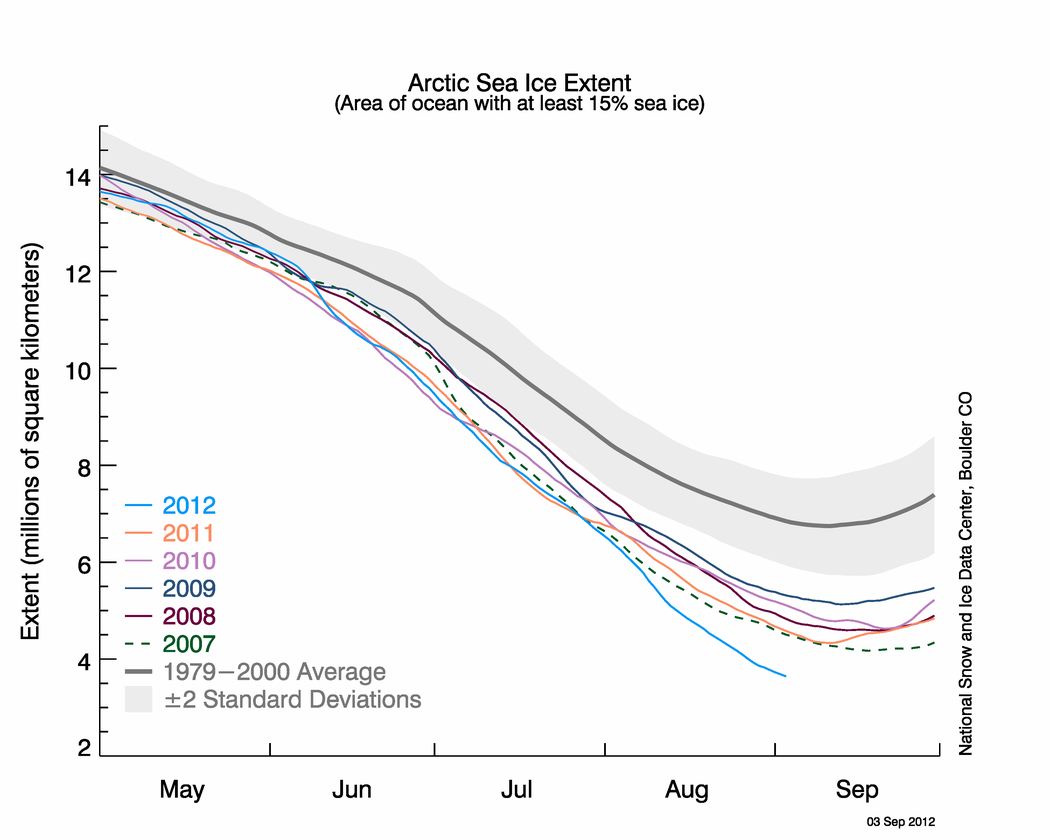
Figure 2. The graph above shows Arctic sea ice extent as of September 3, 2012, along with daily ice extent data for the previous five years. 2012 is shown in blue, 2011 in orange, 2010 in pink, 2009 in navy, 2008 in purple, and 2007 in green. The 1979-2000 average is in dark gray. The gray area around this average line shows the two standard deviation range of the data. Sea Ice Index data.
Credit: National Snow and Ice Data Center. High-resolution image
In 2012, the rate of ice loss for August was 91,700 square kilometers (35,400 square miles) per day, the fastest observed for the month of August over the period of satellite observations. In August 2007, ice was lost at a rate of 66,000 square kilometers (25,400 square miles) per day, and in 2008, the year with the previous highest August ice loss, the rate was 80,600 square kilometers (31,100 square miles) per day. The average ice loss for August is 55,100 square kilometers (21,300 square miles) per day. This rapid pace of ice loss in 2012 was dominated by large losses in the East Siberian and the Chukchi seas, likely caused in part by the strong cyclone that entered the region earlier in the month and helped to break up the ice. However, even after the cyclone had dissipated, ice loss continued at a rate of 77,800 square kilometers (30,000 square miles) per day.
August air temperatures at the 925 hPa level (approximately 3,000 feet above the surface) remained slightly above average (1-3 degrees Celsius, or 2-5 degrees Fahrenheit) over the much of the Pacific sector of the Arctic Ocean as well as at its central sector, with slightly higher temperatures in the Beaufort Sea (approximately 4 C, or 7 F above average). On the Atlantic side, the Kara and Barents seas continued to have air temperatures around 1-4 C (2-7 F) below average.
At the end of August, ice remained in the Western Parry Channel, and neither the northern or southern routes of the Northwest Passage were open. While much of the ice has cleared out, ice still remains, as confirmed by our colleague Steve Howell at the Canadian Ice Service. In the latter half of August, more ice actually moved into the passage routes when ice was pushed down into the channels from the north. Whether that ice will clear out remains to be seen.

August 2012 compared to previous years

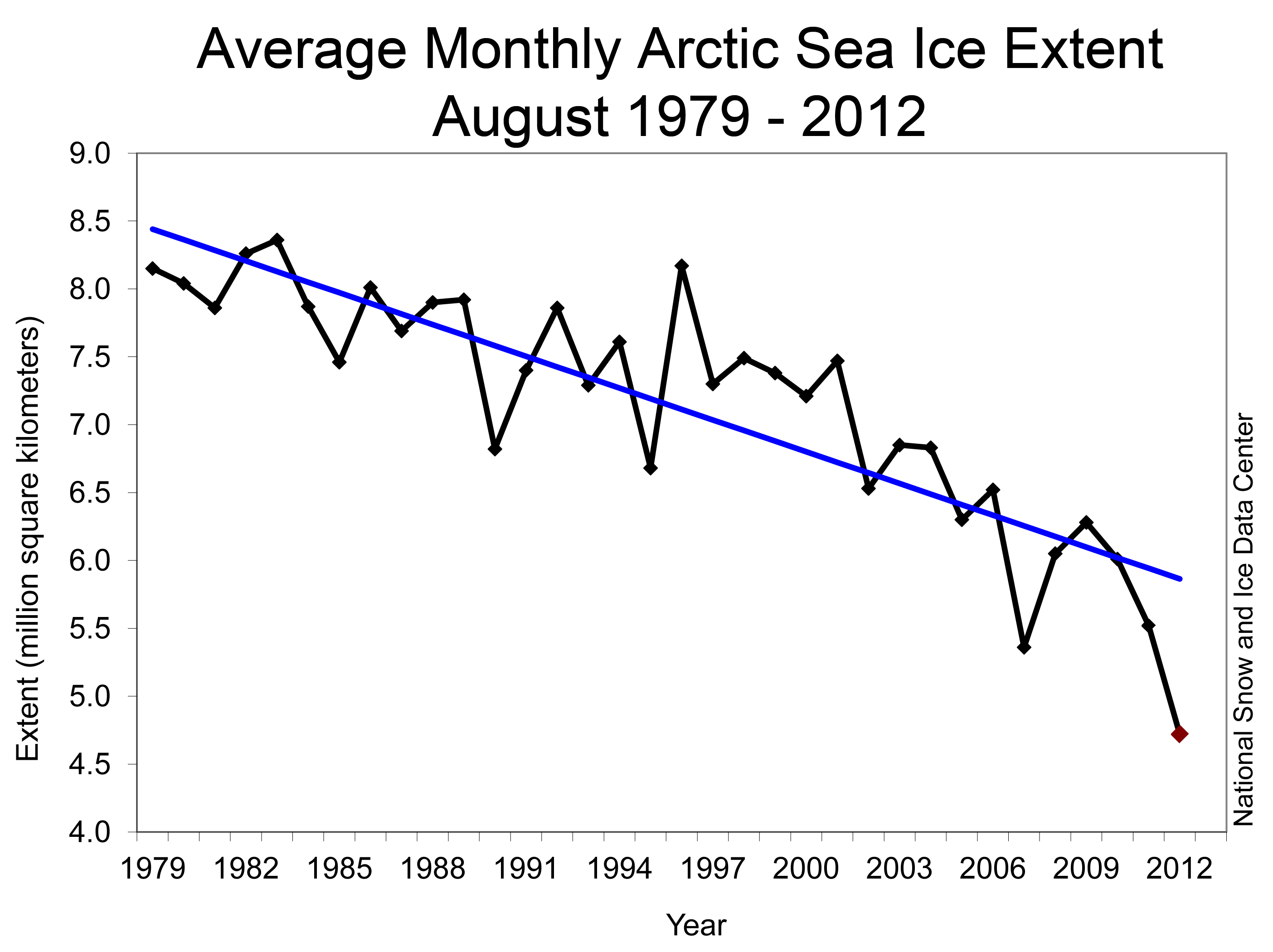
Figure 3. Monthly August ice extent for 1979 to 2012 shows a decline of 10.2% per decade. Credit: National Snow and Ice Data Center. High-resolution image
The monthly averaged ice extent for August was 4.72 million square kilometers (1.82 square miles). This is 2.94 million square kilometers (1.14 million square miles) below the 1979 to 2000 average extent, and 640,000 square kilometers (247,000 square miles) below the previous record low for August set in 2007. Including 2012, the August trend is -78,100 square kilometers (-30,200 square miles) per year, or -10.2 % per decade relative to the 1979-2000 average.

Evolution of sea surface temperatures in August

sea surface temperature images
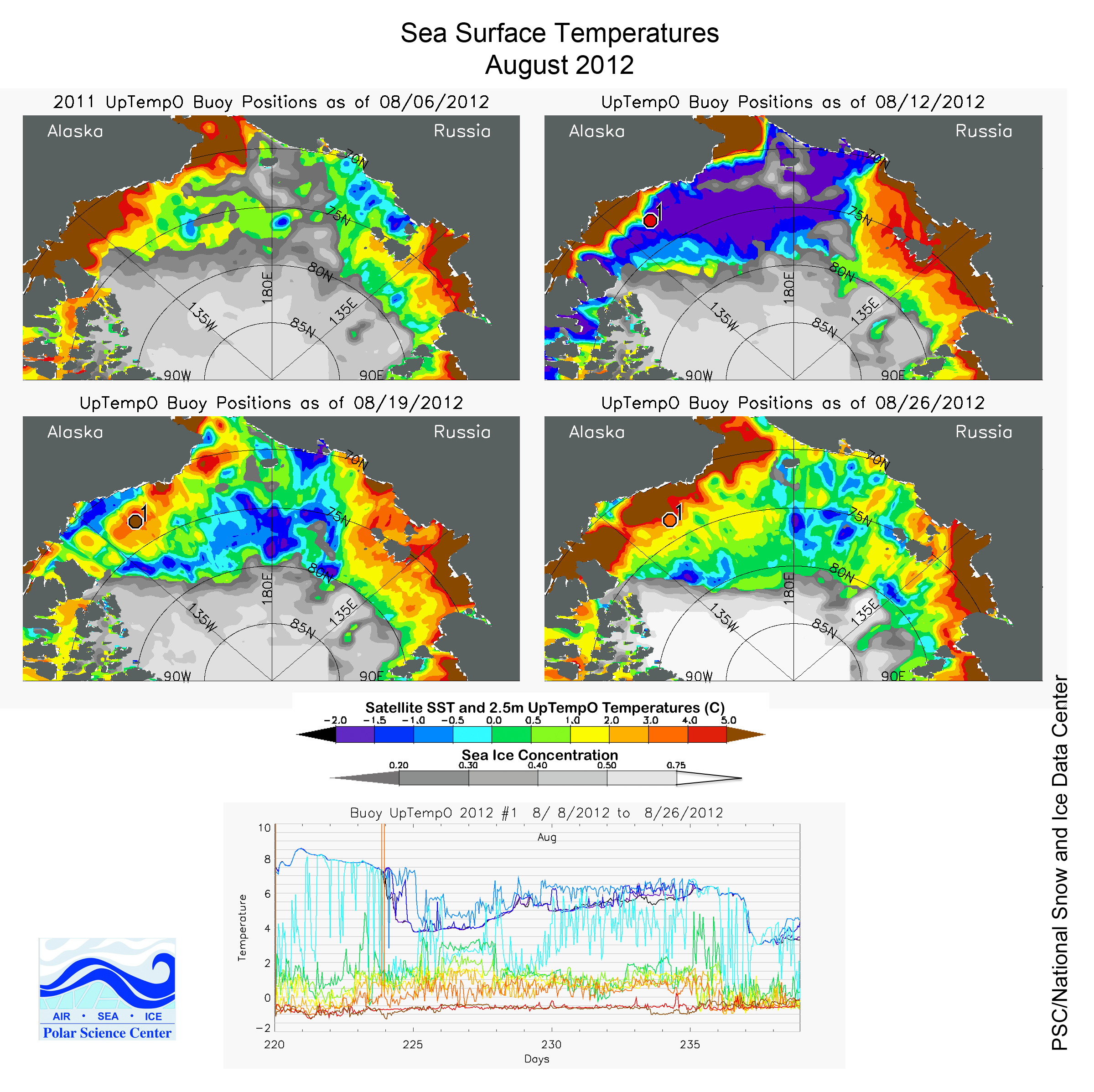
Figure 4. A buoy deployed on August 8, 2012, in open water during the storm initially shows a very warm 10-meter (33-foot)-thick surface mixed layer (upper left image). On August 12 (upper right image), the buoy enters a relatively cooler patch, gradually warms, enters another cool patch 12 days later (bottom left image), and then starts to warm again through August 26 (bottom right image). Red, orange, and yellow indicate higher temperatures, while blues and purples indicate lower temperatures. Credit: University of Washington Polar Science Center. High-resolution image
In recent summers, Arctic Ocean sea surface temperatures (SSTs) have been anomalously high (see our 2010 and 2011 end-of-summer posts), in part linked to loss of the reflective ice cover that allows darker open water areas to readily absorb solar radiation and warm the mixed layer of the ocean. According to Mike Steele, Wendy Ermold and Ignatius Rigor of the University of Washington, SSTs in the Beaufort, Chukchi, and Laptev seas were once again anomalously high before the strong cyclone (mentioned earlier and discussed in our previous post) entered the East Siberian and Chukchi seas on August 5, 2012. SSTs were as much as 5 C (9 F) above normal along the coastal areas in those seas. After the storm, the warm water that developed through summer was interspersed with large areas of cold water created by ice melt. By the third week of August, sea surface temperatures were mostly back to levels observed before the storm, but with a few more patches of colder water interspersed from additional ice melt.
A closer view of the variation in SSTs before and after the storm is recorded in the University of Washington Polar Science Center UpTempO buoy data. A buoy deployed on August 8, 2012, in open water during the storm initially shows a very warm 10-meter (33-foot)-thick surface mixed layer, likely the result of solar heating. On August 12, the buoy enters a relatively cooler patch, gradually warms, enters another cool patch 12 days later and then starts to warm again through August 26. These patches of cooler water may be a result of ice melt and/or the impact of advection from the storm.

Old ice continues to decline

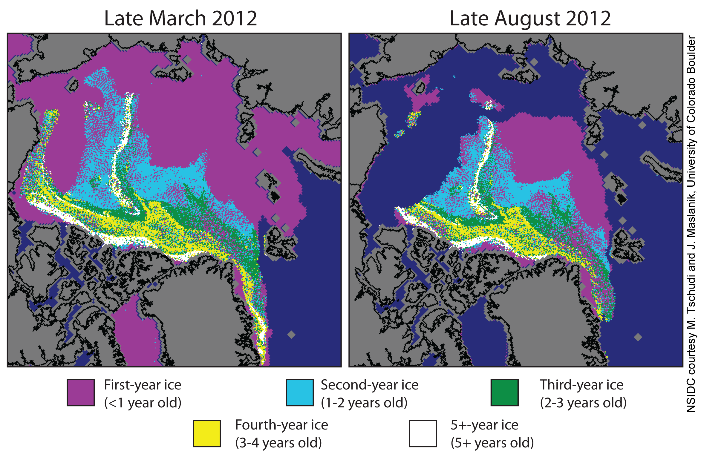
Figure 5. These images from March 2012 (left) and August 2012 (right) show the age of the ice cover in spring and at the end of summer. Much of the Arctic ice cover now consists of first-year ice (shown in purple), which tends to melt rapidly in summer’s warmth. However, the oldest ice, that had survived five or more summers (shown in white), declined by 51%.
Credit: M. Tschudi and J. Maslanik, University of Colorado Boulder. High-resolution image
Ice age is an important indicator of the health of the ice cover. Old ice, also called multiyear ice, tends to be thicker ice and less prone to melting out in summer. The last few summers have seen increased losses of multiyear ice in the Pacific sector of the Arctic; multiyear ice that is transported into the Beaufort and Chukchi seas tends to melt out in summer before being transported back to the central Arctic Ocean through the clockwise Beaufort Gyre circulation. This summer, the tongue of multiyear ice along the Alaska coast mostly melted out by the end of August, with a small remnant left in the Chukchi Sea. The ice on the Pacific side of the Arctic has melted back to the edge of the multiyear ice cover, which should help to slow further ice loss in the region. In the Laptev Sea, by contrast, a large amount of first-year ice remains. In the last two weeks, open water areas have developed within the first-year ice in the Laptev Sea, helping to further foster melt in that region.
Between mid-March and the third week of August, the total amount of multiyear ice within the Arctic Ocean declined by 33%, and the oldest ice, ice older than five years, declined by 51%.

Monday, September 3, 2012

Stefan Rahmstorf: If 2013 breaks heat record, how will deniers respond?


by Stefan Rahmstorf, New Scientist, No. 2880, September 3, 2012

With an El Niño on the way, 2013 could be the warmest year on record. 
But the climate-denial machine will keep on churning
It has been another "normal" global-warming summer in the northern hemisphere. The US sweltered in the hottest July on record, following the hottest spring on record. More than 60% of the contiguous US is suffering from drought, as are parts of eastern Europe and India. In the Arctic, sea ice cover is at a record low and the Greenland ice sheet shows what the US National Snow and Ice Data Center calls "extraordinary high melting." Global land temperatures for May and June were the hottest since records began in the 19th century.
Meanwhile, El Niño conditions are forecast to develop in the tropical Pacific Ocean, warming up ocean surface temperatures. Some observers have predicted that this will lead to record-breaking global temperatures next year.
If El Niño does arrive and temperature records are broken, there will inevitably be much discussion of the causes of the warming. So now is a good time to sort signal from noise in the global temperature records.
For the past 30 years, global temperature has shown a linear warming trend of 0.16 °C per decade (Environmental Research Letters, Vol. 6, p. 044022). When looking for the cause of this warming, a physicist will look for the heat source. One possibility is that the oceans are releasing heat. But measurements show the opposite: the oceans are soaking up heat. The other possibility is that the heat is coming from above, and indeed it is: more radiation is entering the top of the atmosphere than leaving it. This is because increasing amounts of greenhouse gases in the atmosphere hamper the loss of heat into space.
Superimposed on this global-warming signal is short-term natural variability, which makes some years hotter and some colder. Some, notably 2005 and 2010, stick out above the trend line, whereas others, like 2008 and 2011, stay below it. But overall, temperatures are creeping upwards within a corridor of plus or minus 0.2 °C around the trend line. Climate deniers use this variability to claim there is a slowdown in global warming, by cherry-picking time intervals that happen to start in the upper part of the corridor and end in the lower. They mix up signal and noise.
Three known factors explain much of the natural variation. The first is volcanic eruptions -- the eruption of Mount Pinatubo in the Philippines in 1991 was followed by three cold years, for example. Then there is the sun's variability, mostly in the form of the 11-year sunspot cycle. Finally, there is the irregular oscillation between warm El Niño and cold La Niña conditions in the Pacific.
We have independent measurements describing all three that we can easily correlate to global temperature changes. This shows, for example, that during a solar maximum the globe is about 0.1 °C warmer than during a solar minimum, but also that solar activity has contributed nothing to the warming trend of the past 30 years. In fact, it has acted to reduce it, but the effect is so small that the hottest year on record, 2010, was near the end of the deepest solar minimum since satellite measurements began in the 1970s.
The analysis further shows that global temperature typically reaches a maximum about four months after El Niño conditions peak, and is correspondingly colder after La Niña. La Niña episodes in 2008 and 2011 have cooled the past few years, masking the warming trend. But while 2011 was cool in the context of the previous 10 years, it was the hottest La Niña year on record.
It is straightforward to remove the effects of the solar and El Niño cycles from the data, just as unemployment figures routinely have seasonal effects removed. Once this is done, and regardless of the global temperature dataset used, the result is always a steady warming trend that has been no slower in the past decade than it was in the previous two -- and which, incidentally, agrees with what is predicted by the Intergovernmental Panel on Climate Change.
Now solar activity is on the way back up and it is only a matter of time before the next El Niño event comes along. In fact, predictions by the US National Oceanic and Atmospheric Administration suggest that El Niño conditions are likely to arrive any time now. These two factors, combined with the ongoing warming trend, make it likely that a global temperature record will be set next year -- unless a major volcano erupts.
Perhaps a record year will silence those unscientific voices who claim that global warming has come to an end. But the denial industry has already come up with a plan B: to claim that global warming is completely down to El Niño. To expose the fallacy of that, we just need to look again at where the heat comes from: below or above.
In the case of El Niño, the warmth comes from the ocean. During El Niño events, the global ocean releases heat, whereas during La Niña events, it recharges its heat store. That is confirmed by satellite measurements of the radiation balance: during recent La Niña events our planet did not lose heat to space. On the contrary, it absorbed more than normal. That is to be expected: when the ocean exposes colder waters at its surface, as during La Niña, these soak up extra heat.
So if global warming of the past decades was due to El Niño or another mechanism involving heat from the ocean, the ocean would have lost heat. But the heat content has gone up, not down. And it is well understood why: because we created a radiation imbalance by adding greenhouse gases to our atmosphere.
The signal of global warming caused by humans is very clear, despite attempts by certain parties to drown it out with a lot of noise.
Stefan Rahmstorf heads the Earth System Analysis department at the Potsdam Institute for Climate Impact Research in Germany. He is coauthor of The Climate Crisis (Cambridge University Press, 2009)

Tuesday, August 2, 2011

Ice-shelf collapse from subsurface warming as a trigger for Heinrich events, PNAS, Shaun A. Marcott et al.

Proceedings of the National Academy of Sciences, published online before print August 1, 2011; doi: 10.1073/pnas.1104772108

Ice-shelf collapse from subsurface warming as a trigger for Heinrich events


Abstract


Episodic iceberg-discharge events from the Hudson Strait Ice Stream (HSIS) of the Laurentide Ice Sheet, referred to as Heinrich events, are commonly attributed to internal ice-sheet instabilities, but their systematic occurrence at the culmination of a large reduction in the Atlantic meridional overturning circulation (AMOC) indicates a climate control. We report Mg/Ca data on benthic foraminifera from an intermediate-depth site in the northwest Atlantic and results from a climate-model simulation that reveal basin-wide subsurface warming at the same time as large reductions in the AMOC, with temperature increasing by approximately 2 °C over a 1–2 kyr interval prior to a Heinrich event. In simulations with an ocean model coupled to a thermodynamically active ice shelf, the increase in subsurface temperature increases basal melt rate under an ice shelf fronting the HSIS by a factor of approximately 6. By analogy with recent observations in Antarctica, the resulting ice-shelf loss and attendant HSIS acceleration would produce a Heinrich event.


http://www.pnas.org/content/early/2011/07/25/1104772108.abstract