by tamino, "Open Mind" blog, September 10, 2016

Tamino's blog is made possible by readers like you; join others by donating at Peaseblossom’s Closet.
When we see records being broken and unprecedented events such as this, the onus is on those who deny any connection to climate change to prove their case. Global warming has fundamentally altered the background conditions that give rise to all weather. In the strictest sense, all weather is now connected to climate change. Kevin Trenberth HIT THE PAGE DOWN KEY TO SEE THE POSTS Now at 8,800+ articles. HIT THE PAGE DOWN KEY TO SEE THE POSTS

![]() |
| Figure 2. Global mean surface temperature for El Nino years. Data source: GISS NASA |
![]() |
| Figure 3. Global mean surface temperature for strong or moderate/strong El Nino years that were followed by a La Nina. Data source: GISS NASA |
![]() |
| Figure 4. Map showing mean surface temperature, anomalies for May, from the 1951-1980 mean. Source: GISS NASA |
![]() |
| Figure 5. Map showing mean surface temperature, anomalies for April, from the 1951-1980 mean. Source: GISS NASA |
![]() | |
|
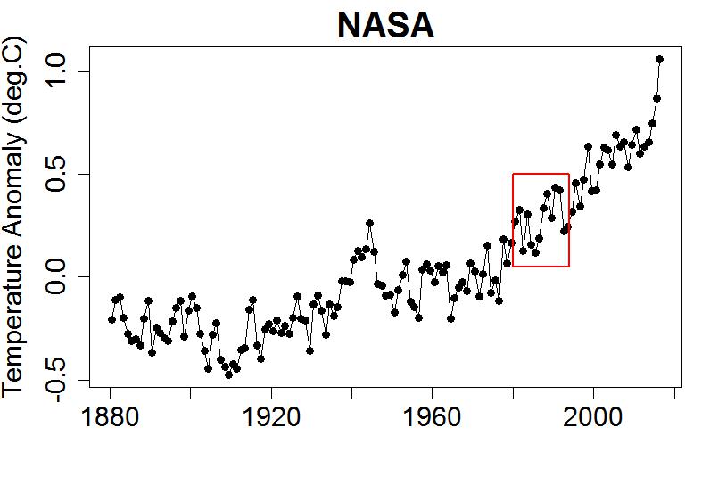
The bottom line is this: there is no global cooling trend. For the time being, until humanity brings its greenhouse gas emissions under control, we can expect each decade to be warmer than the preceding one. Weather fluctuations certainly exceed local temperature changes over the past half century. But the perceptive person should be able to see that climate is warming on decadal time scales.The quote and figure are from a fascinating draft essay, “If It’s That Warm, How Come It’s So Damned Cold?” by NASA’s James Hansen, Reto Ruedy, Makiko Sato, and Ken Lo. It is posted on Hansen’s Columbia University website, and he sent out a note to his email list asking for comments:
Criticisms are welcome. This is a draft essay that I wanted to get out because we are releasing our December and annual surface temperature analysis on the GISS web site. We will prepare a write-up on 2009 temperatures for the GISS web site next week.If you post comments I’ll get them to him.
The long‐term trends are more apparent when temperature is averaged over several years. The 60‐month (5‐year) and 132 month (11‐year) running mean temperatures are shown in Figure 2 for the globe [above] and the hemispheres. The 5‐year mean is sufficient to reduce the effect of the El Nino–La Nina cycles of tropical climate. The 11‐year mean minimizes the effect of solar variability – the brightness of the sun varies by a measurable amount over the sunspot cycle, which is typically of 10–12 years' duration.The draft essay goes into great depth on how NASA knows 2005 was warmer than 1998 and why their dataset is better than the Hadley/CRU dataset (see also “Why are Hadley and CRU withholding vital climate data from the public?” and Finally, the truth about the Hadley/CRU data: “The global temperature rise calculated by the Met Office’s HadCRUT record is at the lower end of likely warming”).
There is a contradiction between the observed continued warming trend and popular perceptions about climate trends. Frequent statements include: “There has been global cooling over the past decade.” “Global warming stopped in 1998.” “1998 is the warmest year in the record.” Such statements have been repeated so often that most of the public seems to accept them as being true. However, based on our data, such statements are not correct.
The origin of this contradiction probably lies in part in differences between the GISS and HadCRUT temperature analyses (HadCRUT is the joint Hadley Research Centre, University of East Anglia Climate Research Unit temperature analysis). Indeed, HadCRUT finds 1998 to be the warmest year in their record. In addition, popular belief that the world is cooling is reinforced by cold weather anomalies in the United States in the summer of 2009 and cold anomalies in much of the Northern Hemisphere in December 2009.
Here we first show the main reason for the difference between the GISS and HadCRUT analyses. Then we examine the 2009 regional temperature anomalies in the context of global temperatures.A key takeaway message is this:
Why are some people so readily convinced of a false conclusion, that the world is really experiencing a cooling trend? That gullibility probably has a lot to do with regional short‐term temperature fluctuations, which are an order of magnitude larger than global average annual anomalies.Short-term weather fluctuations are vastly greater than the long-term global warming anomaly in the climate (so far). Weather isn’t climate.
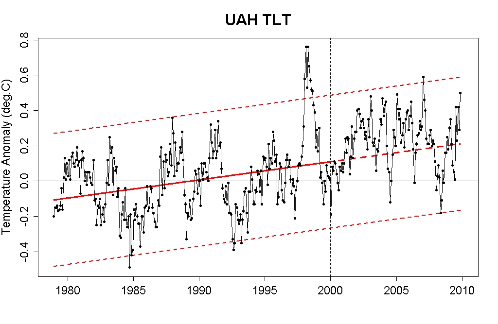
You picked the period 1980 to 2000 do you would get a positive slope. Why not fit a line to 2000 to 2010? Because it shows a negative slope and you don’t want that? Well, that’s precisely the point skeptics are making: if you look at the last 10 years, the trend is zero or down. You choose your own 20 years to show the trend is up. If you chose 1940 t0 1980 the trend would be down. In 1999 climate scientists told us the world would warm up over the next ten years. It didn’t.You are wrong on all counts.
Synopsis: El Niño is expected to strengthen and last through the Northern Hemisphere winter 2009-2010.
A weak El Niño continued during September 2009, as sea surface temperature (SST) anomalies remained nearly unchanged across much of the equatorial Pacific Ocean (Figs. 1 & 2). Since the transition to El Niño conditions during June, the weekly values of the Niño-3.4 index have remained between +0.7°C and +0.9°C (Fig. 2). Subsurface oceanic heat content (average temperatures in the upper 300m of the ocean, Fig. 3) anomalies continued to reflect a deep layer of anomalous warmth between the ocean surface and the thermocline, particularly in the central and east-central Pacific (Fig. 4)…. These oceanic and atmospheric anomalies reflect an ongoing weak El Niño.
A majority of the model forecasts for the Niño-3.4 SST index (Fig. 6) suggest that El Niño will reach at least moderate strength during the Northern Hemisphere fall (3-month Niño-3.4 SST index of +1.0°C or greater). Many model forecasts even suggest a strong El Niño (3-month Niño-3.4 SST index in excess of +1.5°C) during the fall and winter, but in recent months some models, including the NCEP CFS, have over-predicted the degree of warming observed so far in the Niño-3.4 region (Fig. 7). Based on the model forecasts, the seasonality of El Niño, and the continuation of westerly wind bursts, El Niño is expected to strengthen and most likely peak at moderate strength.
Originally posted Dec. 16, 2008, with meteorological year data. Updated Jan. 13, 2009, with calendar year data.
Calendar year 2008 was the coolest year since 2000, according to the Goddard Institute for Space Studies analysis [see ref. 1] of surface air temperature measurements. In our analysis, 2008 is the ninth warmest year in the period of instrumental measurements, which extends back to 1880 (left panel of Fig. 1). The ten warmest years all occur within the 12-year period 1997-2008. The two-standard-deviation (95% confidence) uncertainty in comparing recent years is estimated as 0.05°C [ref. 2], so we can only conclude with confidence that 2008 was somewhere within the range from 7th to 10th warmest year in the record.
Figure 1 above. Left: Annual-means of global-mean temperature anomaly Right: Global map of surface temperature anomalies, in degrees Celsius, for 2008. (Click for PDF.)
The map of global temperature anomalies in 2008 (right panel of Fig. 1), shows that most of the world was either near normal or warmer than in the base period (1951-1980). Eurasia, the Arctic and the Antarctic Peninsula were exceptionally warm, while much of the Pacific Ocean was cooler than the long-term average. The relatively low temperature in the tropical Pacific was due to a strong La Niña that existed in the first half of the year. La Niña and El Niño are opposite phases of a natural oscillation of tropical temperatures, La Niña being the cool phase.
Figure 2, at right. Top: Seasonal-mean global and low latitude temperature anomalies relative to the 1951-1980 base period. (Click for large GIF or PDF.) Bottom: Monthly-mean global-ocean surface temperature anomaly, based on satellite temperature analyses of Reynolds and Smith (ref. 4]. (Click for large GIF or PDF.)
The top of Fig. 2 provides seasonal resolution of global and low latitude surface temperature, and an index that measures the state of the natural tropical temperature oscillation. The figure indicates that the La Niña cool cycle peaked in early 2008. The global effect of the tropical oscillation is made clear by the average temperature anomaly over the global ocean (bottom of Fig. 2). The "El Niño of the century", in 1997-98, stands out, as well as the recent La Niña.
Figure 3 compares 2008 with the mean for the first seven years of this century. Except for the relatively cool Pacific Ocean, most of the world was either near normal or unusually warm in 2008. The temperature in the United States in 2008 was not much different than the 1951-1980 mean, which makes 2008 cooler than all of the previous years this decade. As shown by the right side of Fig. 3, most of the United States averaged between 0.5 and 1°C warmer than the long-term mean during 2001-2007.
The GISS analysis of global surface temperature, documented in the scientific literature [refs. 1 and 2], incorporates data from three data bases made available monthly: (1) the Global Historical Climatology Network (GHCN) of the National Climate Data Center [ref. 3], (2) the satellite analysis of global sea surface temperature of Reynolds and Smith [ref. 4], and (3) Antarctic records of the Scientific Committee on Antarctic Research (SCAR) [ref. 5].
In the past our procedure has been to run the analysis program upon receipt of all three data sets and make the analysis publicly available immediately. This procedure worked very well from a scientific perspective, with the broad availability of the analysis helping reveal any problems with input data sets. However, because confusion was generated in the media after one of the October 2008 input data sets was found to contain significant flaws (some October station records inadvertently repeated September data in the October data slot), we have instituted a new procedure. The GISS analysis is first made available internally before it is released publicly. If any suspect data are detected, they will be reported back to the data providers for resolution. This process may introduce significant delays. We apologize for any inconvenience due to this delay, but it should reduce the likelihood of instances of future confusion and misinformation.
Note that we provide the rank of global temperature for individual years because there is a high demand for it from journalists and the public. The rank has scientific significance in some cases, e.g., when a new record is established. However, otherwise rank has limited value and can be misleading. As opposed to the rank, Fig. 3 provides much more information about how the 2008 temperature compares with previous years, and why it was a bit cooler (again, note the change in the Pacific Ocean region).
Figure 3 above. Comparison of 2008 (left) temperature anomalies with the mean 2001-2007 (right) anomalies. Notice that a somewhat different color bar has been used than in Figure 1 to show more structure in the right-hand map). (Click for PDF.)
Finally, in response to popular demand, we comment on the likelihood of a near-term global temperature record. Specifically, the question has been asked whether the relatively cool 2008 alters the expectation we expressed in last year's summary that a new global record was likely within the next 2-3 years (now the next 1-2 years). Response to that query requires consideration of several factors:
Natural dynamical variability:The largest contribution is the Southern Oscillation, the El Niño-La Niña cycle. The Niño 3.4 temperature anomaly (the bottom line in the top panel of Fig. 2), suggests that the La Niña may be almost over, but the anomaly fell back (cooled) to -0.7°C last month (December). It is conceivable that this tropical cycle could dip back into a strong La Niña, as happened, e.g., in 1975. However, for the tropical Pacific to stay in that mode for both 2009 and 2010 would require a longer La Niña phase than has existed in the past half century, so it is unlikely. Indeed, subsurface and surface tropical ocean temperatures suggest that the system is "recharged", i.e., poised, for the next El Niño, so there is a good chance that one may occur in 2009. Global temperature anomalies tend to lag tropical anomalies by 3-6 months.
Solar irradiance:The solar output remains low (Fig. 4), at the lowest level in the period since satellite measurements began in the late 1970s, and the time since the prior solar minimum is already 12 years, two years longer than the prior two cycles. This has led some people to speculate that we may be entering a "Maunder Minimum" situation, a period of reduced irradiance that could last for decades. Most solar physicists expect the irradiance to begin to pick up in the next several months — there are indications, from the polarity of the few recent sunspots, that the new cycle is beginning.
Figure 4, at right. Solar irradiance through November 2008 from Frohlich and Lean [ref. 8]. (Click for large GIF or PDF.)
However, let's assume that the solar irradiance does not recover. In that case, the negative forcing, relative to the mean solar irradiance is equivalent to seven years of CO2 increase at current growth rates. So do not look for a new "Little Ice Age" in any case. Assuming that the solar irradiance begins to recover this year, as expected, there is still some effect on the likelihood of a near-term global temperature record due to the unusually prolonged solar minimum. Because of the large thermal inertia of the ocean, the surface temperature response to the 10-12 year solar cycle lags the irradiance variation by 1-2 years. Thus, relative to the mean, i.e, the hypothetical case in which the sun had a constant average irradiance, actual solar irradiance will continue to provide a negative anomaly for the next 2-3 years.
Volcanic aerosols:Colorful sunsets the past several months suggest a non-negligible stratospheric aerosol amount at northern latitudes. Unfortunately, as noted in the 2008 Bjerknes Lecture [ref. 9], the instrument capable of precise measurements of aerosol optical depth depth (SAGE, the Stratospheric Aerosol and Gas Experiment) is sitting on a shelf at Langley Research Center. Stratospheric aerosol amounts are estimated from crude measurements to be moderate. The aerosols from an Aleutian volcano, which is thought to be the primary source, are at relatively low altitude and high latitudes, where they should be mostly flushed out this winter. Their effect in the next two years should be negligible.
Greenhouse gases: Annual growth rate of climate forcing by long-lived greenhouse gases (GHGs) slowed from a peak close to 0.05 W/m2 per year around 1980-85 to about 0.035 W/m2 in recent years due to slowdown of CH4 and CFC growth rates [ref. 6]. Resumed methane growth, if it continued in 2008 as in 2007, adds about 0.005 W/m2. From climate models and empirical analyses, this GHG forcing trend translates into a mean warming rate of ~0.15°C per decade.
Summary:The Southern Oscillation and increasing GHGs continue to be, respectively, the dominant factors affecting interannual and decadal temperature change. Solar irradiance has a non-negligible effect on global temperature [see, e.g., ref. 7, which empirically estimates a somewhat larger solar cycle effect than that estimated by others who have teased a solar effect out of data with different methods]. Given our expectation of the next El Niño beginning in 2009 or 2010, it still seems likely that a new global temperature record will be set within the next 1-2 years, despite the moderate negative effect of the reduced solar irradiance.
GISS Surface Temperature Analysis (GISTEMP)
Past global temperature annual summations: 2007, 2005, 2004, 2003, 2002, and 2001.
Related 2008 news releases: NOAA, WMO, and Hadley Center.
Link to this page: http://data.giss.nasa.gov/gistemp/2008/
The meteorological year, December 2007 through November 2008, was the coolest year since 2000, according to the Goddard Institute for Space Studies analysis of surface air temperature measurements. It was the ninth warmest year in the period of instrumental measurements, which extends back to 1880. The nine warmest years all occur within the eleven-year period 1998-2008.
Figure 1 above. Left: Global map of surface temperature anomalies in degrees Celsius for the 2008 meteorological year (December 2007 through November 2008). (Click for large GIF or PDF.) Right: Annual-mean global-mean anomalies, except 2008, which is the 11-month (Jan-Nov) mean anomaly. (Click for large GIF or PDF.)
The map of global temperature anomalies in 2008, the left panel of Figure 1, shows that most of the world was warmer than in the period of climatology (1951-1980). Eurasia, the Arctic and the Antarctic Peninsula were exceptionally warm, while much of the Pacific Ocean was cooler than the long-term average. The relatively low temperature in the tropical Pacific was due to a strong La Niña. La Niña and El Niño are opposite phases of a natural oscillation of tropical temperatures, La Niña being the cool phase.
Figure 2, at right. Top: Seasonal-mean global and low latitude temperature anomalies relative to 1951-1980 base period. (Click for large GIF or PDF.) Bottom: Monthly-mean global-ocean surface temperature anomaly, based on satellite temperature analyses of Reynolds et al. (Click for large GIF or PDF.)
Figure 2 (top) provides seasonal resolution of global and low latitude surface temperature, and an index that measures the state of the natural tropical temperature oscillation. The figure indicates that the La Niña cool cycle peaked in early 2008. The global effect of the tropical oscillation is made clear by the average temperature anomaly over the global ocean (Figure 2, bottom). The "El Niño of the century", in 1997-98, stands out, as well as the recent La Niña.
Figure 3 compares 2008 with the mean for the first seven years of this century. Except for the relatively cool Pacific Ocean, most of the world was unusually warm in 2008. The United States, however, was not exceptionally different than its long-term mean.
The GISS analysis of global surface temperature, documented in the scientific literature [ref. 1], incorporates data from three data bases made available monthly: (1) the Global Historical Climatology Network (GHCN) of the National Climate Data Center [ref. 2], (2) the satellite analysis of global sea surface temperature of Reynolds et al. [ref. 3], and (3) Antarctic records of the Scientific Committee on Antarctic Research (SCAR) [ref. 4].
In the past our procedure has been to run the analysis program upon receipt of all three data sets and make the analysis publicly available immediately. This procedure worked very well from a scientific perspective, with the broad availability of the analysis helping reveal any problems with input data sets. However, because confusion was generated in the media after one of the October 2008 input data sets was found to contain significant flaws (some October station records inadvertently repeated September data in the October data slot), we have instituted a new procedure. The GISS analysis is first made available internally before it is released publicly. If any suspect data are detected, they will be reported back to the data providers for resolution. This process may introduce significant delays. We apologize for any inconvenience due to this delay, but it should reduce the likelihood of instances of future confusion and misinformation.
Finally, we note that we provide the rank of global temperature for individual years because there is a high demand for it from journalists and the public. The rank has scientific significance in some cases, e.g., when a new record is established. However, otherwise rank has limited value and can be misleading. Note that, given our estimated error bar in Figure 1, we can only say that 2008 probably ranks as somewhere between the 7th and 12th warmest year. As opposed to the rank, Figure 3 provides much more information about how the 2008 temperature compares with previous years, and why it was a bit cooler (note the change in the Pacific Ocean region).
Figure 3. Comparison of 2008 temperature anomalies (left) with the mean 2001-2007 anomalies (right). (Click for large GIF or PDF. Notice that a somewhat different color bar has been used than in Figure 1 to show more structure in the right-hand map)
GISS Surface Temperature Analysis (GISTEMP)
Related 2008 news releases: NOAA, WMO, and Hadley Center.
Past NASA news releases: 2007, 2006, 2005, and 2004.
Past global temperature annual summations: 2007, 2005, 2004, 2003, 2002, and 2001. (Note: No separate summation was written for 2006. See news release for that year instead.)
1. Hansen, J., R. Ruedy, J. Glascoe, and Mki. Sato, 1999: GISS analysis of surface temperature change. J. Geophys. Res., 104, 30997-31022, doi:10.1029/1999JD900835.
2. Peterson, T.C., and R.S. Vose, 1997: An overview of the Global Historical Climatology Network temperature database. Bull. Amer. Meteorol. Soc. 78, 2837-2849.
3. Reynolds, R.W., and T.M. Smith, 1994: Improved global sea surface temperature analyses. J. Climate 7, 929-948.
4. Scientific Committee on Antarctic Research (SCAR), www.scar.org.
Please address all inquiries regarding GISS surface temperature trends analysis to Dr. James E. Hansen.
Link to the above information: http://data.giss.nasa.gov/gistemp/2008/
by David Herring • design by Robert Simmon • November 5, 2007 | |||
Gazing up at the patch of night sky where the moon had shone just minutes earlier, young James Hansen had a flash of insight that changed the course of his career. It was December 1963 and Hansen, a senior in college, had gathered with fellow students at a small observatory just outside of Iowa City to observe a lunar eclipse. As the moon entered Earth’s shadow, Hansen expected the lunar disk to grow dark but he didn’t expect it to completely disappear from view. At first the moon’s disappearance puzzled Hansen, but then it dawned on him that it must have something to do with the recent eruption of Mount Agung, in Indonesia. Agung Volcano erupted with such force on March 17, 1963, it injected gases and debris particles high into the atmosphere, above where rain clouds form. Over a span of weeks the volcanic particles spread around the upper atmosphere where they scattered and absorbed incoming light, slightly darkening Earth’s surface. | |||
“Normally you can see the moon during an eclipse from the sunlight beams refracted into Earth’s shadow,” Hansen explained, referring to the way in which the atmosphere bends light beams. “But on that night the atmosphere was so filled with volcanic aerosols that the sunlight beams that usually bent into the moon’s shadow region couldn’t penetrate Earth’s atmosphere well. So it appeared to us as a remarkably dark eclipse.” | During a lunar eclipse the moon usually remains visible, dimly lit by sunlight refracted through Earth’s atmosphere. In December of 1963, however, particles in the atmosphere from the eruption of Mount Agung blocked enough sunlight to make the eclipsed moon almost invisible. (Photograph ©2007 Johannes Schedler.) | ||
Hansen marveled at the power of these airborne particles, known as aerosols. If aerosols can reflect and absorb incoming sunlight, what effect could events like Agung's eruption have on Earth’s surface temperature? To find out, he plugged what was known at the time about aerosols, greenhouse gases, and how Earth absorbs and radiates energy into some physics equations. His results suggested that the aerosols should slightly cool the planet. It was one thing to estimate the impact of volcanic eruptions on global temperature using math and physics. It was quite another thing to compare such estimates to real-world data. The problem was that there were no real-world, global-scale data sets of temperature in the late 1960s to which he could compare his estimates. Murray Mitchell, in the NOAA Weather Bureau’s Office of Climatology, collected the most complete data set at the time. But Mitchell’s data set only included stations in the Northern Hemisphere. Thus Hansen’s goal of comparing his estimates to the real world was put on hold. | A catastrophic eruption of Mount Agung in March 1963 killed over 1,000 Indonesians on the island of Bali. The eruption covered the nearby area with ash and injected sulfur compounds into the stratosphere. The particles remained aloft for several years, absorbing and scattering light and slightly cooling Earth’s surface. (Photograph ©2006 Jesse Wagstaff.) | ||
He continued working on planetary-scale science problems throughout his graduate and post-graduate studies. The United States had become a space-faring nation and the allure of the unknown called many planetary physicists’ attention to worlds beyond Earth’s atmosphere. What were conditions on the other planets like, and could they support life as we know it? Hansen wrote his doctoral thesis on the atmosphere of Earth’s nearest neighbor, Venus. Its dense carbon dioxide atmosphere made Venus’ surface hotter than an oven. Years later Hansen’s studies of Venus would contribute to his efforts to track Earth’s temperature. | The dense carbon dioxide atmosphere of Venus shrouds the planet in a thick layer of clouds—and heats the surface to a scorching 460° C (860° F). Jim Hansen’s research on Venus’ greenhouse effect eventually led him to the study of carbon dioxide and the greenhouse effect on Earth. (Image ©2005 Mattias Malmer.) | ||
Earth is Cooling…No It’s Warming | |||
In 1967 Hansen went to work for NASA’s Goddard Institute for Space Studies, in New York City, where he continued his research on planetary problems. Around 1970, some scientists suspected Earth was entering a period of global cooling. Decades prior, the brilliant Serbian mathematician Milutin Milankovitch had explained how our world warms and cools on roughly 100,000-year cycles due to its slowly changing position relative to the Sun. Milankovitch’s theory suggested Earth should be just beginning to head into its next ice age cycle. The surface temperature data gathered by Mitchell seemed to agree; the record showed that Earth experienced a period of cooling (by about 0.3°C) from 1940 through 1970. Of course, Mitchell was only collecting data over a fraction of the Northern Hemisphere—from 20 to 90 degrees North latitude. Still, the result drew public attention and a number of speculative articles about Earth’s coming ice age appeared in newspapers and magazines. | |||
But other scientists forecasted global warming. Russian climatologist Mikhail Budyko had also observed the three-decade cooling trend. Nevertheless, he published a paper in 1967 in which he predicted the cooling would soon switch to warming due to rising human emissions of carbon dioxide. Budyko’s paper and another paper published in 1975 by Veerabhadran Ramanathan caught Hansen’s attention. Ramanathan pointed out that human-made chlorofluorocarbons (or CFCs) are particularly potent greenhouse gases, with as much as 200 times the heat-retaining capacity of carbon dioxide. Because people were adding CFCs to the lower atmosphere at an increasing rate, Ramanathan expressed concern that these new gases would eventually add to Earth’s greenhouse effect and cause our world to warm. (Because CFCs also erode Earth’s protective ozone layer, their use was mostly abolished in 1989 with the signing of the Montreal Protocol.) The notion that humans could override nature and force the globe to warm intrigued Hansen. “It had been known for more than a century that increasing carbon dioxide could have an effect on global temperature,” Hansen said (referring to the pioneering work of John Tyndall and Svante Arrhenius in the 1800s). But global warming in the near future? That was another matter. Hansen returned his attention to the physics equations he’d played with almost 10 years earlier. Collaborating with Andy Lacis, a colleague at NASA, he built a simple climate model to simulate how changes in the atmosphere cause Earth’s average temperature to change over time. Hansen and Lacis tweaked the inputs to simulate the cumulative influence of all known human-made greenhouse gases except carbon dioxide (including CFCs, methane, nitrous oxide, and ozone) to see if their net effect could even be felt on a global scale in the climate system. To their surprise, Hansen’s team found that the warming effect of all those gases added together is comparable to the warming effect of carbon dioxide alone. | Initial efforts to observe Earth’s temperature were limited to the Northern Hemisphere, and they showed a cooling trend from 1940 to 1970 (jagged line). Scientists estimated the relative effects of carbon dioxide (warming, top curve) and aerosols (cooling, bottom curve) on climate, but did not have enough data to make precise predictions. (Graph from Mitchell, 1972.) | ||
The simple model also allowed Hansen to simulate the climate impact of Mount Agung’s eruption 15 years after the event. The model indicated that loading the atmosphere with volcanic aerosols should have caused a global cooling—a prediction that agreed pretty well with observed temperature data. The model demonstrated that both human and natural activities could force climate to change. But Hansen knew that natural forcings, like volcanic eruptions or changes in the Sun’s activity, tend to go up and down over a long period of time whereas the human forcing from greenhouse gas emissions was steadily increasing. “It became clear that human-produced greenhouse gases should become a dominant forcing and even exceed other climate forcings, such as volcanoes or the Sun, at some point in the future,” Hansen observed. How soon would the human forcing begin to dominate? No one knew. | In 1981, NASA scientists predicted the impact of carbon dioxide emissions on global temperatures between 1950 and 2100 based on different scenarios for energy growth rates and energy source. If energy use stayed constant at 1980 levels (scenario 3, bottom lines), temperatures were predicted to rise just over 1°C. If energy use grew moderately (scenario 2, middle lines), warming would be 1–2.5 °C. Fast growth (scenario 1, top lines) would cause 3–4°C of warming. In each scenario, the warming was predicted to be less if some of the energy was supplied by non-fossil (renewable) fuels instead of coal-based, synthetic fuels (synfuels). (Graph from Hansen et al., 1981.) | ||
To find out, Hansen would need real-world data on a global scale. He requested data tapes from Roy Jenne, of the National Center for Atmospheric Research, who was widely recognized in the 1970s as having the best weather dataset in the world. Of course, there remained the problem that the weather stations supplying Jenne’s dataset were rather sparse compared to the vastness of Earth’s surface. | To test his climate model, Hansen calculated the cooling effect of Mount Agung’s eruption (dotted line) and compared the results with real-world temperature measurements (solid line). Despite its simplicity, the model accurately reflected the dip in tropical temperatures caused by the eruption. (Graph from Hansen et al., 1978.) | ||
“The lack of any global temperature analysis [for Earth] did not seem right to me,” Hansen recalled. Drawing from his previous work in estimating the average planetary surface temperature of Venus, he knew that if scientists had measurements from as many places on another planet as were available from Jenne’s dataset they would not hesitate to estimate Earth’s global temperature. He decided to try. At the outset Hansen knew that weather fluctuations would introduce short-term temperature anomalies into the weather station dataset that are not the same thing as climate change. But he reasoned that by taking averages over several years, and appropriately “weighting” the weather stations’ data, it should be possible to determine meaningful temperature changes over longer time periods. In the mid-1970s, he hired Jeremy Barberra, a New York University undergraduate student at the time, to automate the processing of Jenne’s dataset. They decided to process the data to produce average temperature changes, and not absolute temperature. “If you focus your analysis on temperature change, and not on determining absolute temperature values, then the station coverage is adequate,” Hansen explained. “What matters is the long-term mean over large scales, not single measurements from individual stations.” The success of Hansen’s and Barberra’s approach depended on the principle that temperature anomalies have a much larger scale than absolute temperature. Consider a mountain on which it can be much cooler on one side than the other. This example illustrates how absolute temperature patterns can vary sharply over relatively short distances. On the other hand, temperature anomalies are typically large-scale events driven by Rossby Waves. Rossby Waves are slow-moving waves in the ocean or atmosphere, driven from west to east by the force of Earth spinning. We see such waves in the atmosphere as large-scale meanders of the mid-latitude jet stream. | Weather stations (red dots) are scattered unevenly across the globe. They are especially sparse in Africa and over the oceans. Before scientists could be confident in global temperature records, Hansen needed to demonstrate that widely spaced observations captured global temperature trends accurately. (NASA map by Robert Simmon, based on data from the National Climatic Data Center.) | ||
| “If it is an unusually warm winter in New York, it is probably also warm in Washington, D.C., for example,” Hansen explained. “At high- and mid-latitudes Rossby Waves are the dominant cause of short-term temperature variations. And since those are fairly long waves we didn’t think we needed a station at every one degree of separation.” A station at every 1 degree would mean a station roughly every 80 kilometers (at mid-latitudes). But in a 1987 paper appearing in the Journal of Geophysical Review, Hansen and Sergei Lebedeff demonstrated that the temperature readings of weather stations within 1,000 kilometers (620 miles) of one another are highly correlated. The close correlation meant they could map global temperature changes over time despite the fact that weather stations are widely spaced and located mainly on continents and islands. Here’s basically how their approach works: For each center point in a global grid of 1-degree boxes they let all weather station data within a 1,200-kilometer radius influence the estimated temperature change at that point. They gave greatest “weight” to the station closest to that point; for all other stations within that radius, they let the weighting fall off linearly with distance, all the way to a weighting of zero for stations 1,200 kilometers away or farther. “Again, our objective was not to determine the precise temperature of individual stations, but to produce a global-scale map of temperature change,” Hansen emphasized. “We were interested in tracking global climate patterns, not local weather variations.” In their 1981 analysis, published in the journal Science, Hansen’s team reported finding that, overall, Earth’s average temperature rose by about 0.4°C for the period from 1880 to 1978. There was roughly 0.1°C of global cooling from 1940-1970. This cooling was less than what Mitchell had found earlier due to the fact that Hansen’s team was now using global data, and not just data from a swath around the Northern Hemisphere. Just as Budyko had predicted, Hansen found that Earth’s cooling trend swung back in the warming direction around 1970 and has been warming ever since. Moreover, Hansen noted, the warming trend observed in real-world data is consistent with his (and others’) global climate model outputs in their 100-year simulations. | Absolute temperatures can vary a lot even over short distances, but temperature anomalies usually affect a large region. Most week-to-week temperature variability is driven by Rossby Waves. These waves are easy to see in the looping motions of the jet stream. In this animation, Rossby Waves spiral from left to right toward Europe in the Northern Hemisphere and South Africa in the Southern Hemisphere. The scale of these waves is so large that weather stations separated by 1,000 kilometers or more adequately record the temperature anomalies they produce. (Double-click to pause or replay animation.) (NASA animation by Robert Simmon, based on SEVIRI data copyright EUMETSAT.) High definition animation (23 MB Quicktime) | ||
Since 1978, global warming has become even more apparent. Over the last 30 years, Hansen’s analysis reveals that Earth warmed another 0.5°C, for a total warming of 0.9°C since 1880. | The first reliable global measurements of temperature from NASA, published by Hansen and his colleagues in 1981, showed a modest warming from 1880 to 1980, with only a slight dip in temperatures from 1940 to 1970. (Graph adapted from Hansen et al. 1981.) | ||
“To questions about whether this warming is natural or just a fluctuation, the answer has become clear: the world is getting warmer,” Hansen stated. “This fact agrees so well with what we calculate with our global climate model that I am confident we are looking at warming that is mainly due to increasing human-made greenhouse gases.” | Since 1980, global surface temperatures have increased sharply, the Earth’s response to increasing concentrations of greenhouse gases such as carbon dioxide. (NASA graph adapted from Goddard Institute for Space Studies data.) | ||
The Data and the Details | |||
Some nagging questions remained for Hansen and his colleagues. Citing issues such as stations located too close to paved surfaces, stations located in urban areas that are known to be warmer than rural regions, and stations located in developing nations where data collection methods may be unreliable, critics argued that any of these problems could throw off an individual station’s temperature readings. Don’t such concerns cast a shadow of doubt on the NOAA weather station data? Initially, perhaps, but not after the data have been carefully tested in several ways. First, Hansen’s team (and others) finds good agreement of the weather station data with “proxy” data sets that are sensitive to surface temperature changes—such as the rate at which glaciers are receding, or subsurface temperature measurements in boreholes drilled down into the ground. (Scientists can infer surface temperature change from underground temperatures based on equations that describe how heat diffuses through the ground over time.) The results in thousands of remote locations around the world agree well with the surface temperature measurements. Second, Hansen’s team “cleans” the weather station data by finding and filtering out flawed data entries. Specifically, they apply a computer algorithm that checks each data point for temperature readings that are very significantly higher or lower than average for a given location at that time of year. Whenever such an anomaly is flagged, the algorithm compares those data to data from nearby stations to see if they show a similar anomaly. If so, then the data in question are kept; if not, or if there are no nearby stations for comparison, then the data are thrown away. | |||
His team also modifies the data from stations located in densely populated areas by removing the long-term bias of these “urban heat islands.” The team uses satellite data to determine if a given station is in an urban or near-urban location. If so, then the team uses the nearest rural stations to determine the long-term trend at the urban site. If there are no rural neighbors, then Hansen’s team throws out the urban station data. | Bad data are cleaned from the NASA global temperature record by first looking for outliers: months when the temperature at a station is much higher or lower than the average for that time of year. The monthly temperature record for Linyi, China, in 1932 (red dots; June data is missing) shows that September was 5.3° C warmer than average. The unusual data point was compared to nearby stations. Since some of those stations were also exceptionally warm, the data point was retained. If nearby stations do not confirm the anomaly, the team does not use the data. (Graph by Robert Simmon, based on data from the GISS Surface Temperature Analysis Station Data.) | ||
One lesson to be learned here is weather science and climate science are quite different: weather is concerned with what conditions are like at a given location and time, whereas climate is concerned with what conditions are like over large regions, or over the entire globe, and for a long period of time. That explains why climate scientists are not as interested in any given reading for an individual station as they are in 5-year and 10-year blocks of time for the entire planet. Hansen acknowledged there may be flaws in the weather station data. “But that doesn’t mean you give up on the science, and that you can’t draw valid conclusions about the nature of Earth’s temperature change,” he asserted. | Weather stations are screened for potential bias from urban heat islands by comparing station locations with maps of urbanization. Measurements from nearby stations in rural areas (gray) are used to correct urban station data for warming due to the heat island effect. If no rural neighbors are available for comparison, data from urban (dark blue) and peri-urban (blue) stations are left out of the global average calculation. (Map by Robert Simmon, based on data from NOAA.) | ||
From A Dimmer Past to a Brighter Future? | |||
Of greater concern to Hansen than global warming skeptics is the problem of global warming itself. If greenhouse gases are to blame then why did Earth’s average temperature cool from 1940-1970? And why has the rate of global warming accelerated since 1978? Hansen’s answers to these questions brought him full circle to where he began his investigation more than 40 years ago. “I think the cooling that Earth experienced through the middle of the twentieth century was due in part to natural variability,” he said. “But there’s another factor made by humans which probably contributed, and could even be the dominant cause: aerosols.” | |||
In addition to greenhouse gas emissions, human emissions of particulate matter are another significant influence on global temperature. But whereas greenhouse gases force the climate system in the warming direction, aerosols force the system in the cooling direction because the airborne particles scatter and absorb incoming sunlight. “Both greenhouse gases and aerosols are created by burning fossil fuels,” Hansen said, “but the aerosol effect is complicated because aerosols are distributed inhomogeneously [unevenly] while greenhouse gases are almost uniformly spaced. So you can measure greenhouse gas abundance at one place, but aerosols require measurements at many places to understand their abundance.” After World War II, the industrial economies of Europe and the United States were revving up to a level of productivity the world had never seen before. To power this large-scale expansion of industry, Europeans and Americans burned an enormous quantity of fossil fuels (coal, oil, and natural gas). In addition to carbon dioxide, burning fossil fuel produces particulate matter—including soot and light-colored sulfate aerosols. Hansen suspects the relatively sudden, massive output of aerosols from industries and power plants contributed to the global cooling trend from 1940-1970. | Pollution from factories, cars, airplanes, home furnaces, and power plants form aerosols—tiny particles suspended in the air. These particles reflect and absorb sunlight, slightly cooling the Earth’s surface. (Photograph ©2007 Señor Codo.) | ||
“That’s my suggestion, though it’s still not proven,” he said. “There is a nice record of sulfates in Greenland ice cores that shows this type of particle was peaking in the atmosphere around 1970. And then the ice core record shows a rapid decline in sulfates, right about the time nations began regulating their emission.” (Sulfates cause acid rain and other health and environmental problems.) In 2007, Michael Mischenko, of NASA GISS, published a paper in the journal Science in which he reported tropospheric aerosols have indeed declined slightly over the last 30 years. The net effect is that more sunlight passes through the atmosphere, slightly brightening the surface. This increased exposure to sunlight could partially account for the increase in surface temperature that Mischenko and Hansen observed over the same time span. | Sulfur trapped in the Greenland Ice Sheet records the presence of reflective sulfate aerosols downwind of the United States and Canada. Emissions of the pollutants that form sulfate aerosols rose sharply in the United States and Europe during and after World War II. This rise may be responsible for the Northern Hemisphere cooling from 1940–1970. By the 1980s, oil embargos and environmental controls had reduced sulfate pollution in North America, but carbon dioxide continued to build up in the atmosphere. (Graph by Robert Simmon, based on data from McConnell et al., NOAA/NCDC Paleoclimatology Program.) | ||
Over the course of the twentieth century, Hansen and other climate scientists estimate aerosols may have offset global warming by as much as 50 percent by reducing the amount of sunlight reaching the surface. Scientists call this phenomenon “global dimming,” although the change was too gradual and too slight to be perceived by the human eye. (Aerosols’ dimming potential has been observed, of course, after dramatic events like the Agung Volcano eruption that Hansen noticed during the lunar eclipse of December 1963.) Hansen describes the global dimming effect of human-emitted aerosols as a “Faustian bargain”—a deal with the devil. “Eventually you get to a point where you don’t want aerosols in the atmosphere because they’re harmful to human health, harmful to agriculture, and harmful to natural resources,” he stated. “So in the U.S. and much of Europe, we’ve been reducing aerosol emissions.” But we haven’t seen a corresponding reduction in greenhouse gas emissions. Indeed, humans’ use of fossil fuels rose rapidly (about 5 percent per year) from the period after World War II until 1973. After the oil embargo and price shock of oil in 1973, annual average consumption continued to increase, but at a slower pace (between 1.5 and 2 percent per year). A byproduct of that rising fossil fuel consumption has been a corresponding rise in carbon dioxide emission. Because greenhouse gases reside in the atmosphere for decades, while aerosols usually wash out over a span of days to weeks, the warming influence of greenhouse gases gradually won out. “For much of the twentieth century, both types of human emissions were on nearly equal footing, and aerosols were able to compete with greenhouse gases,” Hansen said. But that balance has tilted increasingly in favor of greenhouse gases in the last 30 years. Today, Hansen’s team estimates the human forcing from greenhouse gases to be about 3 watts per square meter (warming) and the forcing from aerosols to be about minus 1.5 watts per square meter (cooling). Hansen sees these trends as very likely to lead to what he calls “dangerous human interference” with the climate system. “I think action [to reduce greenhouse gas emissions] is needed urgently, because we are on the precipice of a climate system ‘tipping point’,” Hansen concluded. “I believe the evidence shows with reasonable clarity that the level of additional global warming that would put us into dangerous territory is at most 1°C.” | Satellite observations of aerosol optical thickness (how greatly aerosols reduce the intensity of sunlight reaching the surface) show that aerosol concentrations have decreased since 1991 (green line). Prior to that, they had been rising slightly (blue line). In addition to the long-term trends of human-made aerosols, the graph shows the occurrence of large volcanic eruptions like El Chichón in 1982 and Mount Pinatubo in 1991. These natural events produce large spikes in aerosol concentrations, but their impact is short-lived. (Graph adapted from Mishchenko et al., 2007) | ||
If we follow a ‘business-as-usual’ course, Hansen predicts, then at the end of the twenty-first century we will find a planet that is 2-3°C warmer than today, which is a temperature Earth hasn’t experienced since the middle Pliocene Epoch about three million years ago, when sea level was roughly 25 meters higher than it is today. | |||