Oh, the The Mail on Sunday. Is there no limit to your denial of climate change?
The Mail on Sunday is a sister publication of the UK tabloid Daily Mail, and has a history of running ridiculously misleading claims downplaying the reality of climate change. Probably the worst offender is David Rose, who has been constantly hammering the idea—despite all the evidence against it—that the Earth has not been getting warmer for the past 16 years. To make this claim he has to egregiously cherry-pick his data, choosing where to look on a graph of temperatures to make it look like warming has slowed.
I’ve shown just how Rose is so fast and loose with reality in previous posts, when he first came to my attention for claiming warming had stopped (and then tried to show that the Sun’s lack of activity would cool the Earth, a claim for which there is essentially no good evidence), and then again when he posted a graph so wrong it would mean getting an F in ninth-grade math. You can also read debunkings of Rose’s ridiculosities from the UK Met Office, the national weather service for the United Kingdom, which regularly has to issue articles debunking the nonsense posted in The Mail.
Unfortunately, because he is so loud and given a venue in the The Mail, people who prefer fiction to reality use Rose’s claims to bolster their own. Big names in climate denial then write fact-free OpEd letters to venues like the Wall Street Journal, which get read by even more people, fooling them into thinking climate change isn’t happening.
But it is happening. So Rose is still denial mode, writing yet another error-laden article for The Mail, again claiming warming has stopped, and again relying on grossly misinterpreting real data. His point this time rests on this graph:
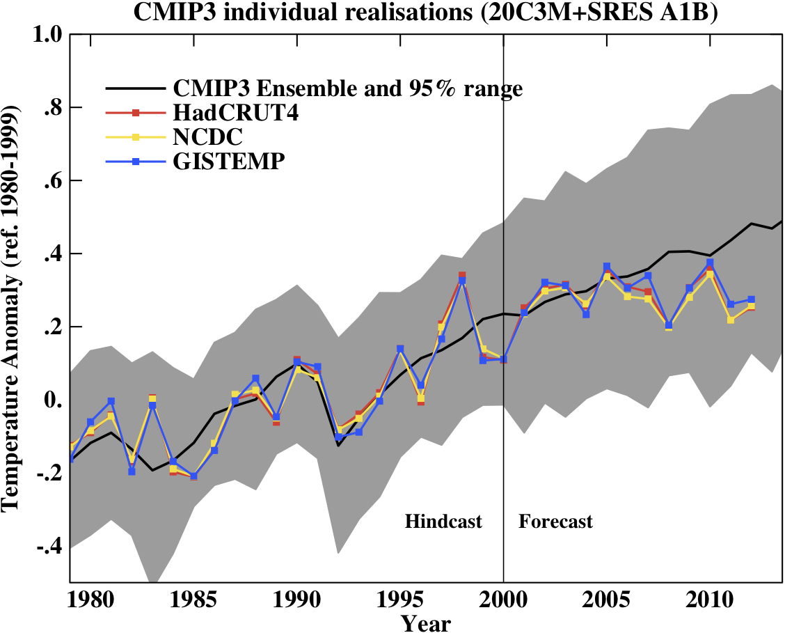
The graph of temperatures versus predictions that is the source of all this misleading woe. Image credit: The Mail On Sunday via IPCC/MET Office (and Ed Hawkins)
The graph shows the temperature anomaly—the difference in temperature from an average temperature—compared to predictions of surface air temperatures made by climate scientists. The graph is actually real; Rose claims it’s from the UK Met Office and the IPCC reports, though it looks very much like it was taken from climatologist Ed Hawkins’ blog. Either way, Rose starts flinging accusations that are remarkable only by how much they miss their marks.
First, the graph is showing air temperatures. These are not the best representation of global warming, since a huge amount of the extra heat is going into the oceans. So right away, you have to be very careful extrapolating this graph to global heat content overall.
Where's the heat? Click to entropenate. Image credit: Skeptical Science
Also, you have to note what the graph Rose uses is actually showing you, and not what Rose is claiming. The light red band is the temperature prediction with 95% confidence. Confidence levels are a statistical way of measuring how well you can trust the data you see. Something at the 95% level means there’s only a 5% chance the numbers are due to random noise, for example.
Now look again at the graph, and note the measured temperatures are still within that band. Sure, it’s at the low end, but even if the temperatures fell outside the band it doesn’t mean “the world isn’t getting warmer” as Rose so incorrectly claims. It just means the temperatures weren’t quite as high as predicted. They are still within the expected range, though, and still running at a high confidence level.
Not only that, but the 95% confidence level band Rose uses may not the best one for this argument. As the site RealClimate shows, a different set of models has a wider 95% confidence band, meaning the measured temperatures are even farther inside the expected range:
Global surface temperature measurements and predictions over time.
Image credit: RealClimate
What we've seen is that Rose isn't interpreting the graph correctly, and even if he were his claim of global warming having “stopped” is wrong because he’s only looking at surface air temperatures. But his problems go even deeper than that: He’s also only looking at the past few years of data. But you have to be very, very careful when looking at short-period fluctuations! They can fool you, and extrapolating them is very dangerous if you don’t know what you’re doing.
That’s because you expect to see ups and downs from year to year. Looking over the graph makes that pretty obvious. Sometimes you get more downs than ups, sometimes it’s the other way. It’s a bit like throwing a pair of dice: Do it enough times and you’ll get a few snake eyes in a row just by random statistics. But if the dice are off-balance, just a bit, then over time you’ll see there are way more bad throws than you’d expect if the dice were fair.
That’s our current climate. Because human-generated global warming is loading the dice, we see that upward trend over time. You can’t look at one throw of the dice, or even three or four; you need to look at dozens to understand the trend. What Rose is doing is showing you the past three throws and ignoring what was going on in the last 50.
Perhaps even more importantly, Rose is also not accounting for global climate effects due to La Niña. This is the name given to a seasonal cooling of ocean surface temperatures in the Pacific, which affects temperatures and weather across the globe. It provides a cooling trend on average, so temperatures measured in La Niña years will be lower. It’s important to know that while the surface of the oceans cool, the heat from global warming goes into deeper waters, so the temperatures measured in La Niña years are doubly misleading when it comes to warming.
2010 and 2011 were La Niña years, and it even persisted into 2012, longer than usual. That cooled those years’ measurements overall, making it look like warming has slowed—but that’s not true; the underlying trend to higher temperatures certainly still continues. Couple that with the normal unpredictability of short-term trends and you have a denier’s dream graph.
But a dream is all it is. When you do the analysis correctly (like here and here and here) you see what happens when you wake up to reality. Clearly, Rose’s article stating “The Mail on Sunday today presents irrefutable evidence that official predictions of global climate warming have been catastrophically flawed” is just a load of fish-wrapping.
He also says, “The graph confirms there has been no statistically significant increase in the world’s average temperature since January 1997 – as this newspaper first disclosed last year” which again was wrong last year and just as wrong now.
After all this I haven’t even said anything about the text of his article, which pretty much follows the same misleading path. I know a few other climate bloggers will be tackling this, so I’ll leave it to them to debunk, and I’ll update this post with links as they go online.
And while deniers like Rose publish misleading articles in The Mail on Sunday, in the real world temperatures keep going up.
Remember: nine of the ten hottest years on record have been in the past decade, there have been vast declines in Arctic and Antarctic sea ice, a corresponding rise in sea level, glacial retreats, more devastating wildfires, wilder weather, and, of course, an increase in denial in all these things.
The truth is, the planet is warming up and we’re the cause. As I have to state over and again, there is no scientific controversy about this. The only arguing going is manufactured ideologically by people who cannot back up their claims with real science. They rely on smoke and mirrors, and where there’s smoke…well.
Tip o’ the thermometer to real climate scientist Michael Mann, and Dana Nuccitelli from the fantastic Skeptical Science site for their help with this.
http://www.slate.com/blogs/


2 comments:
Pictures won't show :(
What browser are you using? I see them on IE and Chrome.
Post a Comment