When we see records being broken and unprecedented events such as this, the onus is on those who deny any connection to climate change to prove their case. Global warming has fundamentally altered the background conditions that give rise to all weather. In the strictest sense, all weather is now connected to climate change. Kevin Trenberth
HIT THE PAGE DOWN KEY TO SEE THE POSTS
Now at 8,800+ articles. HIT THE PAGE DOWN KEY TO SEE THE POSTS
Observers are calling the record floods a “classic signal of climate change” — and high-resolution models predict another one to two feet of rain by Saturday evening.
Photo: Ines Hegedus-Garcia/Flickr. by Eric Holthaus, Pacific Standard Magazine, August 12, 2016 By mid-morning on Friday, more than a foot of rain had fallen near Kentwood, Louisiana, in just a 12-hour stretch — a downpour with an estimated likelihood of just once every 500 years, and roughly three months’ worth of rainfall during a typical hurricane season. It’s the latest in a string of exceptionally rare rainstorms that are stretching the definition of “extreme” weather. It’s exactly the sort of rainstormthat’s occurring more frequentlyas the planet warms.
In response to the ongoing heavy rains, Louisiana Governor John Bel Edwards declared a statewide state of emergency on Friday, and local governments are distributing sandbags, conducting water rescues, and facilitating evacuations. The New Orleans Times-Picayune is maintaining a live blog of the latest developments. The Tickfaw River north of New Orleans soared 18 feet in about 12 hours to a new record crest on Friday morning, beating the water level of April 1983, and 5 feet higher than the high-water mark during Hurricane Isaac in 2012, the last hurricane to make landfall in Louisiana.
Meanwhile, a lot more rain is still on the way. High-resolution weather models predict an additional one or two feet of rain by Saturday evening, a total the local National Weather Service referred to as “scarily high.” The NWS has issued its highest alert for excessive rain and warned of “significant to catastrophic flash flooding.” A “flash flood emergency” is in effect for the hardest-hit regions, a warning reserved only for the direst and most life-threatening events.
An instant analysis from Climate Nexus refers to today’s Louisiana rainstorm as a “classic signal of climate change.” It’s right.
Obviously, this is no ordinary storm. Though the overall structure of this meteorological event does not meet the technical requirements for a tropical storm or hurricane (it’s attached to a stalled weather front, for example), the NWS is treating it roughly the same way, and the physics of the rain clouds themselves are similar. (Tropical rain clouds are generally more efficient at converting cloud moisture into raindrops.)
This storm’s tropical nature, in combination with record-warm water temperatures just offshore in the Gulf of Mexico, are creating a nearly perfect environment for extremely heavy rain and record flooding in one of the wettest places in the country. As the atmosphere warms thanks to greenhouse gas emissions, it can hold more water vapor — and this effect makes it exponentially more likely that extreme rainfall events will occur. The weather balloon released on Friday morning from the New Orleans office of the NWS measured near all-time record levels of atmospheric moisture, higher than some measurements taken during past hurricanes. The NWS meteorologist who reported this morning’s reading remarked simply, “obviously we are in record territory.”
An instant analysis from Climate Nexus refers to today’s Louisiana rainstorm as a “classic signal of climate change.” It’s right. The NWS maintains a statistical database used to calculate the “annual exceedance probability” of a given rainfall event — basically, the expected frequency this event would occur in any given year.
Today’s rainstorm in Louisiana is at least the eighth 500-year rainfall event across America in little more than a year, including similarly extreme downpours in Oklahoma last May, central Texas (twice: last May and last October), South Carolina last October, northern Louisiana this March, West Virginia in June, and Maryland last month.
And these were just the events that the agency decided to write a report on. One notable exception to this list is the Tax Day Flood in the Houston metropolitan area this April, at least the fourth major flood in that region in a span of a year. The local flood control district extrapolated the 23.5 inches of rain over 14.5 hours in Pattison, Texas, during the Tax Day Storm to be a one-in-10,000-year event.
Statistical calculations like these make a major assumption: That the climate of the past is the same as the climate of today. That’s no longer a very good assumption.
A guest article by Florence Fetterer, principal investigator at the National Snow and Ice Data Centre (NSIDC) in the US.
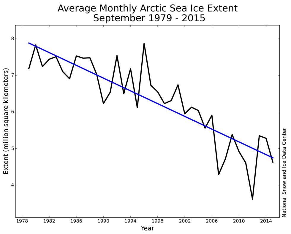
Sea ice cover in the Arctic has undergone a widely reported decline in recent decades. The decrease has been greatest during summer, with sea ice extent reducing by around 12% per decade since the satellite record began in 1979.
The main cause of this rapid decline is rising air temperatures. The Arctic is warming twice as quickly as the global average, a phenomenon known as Arctic amplification. Other factors, such as wind patterns and ocean warming, also play a role in the diminishing sea ice.
Average monthly Arctic sea ice extent in September between 1979
and 2015 (at a rate of 13.4% per decade). Credit: NSIDC
Satellites provide a near-continuous record of Arctic sea ice cover, allowing scientists to monitor changes from one day to the next. But because this data spans only the most recent three and a half decades, we need to look elsewhere to gather information on variations over longer periods.
This data is necessary as there are some research questions that can’t be answered with only short-term records, such as:
Has Arctic sea ice cover been this small since the start of the industrial revolution?
Has sea ice ever declined this rapidly in the historical record?
How is sea ice affected by natural fluctuations over multiple decades?
To tackle this problem we set about constructing a record of sea ice going back to 1850. And this meant gathering data from some rather unusual sources.
Digitising data
First, a little background. In the 1970s, the world’s community of sea ice researchers was a small one. Academics were mainly interested in the role sea ice played in regulating the surface energy balance of the Arctic. Sea ice insulates the cold atmosphere from the warmer ocean, reflects sunlight throughout the polar summer, and releases or stores heat through the process of melting or freezing.
At the time, the question of whether variability in Arctic sea ice extent was being affected by the climate was still an open one.
Nevertheless, scientists were still concerned about preserving existing data on sea ice, and gathering more, with the aim of producing an Arctic-wide view of sea ice conditions.
Observations of sea ice came from far and wide, including ship reports, aeroplane surveys, compilations by naval oceanographers, and analyses by national ice services and meteorological offices.
Walsh, along with Prof William Chapman from the University of Illinois, used these various sources to make monthly grids in Arctic and Southern Ocean sea ice concentrations, covering the period 1901–1995. These grids proved to be very popular among researchers – possibly because there were few alternatives.
However, the early years of this record had significant gaps. Almost no ice information was collected during the second world war, for example.
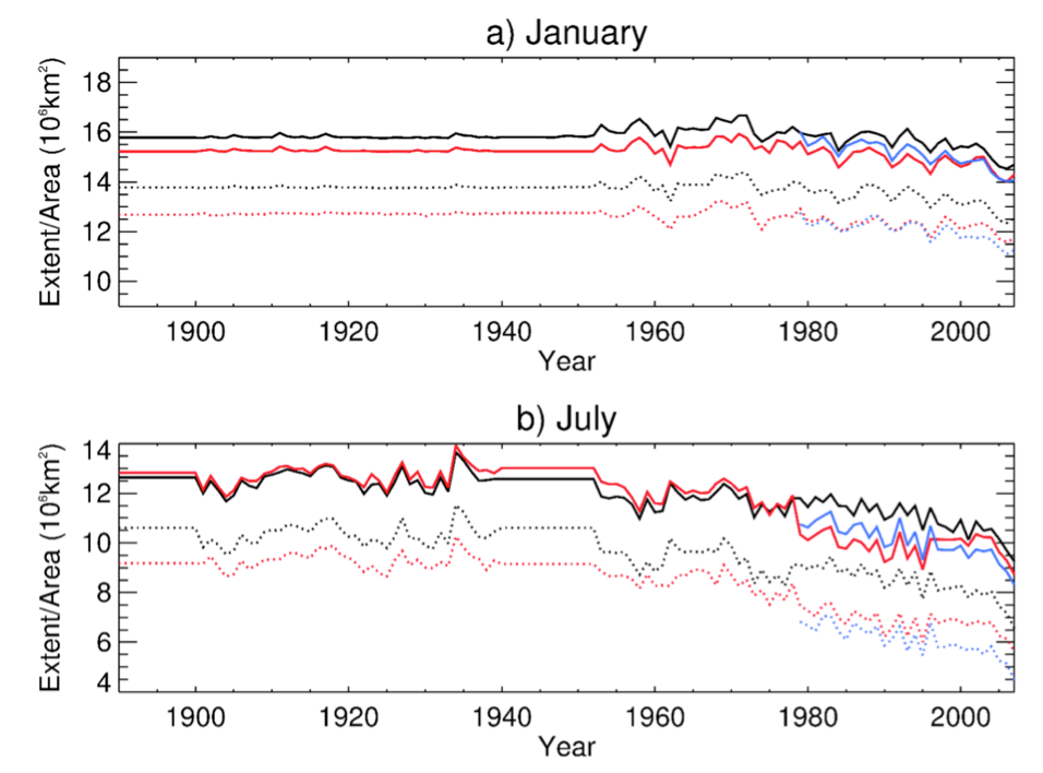
These gaps were filled by using the long-term averages for each month. This is illustrated in the charts below, which show monthly sea ice data from the Met Office Hadley Centre (red and black lines) and the recent NASA satellite record (blue line).
Time series of Northern Hemisphere sea ice extent (solid line) and area
(dotted) for 1890–2007, for the Met Office Hadley Centre datasets HadISST.2.1.0.0 (black), HadISST1.1 (red), and the NASA
Team dataset (blue). Monthly average values are shown for a) January
and b) July. Credit: Holly Titchner, UK Met Office.
While this data provides an indication of long-term sea ice changes, it doesn’t accurately reflect the ups and downs of natural variability. This presents a problem for climate modellers, who need data with realistic past sea ice fluctuations on which to base their projections for the future.
Fortunately, in the decade since those monthly grids were published, more historical data sources have become available.
New sources
We’ve used a range of new data sources to fill gaps and extend the Arctic sea ice record back to 1850. We’ve also updated the record with the latest satellite data.
These are some of the sources of information we used to create our sea ice dataset:
The sea ice edge positions in the North Atlantic, between 1850 and 1978, derived from various sources, including newspapers, ship observations, aircraft observations, diaries and more.
Sea ice concentration data from regular aerial surveys of ice in the eastern Arctic by the Arctic and Antarctic Research Institute, St. Petersburg, Russia, beginning in 1933.
Sea ice edge positions for Newfoundland and the Canadian Maritime Region from observations, for 1870 to 1962.
Detailed charts of ice in the waters around Alaska for 1954 to 1978, originally the property of a consulting firm (the Dehn collection).
Arctic-wide maps of ice cover from the Danish Meteorological Institute from 1901 to 1956.
Whaling ship logbook entries that noted ship position along with an indication of whether the ship was in the presence of ice (see image of whaling ship below).
In the Crow’s Nest, watching for a whale ‘blow.’ “Thar she blows.”
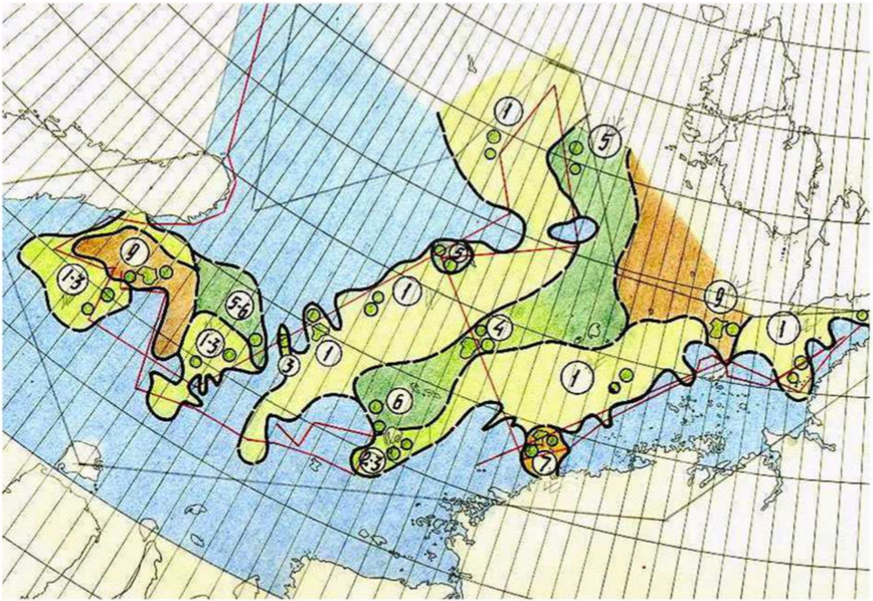
These new sources already existed as data compilations in one form or another before we got hold of them. But many needed digitisation and interpretation before the information could be incorporated into a long-term record. For example, below is one of the aerial survey maps from the Arctic and Antarctic Research Institute in Russia. The different colour shading indicates the coverage of sea ice.
Example of an early (August 1933) sea ice cover map compiled by the
Arctic and Antarctic Research Institute (St. Petersburg, Russia). The
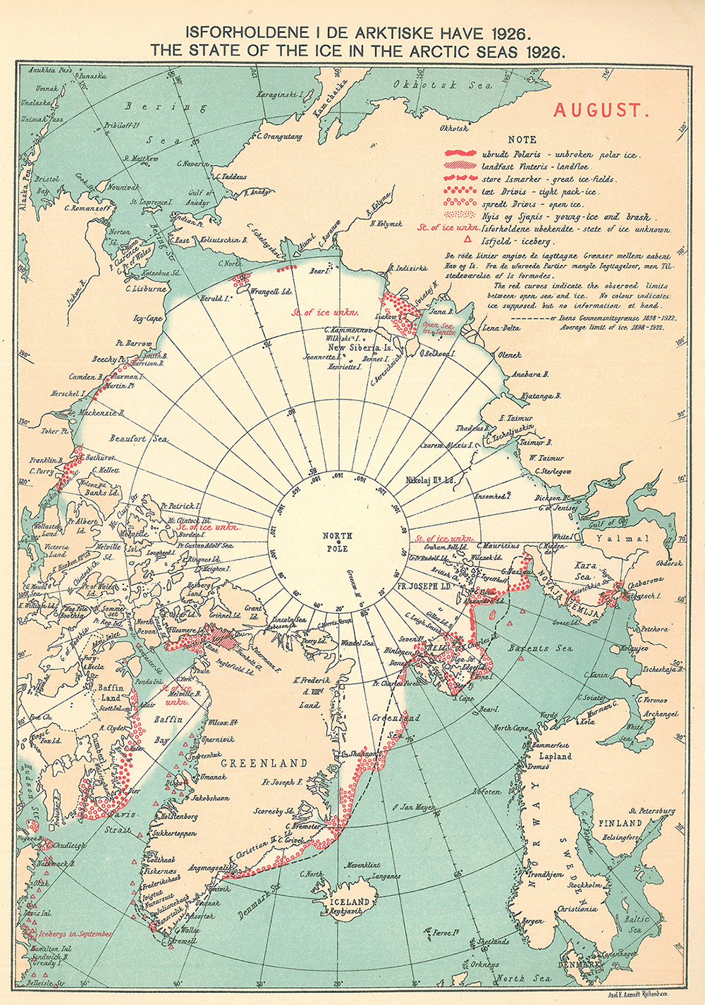
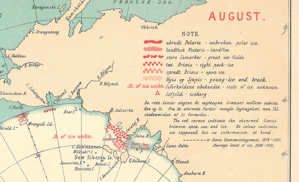
You can see another source of data below, this time one of the maps from the Danish Meteorological Institute. These are remarkable for their information value and because they represent a cooperative international effort to report ice conditions in a systematic way that was sustained over decades. The red symbols and terms in the legend (see close-up below the map) indicate the sea ice extent. “Tight pack-ice,” for example, indicates ice of 70% to 90% concentration of ice over the sea.
A Danish Meteorological Institute ice chart for August, 1926.
The red symbols mark the location of observations recorded in
ship logbooks. Source: Walsh et al. (2016).
Close-up view of the legend for the above sea ice chart. Credit: Walsh et
al. (2016).
The result of all this work is our new dataset, “Gridded Monthly Sea Ice Extent and Concentration, 1850 Onwards.” This has a much more realistic representation of the year-to-year fluctuations in sea ice, as well as the long-term trend.
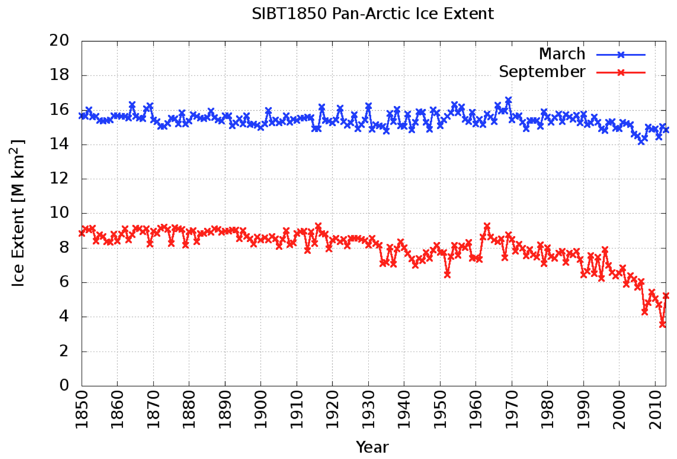
The charts below illustrate the new record. The blue line shows Arctic sea ice extent in March, at the end of the winter when the ice is at its annual maximum. The red line shows sea ice cover in September, at the end of the summer when ice extent shrinks to its yearly minimum.
Time series of Arctic sea ice extent, 1850-2013, for March (blue line)
and September (red line). Credit: Walsh et al. (2016).
Most fundamentally of all, the new dataset allows us to answer the three questions we posed at the beginning of this article.
First, there is no point in the past 150 years where sea ice extent is as small as it has been in recent years. Second, the rate of sea ice retreat in recent years is also unprecedented in the historical record. And, third, the natural fluctuations in sea ice over multiple decades are generally smaller than the year-to-year variability.
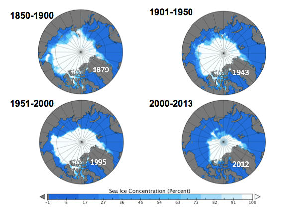
Sea ice cover maps for the annual minimum in September, for the periods 1850-1900, 1901-1950, 1951-2000, and 2001-2013. The maps show the sea ice extent in the lowest minimum during each period, which are in years: 1879, 1943, 1995, and 2012.
This guest article is based on the following journal paper: Walsh, J. E., Fetterer, F., Stewart, J. S. and Chapman, W. L. (2016) A database for depicting Arctic sea ice variations back to 1850. Geographical Review, doi:10.1111/j.1931-0846.2016.12195.x
As many as 150,000 workers from the U.S. coal mining and coal-fired power sectors could be retrained for jobs in the fast-growing solar photovoltaics (PV) industry at a relatively low cost to business and governments, according to new research from public policy and engineering experts.
The analysis, published in the journal Energy Economics by scholars at Michigan Technological University and Oregon State University, is among the first to calculate the labor force impacts of one of the most sweeping U.S. energy-sector transitions of the last century. Its relevance is heightened by recent policy positions staked out by the Republican and Democratic presidential nominees.
Joshua Pearce, an associate professor of materials science and electrical and computer engineering at Michigan Tech, said the findings should offer hope for depressed coal communities as well as quantitative evidence that the U.S. energy sector is more dynamic than many of the doom-and-gloom scenarios offered by the coal lobby.
"People owe it to themselves to ignore the politics and look closely at the facts," Pearce said in an email. "Economics will drive the future electrical supply to be made up of far more solar and far less coal. In short, the future of the U.S. domestic coal industry is not bright."
Among the factors dimming coal's future, Pearce and fellow researcher Edward Louie of Oregon State found, are price competition from alternative energy resources, including natural gas, wind and solar power; steep cost declines in renewable energy technologies; and tightening U.S. and global regulations on emissions from coal-fired plants, including emissions of mercury, sulfur dioxide, and carbon dioxide.
"These factors all contribute to a decline in profitability for continuing to operate coal-fired power plants in both the near and long term," the researchers said.
One of the greatest challenges associated with a declining coal industry is that its workers will need to retrain for new jobs outside of the sector.
"Fortunately, there is one energy industry sector growing at an incredible rate — solar photovoltaic technology that converts sunlight directly into electricity," the researchers state.
15 years for solar to absorb coal industry layoffs
Among the upsides, Pearce and Louie found that solar can be deployed in most regions of the United States, so "the need for relocation would be minimized."
Also, PV technology is becoming increasingly attractive to large utilities and independent power producers, which are investing hundreds of millions of dollars in new utility-scale solar plants. The construction and operation of these plants could employ significant numbers of workers.
The U.S. solar industry employed 209,000 workers in 2015, according to data compiled by the Solar Foundation, and is creating jobs at a rate 12 times greater than employment growth in the overall economy. The Bureau of Labor Statistics, meanwhile, projects the number of solar PV installers to surge by 24% between 2012 and 2022.
"It thus appears possible for the growth of solar PV-related employment to absorb the layoffs in the coal industry in the next 15 years," the researchers conclude.
But critics and independent observers have questioned some of the report's conclusions.
Among other things, they note that solar is not an evenly distributed industry across the United States. Its biggest footprint is in a few states — notably California. For miners in Appalachia, the West Coast is a logistical, cultural and socio-economic stretch that many would consider too great or even unattractive. The same holds true for solar firms pondering expansion plans.
"Solar companies are unlikely to pull up stakes and move their businesses to Appalachia — and, on the flipside, people don't simply migrate en masse to wherever jobs happen to be," Michael Reilly, editor of the MIT Technology Review, wrote yesterday in a response to the study.
Other critiques raise questions about the success of worker retraining programs.
Reilly pointed to a 2008 study by the Labor Department suggesting that worker retraining programs have limited success and another study by the Hamilton Project that found worker training must be highly targeted to workers most likely to benefit — namely younger, more educated and more mobile people.
In an email, Pearce addressed such critiques by acknowledging that those with highly specialized coal-mining jobs would have the most difficulty in transitioning to the solar sector and that such workers would "need to invest in significant retraining to match their salaries" in the solar sector.
But, he added, this group "is a relative minority."
As for issues of geography and culture, Pearce argued that "solar technology works everywhere and any state with a high concentration of coal workers can easily 'open up' the solar market by making relatively modest policy changes."
He also said, more pointedly, "Unlike some viewpoints I have read in the media, I don't think that coal workers are too stupid to do anything else. I have read interviews with coal workers themselves that indicate they would be happy to transition if they had the training."
Appalachia faces highest worker-transition costs
Yet for a coal-to-solar sector transition to occur smoothly and with minimal economic hardship, early- and mid-career workers in the coal mining and coal-fired power sectors should begin preparing themselves for the shift, including through education, training, and skill acquisition, the researchers said.
As part of the research, the authors used industry-created metrics to determine "the amount of training needed to equip each coal worker for success in the closest matching PV job," based on the level of education and training required for the new job. Researchers also estimated the variable costs associated with the transition — including education, training, certification, licensing, and salary requirements of workers transitioning to solar jobs from coal-producing states.
While the costs varied by region and state, the analysis found the highest worker transition costs in Appalachia, led by West Virginia and Kentucky, with the lowest transition costs in the Midwest, Plains, and West. Wyoming, the nation's No. 1 coal-producing state, saw retraining costs ranging from $14 million, under a best-case scenario, to $146 million, under a worst-case scenario. By comparison, West Virginia's estimated coal worker retraining costs ranged from $46 million to $475 million.
The state and regional differences are due in part to the number of coal-sector workers employed in each state. For example, West Virginia's estimated coal-mining labor force is more than 22,000 workers, while Wyoming claims just over 7,000 workers. The scenarios also factor in whether retraining costs are absorbed by industry, government, or the workers themselves, and the length of time required to train for a new position in the solar sector. Researchers calculated that some solar jobs could be acquired with just a few months of training, while others could require as much as nine years.
On per-worker basis, costs ranged from a few thousand dollars to more than $100,000, the researchers calculated, depending upon a coal-sector employee's existing skills and what would be needed to acquire a similar or higher-level job in the PV industry. "Thus, the cost of retraining is not trivial for some of the individual coal employees and could be financially burdensome for an individual to pursue themselves," the researchers said.
Yet, even if the federal government paid the full cost of coal worker retraining — ranging from $180 million to $1.87 billion — the spending would account for just 0.0052% to 0.0543% of the U.S. federal budget, according to the researchers.
As it stands, President Obama has committed in his 2017 budget proposal $75 million to retrain coal workers and promote economic diversification in communities hit hard by regulations such as the Clean Power Plan.
Democratic presidential candidate Hillary Clinton, meanwhile, has pledged to spend $30 billion to bolster coal communities and "ensure that to ensure that coal miners and their families get the benefits they've earned and respect they deserve," according to a briefing paper on her campaign website.
Donald Trump, her Republican rival, has promised to aid coal communities by rolling back much of the Obama administration's energy agenda, including the Clean Power Plan and other regulations targeting coal mining and coal-fired power (ClimateWire, Aug. 11, 2016).






 Posts
Posts