On another forum entirely, discussion arose of Jim Hansen’s 1988 computer model simulation and its prediction for future temperature change. Talk centered around a graph from this post by the GWPF (Global Warming Policy Foundation):

Hansen estimated future temperature based on three scenarios of possible greenhouse gas emissions, high emissions (scenario A), medium (scenario B), and low (scenario C). The GWPF states that
“… not only has the world matched the ‘BAU’ growth of the 15 years prior to the 1988 testimony, we have increased the CO2 emission tonnes growth from 1.8% per year to 2.2% (the 15 years prior to 2013). To put those numbers into context, from 1972 through 1987, humans emitted 302 billion tonnes of CO2; in contrast, from 1998 through 2012 humans produced 461 billion tonnes.”
Therefore, they suggest, temperature should have increased at least as fast as the fastest simulation. But it hasn’t. On that basis, one person concluded
“It seems that if CO2 was the culprit, then the temperature would have done what he predicted.”
I’m quite sure that’s exactly what the GWPF wants him to believe.
At the outset, it seems ridiculous to suggest that “Empirical evidence confirms failed performance of global climate models” based on one run each of three scenarios from 25 years ago. But that’s hardly the biggest problem with the GWPF presentation.
The biggest problem is that the GWPF has presented the ultimate simpleton’s viewpoint of the situation. They imply that temperature had to come closest to Hansen’s scenario A because CO2 increase has most closely matched Hansen’s scenario A. But global temperature is affected by a lot more than just CO2, it is affected by the entirety of climate forcing. CO2 is only one of many.
Here are the net climate forcings according to the 2005 IPCC report:

Notice that even among man-made greenhouse gases, CO2 isn’t the only forcing. There’s also methane (CH4), NO2, and a variety of halocarbons. Then there are the aerosols, which have a cooling effect on climate.
How do their changes compare to the forcing used in Hansen’s 1988 predictions? Here’s a comparison of the methane concentration (the 2nd-most-important man-made greenhouse gas) used in those models, to observed methane concentration since 1983 (measured at the Mauna Loa atmospheric observatory):

It turns out that methane has increased more slowly than the slowest of the scenarios. If we do like the GWPF did and account for only one climate forcing, but use methane instead of CO2, then temperature should have increased less than the slowest of the scenarios. The GWPF certainly didn’t mention that. Just my opinion, but I wouldn’t put it past them to neglect mentioning it even if they knew. And I wouldn’t be at all surprised if they didn’t even know.
Let’s not play the one-climate-forcing-only game. Let’s look at data for all climate forcings, and compare what was used in Hansen’s scenarios to best estimates of what has actually happened since the prediction began. This was done 7 years ago on RealClimate, but we’ve learned more about climate forcing since then (and we have more data), so let’s update that comparison.
As in the RealClimate post, I’ll leave out volcanic forcing because it’s short-lived, and the prediction can’t be expected to forecast volcanic eruptions anyway. Here’s the climate forcing used in the three scenarios compared to actual climate forcing since the prediction began:
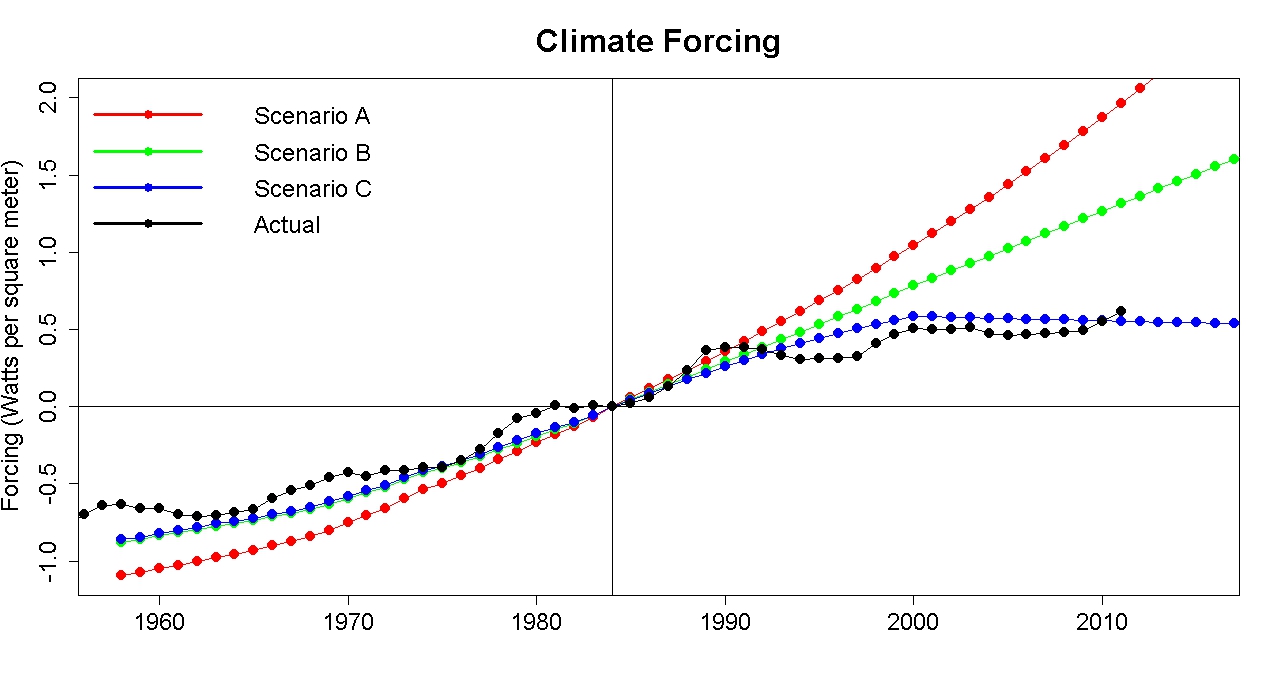
Notice that I aligned the forcing estimates at 1984, because that’s when the prediction began. The paper was published in 1988, but the models had to be run (which took a lot longer in those days) before that, the paper had to be written, and reviewed, then published. The actual prediction started in 1984.
Notice also that actual forcing follows scenario C more closely than the other scenarios. On that basis, we should expect observed temperature change to match scenario C more closely than the other scenarios. And it does.
In fact, the match of observed temperature to Hansen’s scenario is C quite good. Damn good. So good, that I suspect the match isn’t entirely due to the excellence of the model, in part it was coincidence. Regardless of that, to claim on the basis of these 25-year-old model runs that “Empirical evidence confirms failed performance of global climate models” is downright ludicrous. Really. Ludicrous.
Think about how much work I had to do to track down the data and produce this analysis. And I’ve been analyzing climate data for years! Now think about the guy in the discussion who is new to the climate issue. How easy would it be for him to ferret out the truth about this? Fortunately, he seems to have an open mind and to want to know the truth regardless of political considerations. But given the complexity of the situation, given the tremendous amount of information which the GWPF failed to mention (and maybe doesn’t even know), what chance does he have to get at the truth in this situation? The only thing that’s “easy” about this is how ridiculously easy it was for the GWPF to give the wrong impression.
But the ridiculously simplistic viewpoint about climate forcing isn’t the only problem with the GWPF presentation. Notice that at the top of their graph they state “The NASA/GISS 2012 “correction” revisions of +0.05° per year average increase adjusted for.” That’s their way of saying (with appropriate “scare quotes”) that they’ve subtracted 0.05° from the temperature data according to NASA/GISS. They changed the data to make observed temperature seem lower. That sounds like cheating to me.
Look also at the line stating “HadCRUT3 Observed Annual Temperature Anomaly – prior to 2010, every 5 years.” Does that make you wonder why they chose to plot it only for every 5 years?
Let’s compare the temperature data from NASA GISS to that from HadCRUT3 using all the years from 1880 through 2013:

Notice a difference? The HadCRUT3 data are consistently lower than the NASA GISS data. That’s because the two organizations use a different baseline — NASA data are the temperature difference from the 1951-1980 average while HadCRUT3 data are the temperature difference from the 1961-1990 average. Comparing the two, without compensating for the different baseline, is like comparing an infant’s height above the ground (which is a positive number), to my height above Shaquille O’Neil (which is negative because he’s taller than I am). Properly to compare our heights, you’d have to use the same baseline. Properly to compare NASA GISS and HadCRUT3 temperatures, you’d have to use the same baseline. The GWPF didn’t.
I find it very hard to believe that they didn’t know about this. If they truly didn’t, then they’re so ignorant about temperature data they have no business discussing the issue at all. If they did know, but failed to compensate or even to mention it because that makes the HadCRUT3 data look even lower, then … draw your own conclusion. I can’t be sure, but it certainly seems to me that this difference is the reason they only plotted HadCRUT3 data “every 5 years” before 2010.
If you’ve already imagined how hard it would be for an honest, but inexperienced, investigator of climate science to get at the truth about Hansen’s 1988 predictions, now imagine how much harder it is when data are plotted in misleading fashion.
Computer models of global climate are far from perfect. But they remain our best tool to predict future climate change. Even so, they are not the basis for concluding that climate change is really happening, that it’s mainly because of us, and that it’s dangerous. Very dangerous. Those conclusions are based on observation of past climate changes (including way back to the glacial cycles over the last million years and more), and those pesky little laws of physics.
But the fact remains that far too many people, and organizations, who really don’t have the knowledge to know what they’re talking about, bombard us with misleading claims. That’s one of the main reasons our society remains paralyzed, doing next to nothing to address what is really the defining issue of this century.
In the meantime, I advise everyone who hears anything at all from the GWPF to be skeptical. Be very skeptical.


No comments:
Post a Comment