When we see records being broken and unprecedented events such as this, the onus is on those who deny any connection to climate change to prove their case. Global warming has fundamentally altered the background conditions that give rise to all weather. In the strictest sense, all weather is now connected to climate change. Kevin Trenberth
HIT THE PAGE DOWN KEY TO SEE THE POSTS
Now at 8,800+ articles. HIT THE PAGE DOWN KEY TO SEE THE POSTS
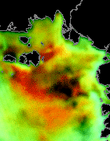
Methane belches (?) from Laptev Sea, January 1 through January 21, 2012
Dear Readers,
UPDATE OF JAN. 25: please see my collection of images that cover the entire Arctic at http://crocodoc.com/5UOfu7A
UPDATE: please see the comments below the post. That will save me writing this stuff again. Thanks!
These false-color images are from a site maintained by the Danish Technical University (DTU). Images are updated daily. I'm not sure, but I think they are taken with microwave sensors aboard a satellite. The false colors are meant to show ice type, as I understand it.
I am sorry, but I have no scale to go with the colors. My interpretation is that the black blobs are below the ice and the orange is above the ice.
The dark blobs do not represent open sea. There is ice cover there.
There are much larger occurrences over toward the Bering Strait, but I have not had time to crop them, yet.
The main action seemed to really kick up in mid-November 2011.
UPDATE: I'm adding this drawing from 2010. Click on it to enlarge it. Note that there are at least two measures that are out of date. We know from Shakhova that the sediment cores they took from the sea floor were below 0 centigrade, but the sediments had melted anyway. Further, the temperature of the sea water is higher now.
more likely the images are of atmospheric water/ice droplets, but not sure. Anyway no reason to put other kinds of images w/ what is clearly a composite) of sea ice.
What the heart does not want to know, the eyes will not see.
How can the black blobs be ice droplets when there are enormous storms over that entire area for the past month or two? You're talking about an area of hundreds of miles.
I have a file of images going back to December 1, 2011, in ppt or pptx format. It is about 8 megabytes.
The file is of images that show the entire Arctic.
There are at least 4 regions where this type of activity is going on.
It is consistent with the idea that as gas escapes from the sea floor, water rushes in and melts more, releasing more gas, etc. This is the postulated "unzipping" of the sea floor's subsea permafrost.
like i said, i'm not sure. here's though an instrument (japanese) onboard ESA satellite that has a channel for methane, I guess the 400 mb level methane images you posted recently were from this? I don't know how to access the data.
I am not saying the satellite is trying to detect methane.
The false colors, as I understand it, were to show the different ice types.
This orange stuff is a newer phenomenon. It is not ice. It could be some type of precipitation, but it only occurs when the black blobs grow. The blobs are stationary. After the occurrence of the orange, the blobs dim. Then they grow bigger, and more orange occurs.
This all happens over a period of only 2 or 3 days!
I maintain that it is consistent with melting subsea permafrost emitting gas, leaving a new hole in the seafloor that permits warm water to flow in and melt more, then another emission, and so on and so forth.
The long sequence of AIRS plots of methane concentration confirms that a highly variable seasonal release is occuring across the arctic ocean, which has been increasing overall since 2002.
The continued lack of higher CH4 amounts shown over the Greenland ice cap implies that there is little smearing by winds of the released CH4 -i.e. the plots show where the releases are occurring.
Two aspects puzzle me. First, there is no sign of the relatively high CH4 concentrations in the tropics, which the 'CO2-is-The-Problem' crew propose greatly outwieghs the significance of arctic CH4 outputs. Can anyone explain this anomally ?
Second, there seems a strange focus of CH4 outputs on the pole, to the extent that some plots show distinct concentric arcs of higher or lower outputs. If this is not my imagination, I'd be interested to learn how CH4 emissions might relate to the planet's rotation.
I don't have much expertise, but I would imagine that, at the North Pole, the Arctic Oscillation would have more to do with how the CH4 gets around, and I think the jet stream is also related to the rotation, and I imagine that the polar jet stream has a large effect, but I have no means of knowing this.
wait, wait, -- these are images of what? From where? Somewhere among these? http://www.dtu.dk/english/service/searchresult.aspx?q=sea%20ice They're not related to methane, from anything I can find.
What do the people providing the images say on the page where you found the images? Have you asked them?
I did not say they were related to methane. I wish people would carefully read what I write. I said that the false colors were meant to represent types of sea ice. I have not been able to get a scale from the DTU, although I have twice requested one.
IMO, the sequence is consistent with what would occur if the subsea permafrost melted, emitted gas, let sea water flow in the gap, melting more permafrost, emitting more gas.
From observing other images on the same site that are also from microwave sensors, it is my impression, after having looked at the images nearly every day for over 3 years, that the images display information that cannot be seen at the visual wavelength level.
It is my opinion(!) that the black blobs are under the sea ice and the orange is above it.
The way the black spots grow darker, then orange appears, then the spots grow dimmer and the orange dissipates, then the process repeats, is consistent with the "unzipping" mechanism suggested by the MIT modelers in 2009. They actually said the ruptures looked like "cornflakes" in their model.
Note that this region of the Arctic Sea is covered with ice. Other images show this.
Hank send me an email at apaixonada.por.rio@gmail.com and I will send you the PowerPoint file with images of the entire Arctic, from Dec. 1 through Jan. 21.
You will hardly fail to see what I am talking about if you see the slide show.
Hank, I have the JGR article if you want to read it.
A. K. Jain and R. Juanes. Preferential mode of gas invasion in sediments: grain-scale mechanistic model of coupled multiphase fluid flow and sediment mechanics. Journal of Geophysical Research, 114, B08101 (2009).
I have not been able to get a scale from the DTU, although I have twice requested one.
It's not hard to work out. The black blob is about the same size as the largest of the islands in the archipelago at top left (the New Siberian Islands, as I pointed out once before). This corresponds to a region of ~10,000 km^2: i.e. the blob is of the order of 100 km across.
Seafloor dynamics (bubbling, water rushing in to fill voids) on that scale would cause a megatsunami in the Arctic ocean!
As you say, that picture does not show methane, but relates to surface characteristics of the ice (roughness etc), which is a way of discriminating old (rough/ridged) ice from newer ice. Note that the area of multiyear ice up against the north Canadian coast is all black.
It seems plausible therefore that the black blobs represent areas of ice ridging, such as might result from a storm. As for why they fade... snowfall smoothing out the roughness, or some such?
There seems absolutely no reason to suspect this has anything to do with methane.
Tenney - back in the late '90s the UK Independent paper showed a satellite photo of part of the coast of Alaska, with a large methane plume about 30 miles offshore.
The latter was slightly curved and grew to about six times its length as far as I remember, as was very distinct against the dark sea.
There was no discussion of the methane source, though no corporation admitted responsibility for it.
All of which leaves me wondering just what is available in the archives of satellite images of the Laptev Sea ? And just why Semiletov and other dedicated scientists don't appear to derive overview data on emissions from this source ?


19 comments:
more likely the images are of atmospheric water/ice droplets, but not sure. Anyway no reason to put other kinds of images w/ what is clearly a composite) of sea ice.
http://en.wikipedia.org/wiki/Advanced_Microwave_Sounding_Unit
http://en.wikipedia.org/wiki/Microwave_humidity_sounder
I guess the monitoring network for methane would be in order, though. the satellite that blew a couple of years back might have been a good one.
What the heart does not want to know, the eyes will not see.
How can the black blobs be ice droplets when there are enormous storms over that entire area for the past month or two? You're talking about an area of hundreds of miles.
I have a file of images going back to December 1, 2011, in ppt or pptx format. It is about 8 megabytes.
If you want a copy, contact me at:
apaixonada.por.rio@gmail.com
The file is of images that show the entire Arctic.
There are at least 4 regions where this type of activity is going on.
It is consistent with the idea that as gas escapes from the sea floor, water rushes in and melts more, releasing more gas, etc. This is the postulated "unzipping" of the sea floor's subsea permafrost.
like i said, i'm not sure. here's though an instrument (japanese) onboard ESA satellite that has a channel for methane, I guess the 400 mb level methane images you posted recently were from this? I don't know how to access the data.
http://earth.esa.int/object/index.cfm?fobjectid=7440
Black blogs dim and grow and dim and grow. Orange moves away.
The situation in the Arctic has been pretty stormy for a while -- have a look here:
http://synoptic.envsci.rutgers.edu/site/sat/sat.php?sat=nhem&url=../imgs/wv_nhem_anim.gif
and here:
http://www.weatheroffice.gc.ca/data/satellite/hrpt_dfo_ir_100.jpg
sorry a japanese satellite
Sorry, let me be a little bit clearer.
I am not saying the satellite is trying to detect methane.
The false colors, as I understand it, were to show the different ice types.
This orange stuff is a newer phenomenon. It is not ice. It could be some type of precipitation, but it only occurs when the black blobs grow. The blobs are stationary. After the occurrence of the orange, the blobs dim. Then they grow bigger, and more orange occurs.
This all happens over a period of only 2 or 3 days!
I maintain that it is consistent with melting subsea permafrost emitting gas, leaving a new hole in the seafloor that permits warm water to flow in and melt more, then another emission, and so on and so forth.
OK, could be associated.
The long sequence of AIRS plots of methane concentration confirms that a highly variable seasonal release is occuring across the arctic ocean, which has been increasing overall since 2002.
The continued lack of higher CH4 amounts shown over the Greenland ice cap implies that there is little smearing by winds of the released CH4 -i.e. the plots show where the releases are occurring.
Two aspects puzzle me. First, there is no sign of the relatively high CH4 concentrations in the tropics, which the 'CO2-is-The-Problem' crew propose greatly outwieghs the significance of arctic CH4 outputs.
Can anyone explain this anomally ?
Second, there seems a strange focus of CH4 outputs on the pole, to the extent that some plots show distinct concentric arcs of higher or lower outputs. If this is not my imagination, I'd be interested to learn how CH4 emissions might relate to the planet's rotation.
Regards,
Lewis
Hi Lewis, thank you for your comment.
I don't have much expertise, but I would imagine that, at the North Pole, the Arctic Oscillation would have more to do with how the CH4 gets around, and I think the jet stream is also related to the rotation, and I imagine that the polar jet stream has a large effect, but I have no means of knowing this.
wait, wait, -- these are images of what? From where? Somewhere among these?
http://www.dtu.dk/english/service/searchresult.aspx?q=sea%20ice
They're not related to methane, from anything I can find.
What do the people providing the images say on the page where you found the images? Have you asked them?
Dear Hank,
I did not say they were related to methane. I wish people would carefully read what I write. I said that the false colors were meant to represent types of sea ice. I have not been able to get a scale from the DTU, although I have twice requested one.
IMO, the sequence is consistent with what would occur if the subsea permafrost melted, emitted gas, let sea water flow in the gap, melting more permafrost, emitting more gas.
From observing other images on the same site that are also from microwave sensors, it is my impression, after having looked at the images nearly every day for over 3 years, that the images display information that cannot be seen at the visual wavelength level.
It is my opinion(!) that the black blobs are under the sea ice and the orange is above it.
The way the black spots grow darker, then orange appears, then the spots grow dimmer and the orange dissipates, then the process repeats, is consistent with the "unzipping" mechanism suggested by the MIT modelers in 2009. They actually said the ruptures looked like "cornflakes" in their model.
Note that this region of the Arctic Sea is covered with ice. Other images show this.
Hank send me an email at apaixonada.por.rio@gmail.com
and I will send you the PowerPoint file with images of the entire Arctic, from Dec. 1 through Jan. 21.
You will hardly fail to see what I am talking about if you see the slide show.
It is about 8 megabytes in length.
Hank, I have the JGR article if you want to read it.
A. K. Jain and R. Juanes. Preferential mode of gas invasion in sediments: grain-scale mechanistic model of coupled multiphase fluid flow and sediment mechanics. Journal of Geophysical Research, 114, B08101 (2009).
Ok, I have the cornflake thing completely wrong because the authors are talking about a subvertical fracture in the paper.
I have not been able to get a scale from the DTU, although I have twice requested one.
It's not hard to work out. The black blob is about the same size as the largest of the islands in the archipelago at top left (the New Siberian Islands, as I pointed out once before). This corresponds to a region of ~10,000 km^2: i.e. the blob is of the order of 100 km across.
Seafloor dynamics (bubbling, water rushing in to fill voids) on that scale would cause a megatsunami in the Arctic ocean!
As you say, that picture does not show methane, but relates to surface characteristics of the ice (roughness etc), which is a way of discriminating old (rough/ridged) ice from newer ice. Note that the area of multiyear ice up against the north Canadian coast is all black.
It seems plausible therefore that the black blobs represent areas of ice ridging, such as might result from a storm. As for why they fade... snowfall smoothing out the roughness, or some such?
There seems absolutely no reason to suspect this has anything to do with methane.
As you wish.
Tenney - back in the late '90s the UK Independent paper showed a satellite photo of part of the coast of Alaska, with a large methane plume about 30 miles offshore.
The latter was slightly curved and grew to about six times its length as far as I remember, as was very distinct against the dark sea.
There was no discussion of the methane source, though no corporation admitted responsibility for it.
All of which leaves me wondering just what is available in the archives of satellite images of the Laptev Sea ? And just why Semiletov and other dedicated scientists don't appear to derive overview data on emissions from this source ?
Regards,
Lewis
Hi Lewis, thank you for your comment.
I'll hazard a guess that the data available is pretty sparse and not over much of a time span or of a geographic area.
Post a Comment