Greenland meltdown
After a record-breaking 2010 in terms of surface melt area in Greenland (Tedesco et al., 2011), numbers from 2011 have been eagerly awaited. Marco Tedseco and his group have now just reported their results. This is unrelated to other Greenland meltdown this week that occurred at the launch of the new Times Atlas.
 The melt index anomaly is the number of days with detectable surface melt compared to the baseline period of 1979-2010. The higher the number, the more melt days there were. While this did not match the record 2010 levels, depending on the analysis 2011 was either the 3rd or 6th year in the rankings.
 Analysis of the surface mass balance via regional modelling demonstrates that there has been an increasing imbalance between snowfall and runoff over recent years, leading to a lowering of ice elevation, even in the absence of dynamical ice effects (which are also occurring, mostly near the ice sheet edge).

Figure 2. Regional model-based estimates of snowfall (orange), surface melt and runoff (yellow) and the net accumulation (Gt/yr) (blue) since 1958.
The estimated 2010 or 2011 surface mass imbalance (~300 Gt/yr) is comparable to the GRACE estimates of the total mass loss (which includes ice loss via dynamic effects such as the speeding up of outlet glaciers) of 248 ± 43 Gt/yr for the years 2005-2009 (Chen et al., 2011). Data for 2010 and 2011 will thus be interesting to see.
While the accelerating mass loss from Greenland is of course a concern, the large exaggeration of that loss rate by Harper Collins in the press release for the 2011 edition of the Times Atlas was of course completely wrong. The publishers have issued a ‘clarification,’ which doesn’t really clarify much (Update, Sept. 22, 2011: The clarification has been clarified from the original statement.) As discussed on the CRYOLIST listserv, the confusion came most likely from a confusion in definitions of what is the permanent ice sheet, and what are glaciers, with the ‘glaciers’ being either dropped from the Atlas entirely or colored brown (instead of white). (No-one that I have seen has posted the legend from the Atlas that gives the definition of the various shadings, though in the 1994 edition I have, glaciers are (unsurprisingly) white, not brown.)
The Times is still claiming that it stands by its maps (Update: The new clarification no longer makes this claim.) This is quite silly, and presumably reflects the fact that it would be very expensive to reprint all the atlases that may have already been printed. In case this isn’t already clear, there is simply no measure — neither thickness nor areal extent — by which Greenland can be said to have lost 15 % of its ice. As a letter written by a group of scientists from the Scott Polar Research Institute says, “Recent satellite images of Greenland make it clear that there are in fact still numerous glaciers and permanent ice cover where the new Times Atlas shows ice-free conditions and the emergence of new lands.”
The push back from glaciologists on this issue was a good example of how the science community can organize and provide corrections of high-profile misstatements by non-scientists – by connecting directly with journalists, providing easy access to the real data, and tracking down the source of the confusion. In so doing it also provides an opportunity to give the real story – that change in Greenland and the rest of the Arctic is fast and accelerating.
Update: Here is a figure showing the preliminary GRACE results for Greenland for 2010 and the beginning of 2011. The anomaly in 2010 was huge, indicating perhaps a total loss of about 500 Gt/yr:
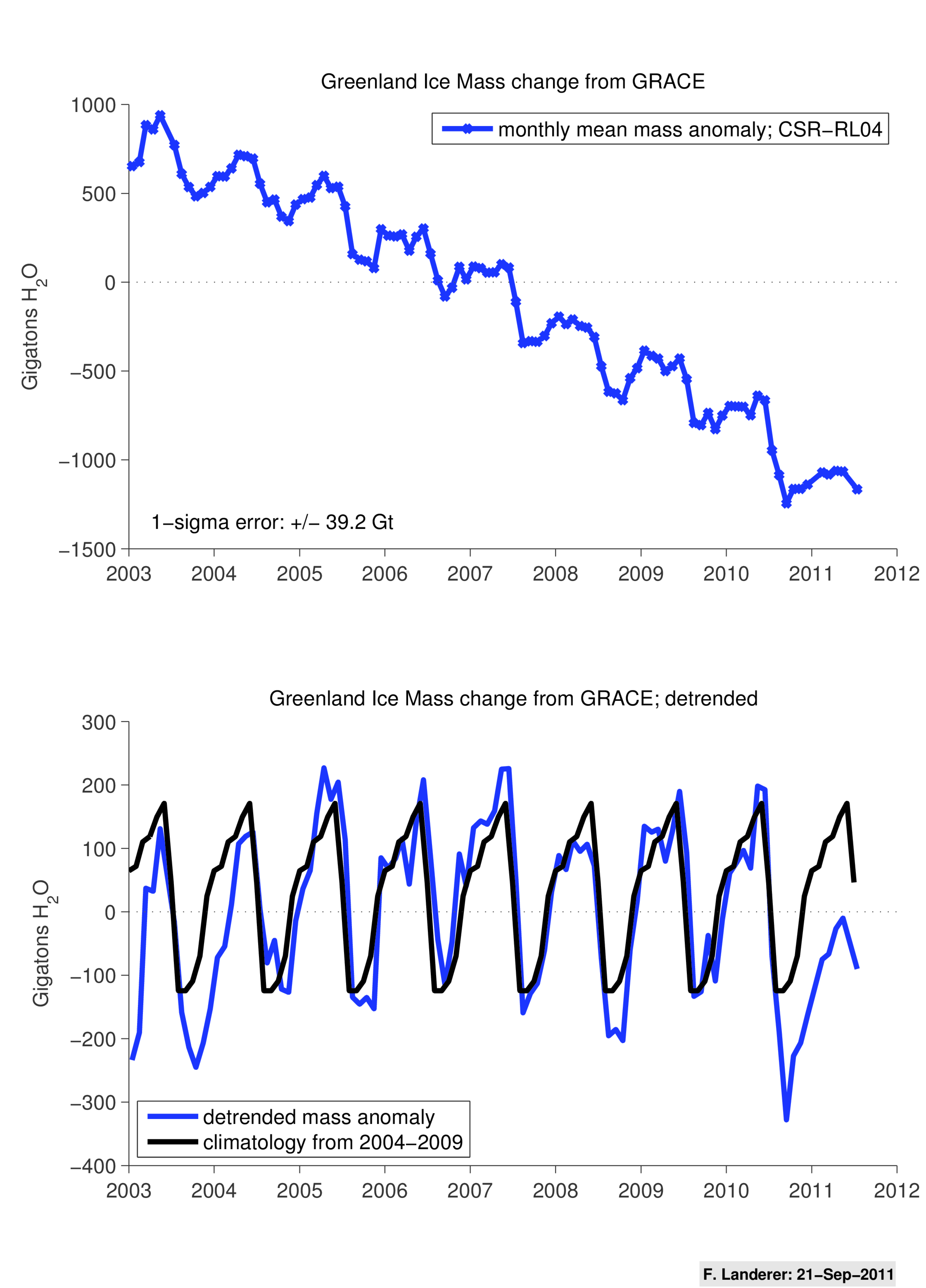
Figure 3. The upper panel shows estimated monthly mass anomalies over Greenland from Jan. 2003 through July 2011 [as in Velicogna (2009)]; the lower panel shows the detrended monthly data (blue), plus a monthly climatology from 2004 through 2009, highlighting the exceptional mass loss in 2010 (~500 Gt-H2O).
Further Update: A more detailed analysis from the Scott Polar Research Institute in the UK demonstrates quite clearly that the Times map is wrong, and inconsistent with all other ice sheets in the Atlas:

Figure 4. The new Times Atlas map (left) together with a mosaic of two satellite images taken in August 2011 (right). Also on the right are contours of ice thickness shown every 500 m. The blue line is the 500-m ice thickness contour which is the same as the outline on the Times Map. The red line is the 0m ice thickness contour which would be a better representation of the ice sheet than the blue line. The Times Map excludes all the ice between the red and blue lines. Furthermore, it excludes all the ice caps and glaciers that are not part of the main ice sheet, visible on the satellite image but not shown on the map. (SPRI).
References
- M. Tedesco, X. Fettweis, M. R. van den Broeke, R. S. W. van de Wal, C. J. P. P. Smeets, W. J. van de Berg, M. C. Serreze, and J. E. Box, "The role of albedo and accumulation in the 2010 melting record in Greenland," Environmental Research Letters, 6 (2011) 014005-; DOI.
- J. L. Chen, C. R. Wilson, and B. D. Tapley, "Interannual variability of Greenland ice losses from satellite gravimetry," Journal of Geophysical Research, 116 (2011); DOI.
- I. Velicogna, "Increasing rates of ice mass loss from the Greenland and Antarctic ice sheets revealed by GRACE," Geophysical Research Letters, 36 (2009); DOI.


No comments:
Post a Comment