You have gone significantly over the line with this post. Accusations of dishonesty are way beyond a difference of opinion on how a graph should be displayed.
If you thought that a single, smoothed graph of estimates of paleo-temperature told the whole story of paleo-climate reconstructions is far more a failing at your end than it is the authors involved. How can a single graph say everything that can possibly be said?
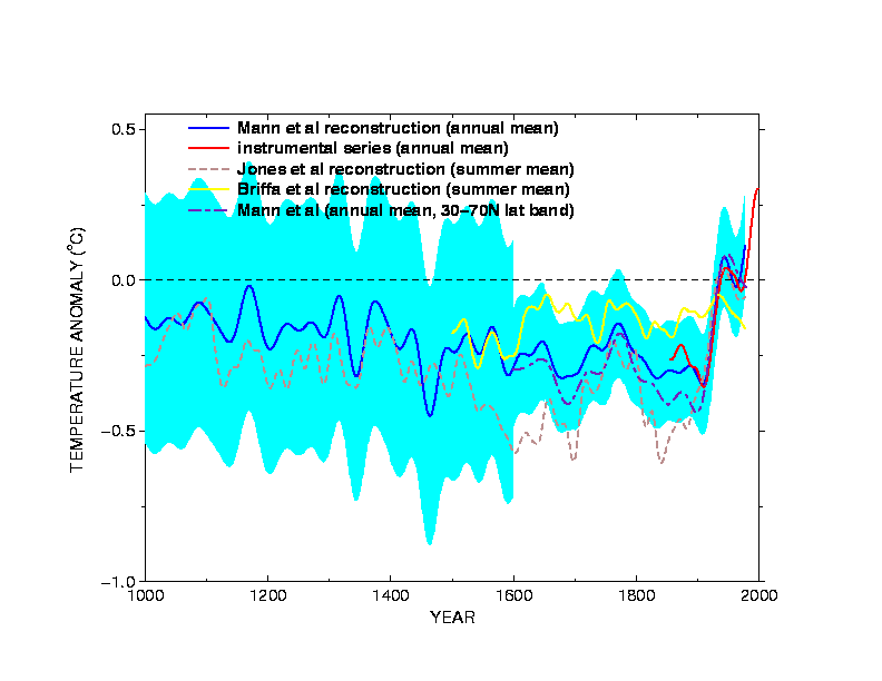
Summary graphs are by their very nature, summaries. The graphs you pick out were summaries of various estimates of what paleo-temperature estimates from the literature were. It is therefore not surprising that they show only the reconstructions where the authors had confidence that the reconstructions were actually of the temperatures.
Problems with modern divergence – which only applies to the Briffa et al curve in any case – are issues to be dealt with in the technical literature, as they still are.
The quote from the emails on the ‘dilution of the message’ was related to a completely different issue – the fact that Briffa et al’s initial reconstruction did not have very much centennial variability at all (the version of the graph that was being discussed is here:http://climateaudit.files.wordpress.com/2009/12/ipcc_tar_zero.png ). You are being misled if you think that is related.
One can have a difference of opinion in how to present a graph, and that depends entirely on what point you want to make. If you want to make a point about multi-decadal temperature changes in the past, it makes sense to include estimates of those temperatures and the uncertainties. It doesn’t make much sense to include annual estimates, or seasonal estimates, or parts of the curve that the originators think doesn’t reflect actual temperatures (for whatever reason). The only issue is to ensure that the graph is sufficiently documented so that these choices are clear (which in the WMO report they were not sufficiently so, but were fine in the IPCC graphs).
But to ascribe a difference of opinion to dishonesty is to remove yourself from any sensible discussion on the topic. Perhaps if I was to find a graph in one of your papers which I thought didn’t show some aspect of the data I was interested in, and then accuse you of dishonesty? Would you react well to that? This is exactly the same.
How can you claim to be building bridges, when you are so busy burning them?
“I’m calling it like I see it”
How brave of you.
How brave of you.
My point is that by lowering yourself to insult, you block off all sensible discussion of specific technical points – if you are so certain in your thinking that no further discussion is required, then fine. No more discussion will occur. But it would have been far better for you to have had the character to allow for disagreements without being disagreeable (did you not pick up anything in Lisbon?).
For a useful analogy, let’s take a different figure, say, figure 4 from Webster et al (2005):
http://www.sciencemag.org/content/309/5742/1844/F4.large.jpg
http://www.sciencemag.org/content/309/5742/1844/F4.large.jpg
This shows a big increase in cat 4+5 hurricanes from 1970 to 2000. But why is it cut off at 1970? Surely it can’t be because the data is poorer prior to that? No, it must be that the pre-1970 data doesn’t support the thesis of the authors, they must be hiding the decline! I insist that the ‘adverse data’ be shown on all graphs, and that anything else is highly misleading. And without any further thought, it must be dishonest – because how is it possible that anyone could have an opinion on how to display data that differs from mine without being dishonest? Pseudo-science!
You see how easy this kind of stupidity is? What is point?

