Updates to model-data comparisons
It’s worth going back every so often to see how projections made back in the day are shaping up. As we get to the end of another year, we can update all of the graphs of annual means with another single datapoint. Statistically this isn’t hugely important, but people seem interested, so why not?
For example, here is an update of the graph showing the annual mean anomalies from the IPCC AR4 models plotted against the surface temperature records from the HadCRUT3v and GISTEMP products (it really doesn’t matter which). Everything has been baselined to 1980-1999 (as in the 2007 IPCC report) and the envelope in grey encloses 95% of the model runs. The 2009 number is the Jan-Nov average.
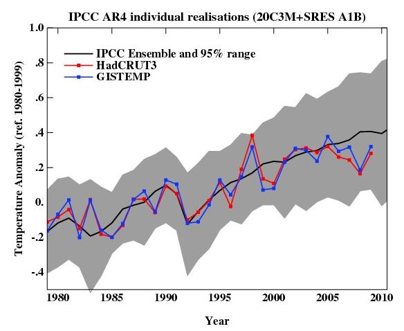
As you can see, now that we have come out of the recent La Niña-induced slump, temperatures are back in the middle of the model estimates. If the current El Niño event continues into the spring, we can expect 2010 to be warmer still. But note, as always, that short term (15 years or less) trends are not usefully predictable as a function of the forcings. It’s worth pointing out as well, that the AR4 model simulations are an ‘ensemble of opportunity’ and vary substantially among themselves with the forcings imposed, the magnitude of the internal variability and of course, the sensitivity. Thus while they do span a large range of possible situations, the average of these simulations is not ‘truth’.
There is a claim doing the rounds that ‘no model’ can explain the recent variations in global mean temperature (George Will made the claim last month for instance). Of course, taken absolutely literally this must be true. No climate model simulation can match the exact timing of the internal variability in the climate years later. But something more is being implied, specifically, that no model produced any realisation of the internal variability that gave short term trends similar to what we’ve seen. And that is simply not true.
We can break it down a little more clearly. The trend in the annual mean HadCRUT3v data from 1998-2009 (assuming the year-to-date is a good estimate of the eventual value) is 0.06+/-0.14 ºC/dec (note this is positive!). If you want a negative (albeit non-significant) trend, then you could pick 2002-2009 in the GISTEMP record which is -0.04+/-0.23 ºC/dec. The range of trends in the model simulations for these two time periods are [-0.08,0.51] and [-0.14, 0.55], and in each case there are multiple model runs that have a lower trend than observed (5 simulations in both cases). Thus ‘a model’ did show a trend consistent with the current ‘pause’. However, that these models showed it, is just coincidence and one shouldn’t assume that these models are better than the others. Had the real world ‘pause’ happened at another time, different models would have had the closest match.
Another figure worth updating is the comparison of the ocean heat content (OHC) changes in the models compared to the latest data from NODC. Unfortunately, I don’t have the post-2003 model output handy, but the comparison between the 3-monthly data (to the end of Sep) and annual data versus the model output is still useful.
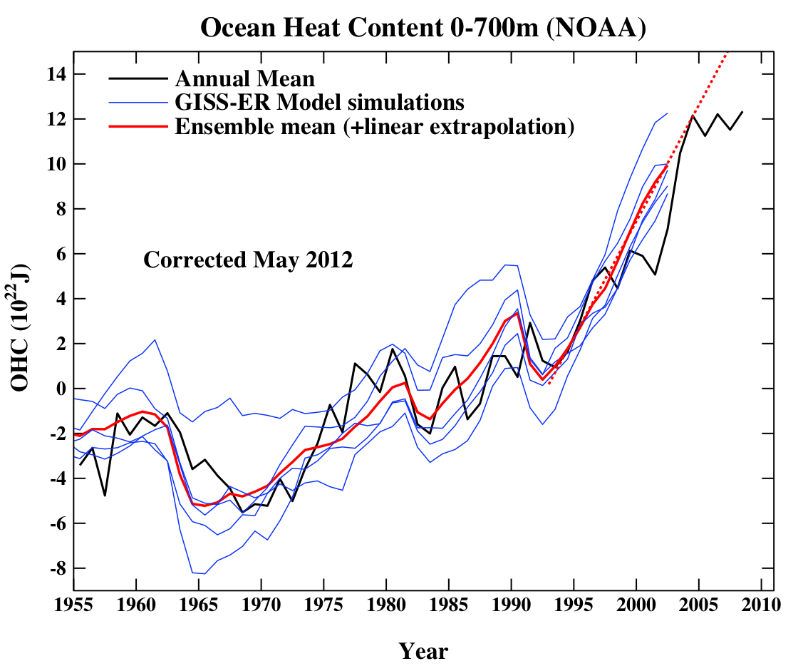
(Note, that I’m not quite sure how this comparison should be baselined. The models are simply the difference from the control, while the observations are ‘as is’ from NOAA.) I have linearly extended the ensemble mean model values for the post 2003 period (using a regression from 1993-2002) to get a rough sense of where those runs could have gone.
And finally, let’s revisit the oldest GCM projection of all, Hansen et al. (1988). The Scenario B in that paper is running a little high compared with the actual forcings growth (by about 10%), and the old GISS model had a climate sensitivity that was a little higher (4.2 ºC for a doubling of CO2) than the current best estimate (~3 ºC).
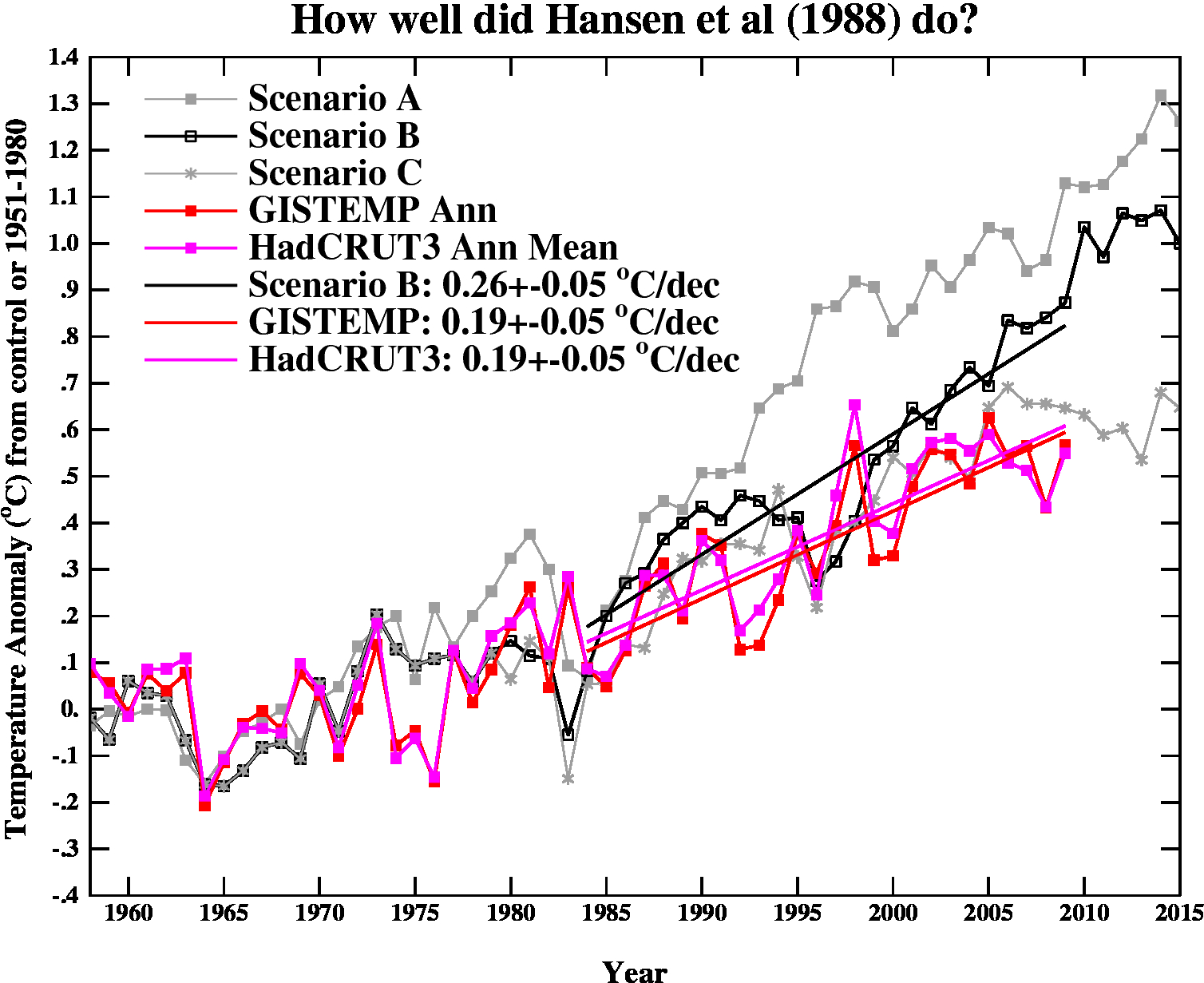
The trends are probably most useful to think about, and for the period 1984 to 2009 (the 1984 date chosen because that is when these projections started), scenario B has a trend of 0.26+/-0.05 ºC/dec (95% uncertainties, no correction for auto-correlation). For the GISTEMP and HadCRUT3 data (assuming that the 2009 estimate is ok), the trends are 0.19+/-0.05 ºC/dec (note that the GISTEMP met-station index has 0.21+/-0.06 ºC/dec). Corrections for auto-correlation would make the uncertainties larger, but as it stands, the difference between the trends is just about significant.
Thus, it seems that the Hansen et al. ‘B’ projection is likely running a little warm compared to the real world, but assuming (a little recklessly) that the 26 yr trend scales linearly with the sensitivity and the forcing, we could use this mismatch to estimate a sensitivity for the real world. That would give us 4.2/(0.26*0.9) * 0.19=~ 3.4 ºC. Of course, the error bars are quite large (I estimate about +/-1 ºC due to uncertainty in the true underlying trends and the true forcings), but it’s interesting to note that the best estimate sensitivity deduced from this projection, is very close to what we think in any case. For reference, the trends in the AR4 models for the same period have a range 0.21+/-0.16 ºC/dec (95%). Note too, that the Hansen et al. projection had very clear skill compared to a null hypothesis of no further warming.
The sharp-eyed among you might notice a couple of differences between the variance in the AR4 models in the first graph, and the Hansen et al model in the last. This is a real feature. The model used in the mid-1980s had a very simple representation of the ocean – it simply allowed the temperatures in the mixed layer to change based on the changing the fluxes at the surface. It did not contain any dynamic ocean variability – no El Niño events, no Atlantic multidecadal variability etc. and thus the variance from year to year was less than one would expect. Models today have dynamic ocean components and more ocean variability of various sorts, and I think that is clearly closer to reality than the 1980s vintage models, but the large variation in simulated variability still implies that there is some way to go.
So to conclude, despite the fact these are relatively crude metrics against which to judge the models, and there is a substantial degree of unforced variability, the matches to observations are still pretty good, and we are getting to the point where a better winnowing of models dependent on their skill may soon be possible. But more on that in the New Year.
Link: http://www.realclimate.org/index.php/archives/2009/12/updates-to-model-data-comparisons/http://www.realclimate.org/index.php/archives/2009/12/updates-to-model-data-comparisons/
For example, here is an update of the graph showing the annual mean anomalies from the IPCC AR4 models plotted against the surface temperature records from the HadCRUT3v and GISTEMP products (it really doesn’t matter which). Everything has been baselined to 1980-1999 (as in the 2007 IPCC report) and the envelope in grey encloses 95% of the model runs. The 2009 number is the Jan-Nov average.

As you can see, now that we have come out of the recent La Niña-induced slump, temperatures are back in the middle of the model estimates. If the current El Niño event continues into the spring, we can expect 2010 to be warmer still. But note, as always, that short term (15 years or less) trends are not usefully predictable as a function of the forcings. It’s worth pointing out as well, that the AR4 model simulations are an ‘ensemble of opportunity’ and vary substantially among themselves with the forcings imposed, the magnitude of the internal variability and of course, the sensitivity. Thus while they do span a large range of possible situations, the average of these simulations is not ‘truth’.
There is a claim doing the rounds that ‘no model’ can explain the recent variations in global mean temperature (George Will made the claim last month for instance). Of course, taken absolutely literally this must be true. No climate model simulation can match the exact timing of the internal variability in the climate years later. But something more is being implied, specifically, that no model produced any realisation of the internal variability that gave short term trends similar to what we’ve seen. And that is simply not true.
We can break it down a little more clearly. The trend in the annual mean HadCRUT3v data from 1998-2009 (assuming the year-to-date is a good estimate of the eventual value) is 0.06+/-0.14 ºC/dec (note this is positive!). If you want a negative (albeit non-significant) trend, then you could pick 2002-2009 in the GISTEMP record which is -0.04+/-0.23 ºC/dec. The range of trends in the model simulations for these two time periods are [-0.08,0.51] and [-0.14, 0.55], and in each case there are multiple model runs that have a lower trend than observed (5 simulations in both cases). Thus ‘a model’ did show a trend consistent with the current ‘pause’. However, that these models showed it, is just coincidence and one shouldn’t assume that these models are better than the others. Had the real world ‘pause’ happened at another time, different models would have had the closest match.
Another figure worth updating is the comparison of the ocean heat content (OHC) changes in the models compared to the latest data from NODC. Unfortunately, I don’t have the post-2003 model output handy, but the comparison between the 3-monthly data (to the end of Sep) and annual data versus the model output is still useful.

(Note, that I’m not quite sure how this comparison should be baselined. The models are simply the difference from the control, while the observations are ‘as is’ from NOAA.) I have linearly extended the ensemble mean model values for the post 2003 period (using a regression from 1993-2002) to get a rough sense of where those runs could have gone.
And finally, let’s revisit the oldest GCM projection of all, Hansen et al. (1988). The Scenario B in that paper is running a little high compared with the actual forcings growth (by about 10%), and the old GISS model had a climate sensitivity that was a little higher (4.2 ºC for a doubling of CO2) than the current best estimate (~3 ºC).

The trends are probably most useful to think about, and for the period 1984 to 2009 (the 1984 date chosen because that is when these projections started), scenario B has a trend of 0.26+/-0.05 ºC/dec (95% uncertainties, no correction for auto-correlation). For the GISTEMP and HadCRUT3 data (assuming that the 2009 estimate is ok), the trends are 0.19+/-0.05 ºC/dec (note that the GISTEMP met-station index has 0.21+/-0.06 ºC/dec). Corrections for auto-correlation would make the uncertainties larger, but as it stands, the difference between the trends is just about significant.
Thus, it seems that the Hansen et al. ‘B’ projection is likely running a little warm compared to the real world, but assuming (a little recklessly) that the 26 yr trend scales linearly with the sensitivity and the forcing, we could use this mismatch to estimate a sensitivity for the real world. That would give us 4.2/(0.26*0.9) * 0.19=~ 3.4 ºC. Of course, the error bars are quite large (I estimate about +/-1 ºC due to uncertainty in the true underlying trends and the true forcings), but it’s interesting to note that the best estimate sensitivity deduced from this projection, is very close to what we think in any case. For reference, the trends in the AR4 models for the same period have a range 0.21+/-0.16 ºC/dec (95%). Note too, that the Hansen et al. projection had very clear skill compared to a null hypothesis of no further warming.
The sharp-eyed among you might notice a couple of differences between the variance in the AR4 models in the first graph, and the Hansen et al model in the last. This is a real feature. The model used in the mid-1980s had a very simple representation of the ocean – it simply allowed the temperatures in the mixed layer to change based on the changing the fluxes at the surface. It did not contain any dynamic ocean variability – no El Niño events, no Atlantic multidecadal variability etc. and thus the variance from year to year was less than one would expect. Models today have dynamic ocean components and more ocean variability of various sorts, and I think that is clearly closer to reality than the 1980s vintage models, but the large variation in simulated variability still implies that there is some way to go.
So to conclude, despite the fact these are relatively crude metrics against which to judge the models, and there is a substantial degree of unforced variability, the matches to observations are still pretty good, and we are getting to the point where a better winnowing of models dependent on their skill may soon be possible. But more on that in the New Year.
Link: http://www.realclimate.org/index.php/archives/2009/12/updates-to-model-data-comparisons/http://www.realclimate.org/index.php/archives/2009/12/updates-to-model-data-comparisons/


No comments:
Post a Comment