NSIDC: February 26, 2009
Near-real-time data now available
Arctic sea ice reflects sunlight, keeping the polar regions cool and moderating global climate. According to scientific measurements, Arctic sea ice has declined dramatically over at least the past thirty years, with the most extreme decline seen in the summer melt season.
Read timely scientific analysis year-round below. We provide an update during the first week of each month, or more frequently as conditions warrant.
Sign up for the Arctic Sea Ice News RSS feed for automatic notification of analysis updates. Updates are also available via Twitter.

Click on graph to enlarge the details. Sea ice data updated daily, with one-day lag. Gray line shows 1979-2000 average extent for the day shown. Click for high-resolution image. Learn about update delays, which occasionally occur in near-real-time data. Read about the data. —Credit: National Snow and Ice Data Center
Note: The daily image update now uses data from the SSM/I sensor on the Defense Meteorological Satellite Program F13 satellite. For more information on the data, see the February 26 post to Arctic Sea Ice News & Analysis.
Near-real-time sea ice data updates are again available from Arctic Sea Ice News & Analysis. We have switched to the Special Sensor Microwave/Imager (SSM/I) sensor on the Defense Meteorological Satellite Program (DMSP) F13 satellite following the sensor drift problem described in our February 18 post.
The temporary error in the near-real-time data does not change the conclusion that Arctic sea ice extent has been declining for the past three decades. This conclusion is based on peer reviewed analysis of quality-controlled data products, not near-real-time data.
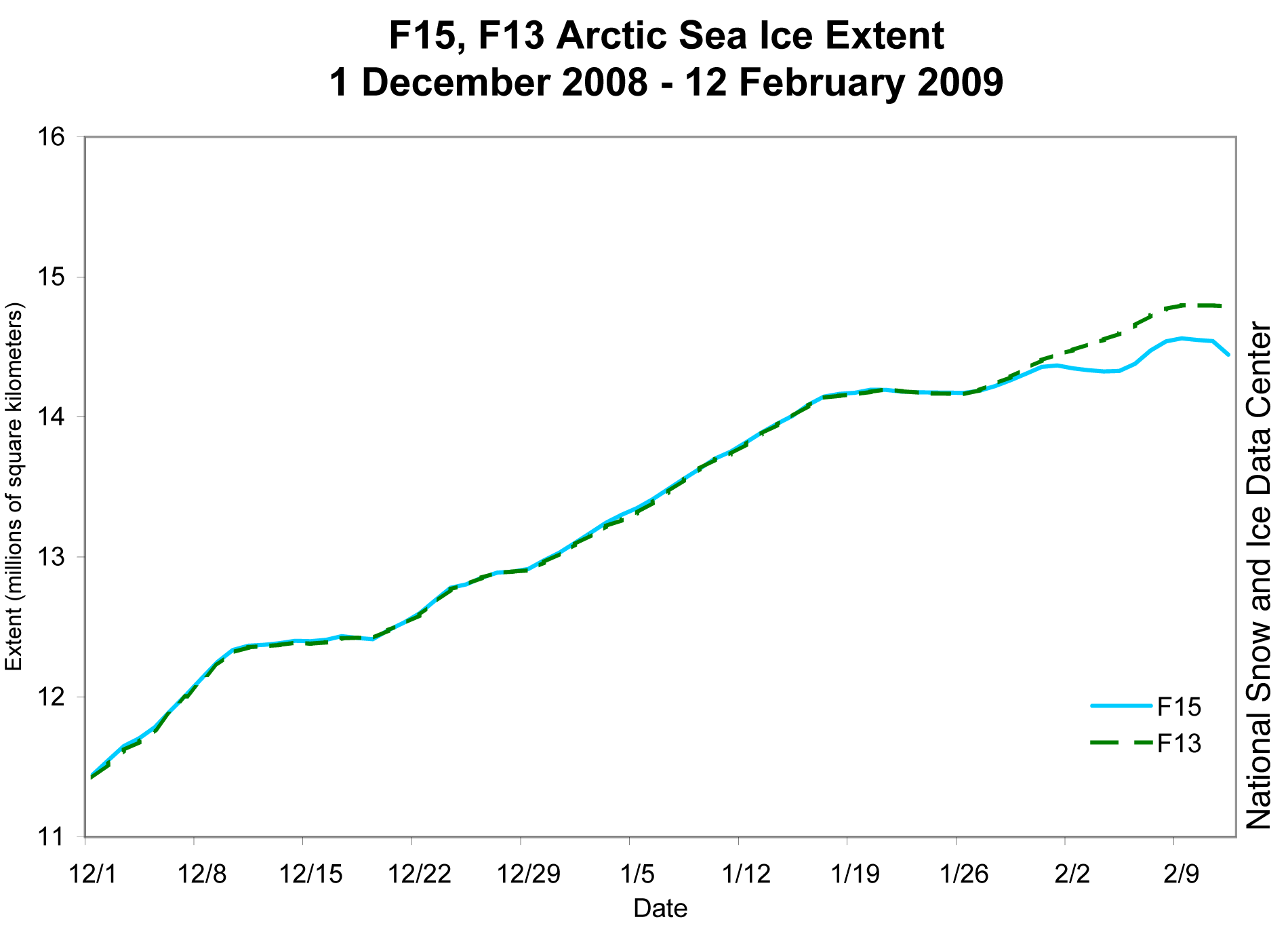 Figure 1. SSM/I Arctic sea ice extent data from F13 (dashed green line) and F15 (solid blue line) were consistent until late January, when the F15 SSM/I sensor began to degrade. —Credit: National Snow and Ice Data Center
High-resolution image
Impact of the F15 sensor drift
On February 18, we reported that the F15 sensor malfunction started out having a negligible impact on computed ice extent, which gradually increased as the sensor degraded further. At the end of January, the F15 sensor underestimated ice extent by 50,000 square kilometers (19,300 square miles) compared to F13. That is still within the margin of error for daily data. By mid-February, the difference had grown to 500,000 square kilometers (193,000 square miles), which is outside of expected error. However, that amount represents less than 4% of Arctic sea ice extent at this time of year. When the computed daily extent dropped sharply on February 16, the sensor failure became obvious.
NSIDC stopped displaying the problematic data, and recalculated sea ice extent using data from the DMSP F13 satellite, an older sensor in the same series of satellites. The recalculation changed the January monthly average ice extent by less than the margin of error for the sensor. As we reported in our February 3 post, growth of Arctic sea ice did indeed slow in January because of unusual atmospheric conditions. Using F13 data instead of F15, the September daily minimum that we reported on September 16, 2008, changed from 4.52 million square kilometers (1.74 million square miles) to 4.54 million square kilometers (1.75 million square miles), within the margin of error for daily data.
The F15 sensor drift does not change any of our conclusions regarding the long-term decline in Arctic sea ice extent. Such scientific conclusions, published in peer-reviewed journals, are based on quality-controlled monthly to annually averaged data. We have quality-controlled the final data through 2007; a thorough audit of the more recent data from 2008 shows that any discrepancies fall within the margin of error.
 Figure 2. NSIDC acquires sea ice data from a series of Defense Meteorological Satellite Program (DMSP) satellites. Overlap between satellite sensors allows us to build a consistent long-term data record. —Credit: Image courtesy Air Force Space Command Defense Meteorological Satellite Program
High-resolution image
Building long time series from satellite data
Like cars, airplanes, and other machines, satellites do not last forever. Scientists monitor satellites for problems, and new satellites must be launched to replace them. One advantage of the DMSP series of satellites is the continual overlap between one satellite and the next. This overlap allows scientists to compare and calibrate data from each satellite to ensure consistency over time. By using a series of intercalibrated sensors, we can build a consistent long-term record of sea ice extent.
Before acquiring data from F15, NSIDC obtained sea ice data from the SSM/I sensors on the DMSP F8, F11, and F13 satellites. In March 2008, we switched from the F13 satellite to the F15 satellite because the F13 SSM/I sensor had started to have regular areas of missing data. The missing data were caused by malfunctioning data recorders on the satellite, not because of any problem with the sensor itself. At the time, we were concerned that the recorder problem would become more serious. However, the F13 data recorders have not degraded further.
In comparison, the F15 sensor drift makes those data unreliable for our purposes, so we have switched back to F13. As a long-term solution, we are working on a transition to the newest sensor, which is on the F17 satellite.
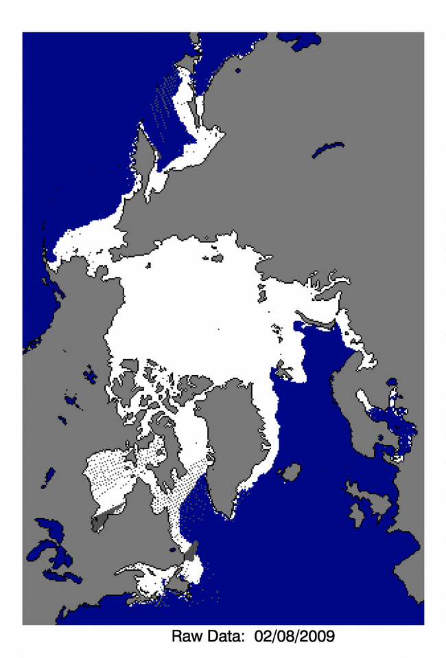 Figure 3. This animated map shows how NSIDC scientists now correct for missing data in the daily time series. The daily sea ice extent map labeled "raw data" shows areas of missing data as gray wedges and speckles. The map labeled "interpolated" shows the daily image used to calculate the daily time series. Sea Ice Index data. About the data. —Credit: National Snow and Ice Data Center
High-resolution image
Correcting the daily time series
The daily extent map now shows any areas of missing data as dark gray regions, speckles, or spider web patterns. However, in the time series chart we account for the missing data by averaging the extent for that region from the day before and the day after the gap, a mathematical technique called interpolation. Interpolation is an appropriate approach because ice cover changes slowly. The animation in Figure 3 shows an Arctic sea ice extent map with regions of missing data (Raw Data: 2009.02.08), and the same map, showing the filled-in data (Interpolated: 2009.02.08).
Isolated areas of missing data occasionally occur in near-real-time sea ice data. We adjust for such gaps during the quality control for the final data products, which are usually released about a year after the near-real-time data. The final data products form the basis for peer-reviewed scientific analysis; this is typical for all fields that use satellite data, not just sea ice science. For more information about quality control for NSIDC sea ice data, see Do your data undergo quality control? on the Frequently Asked Questions about Arctic sea ice Web page.
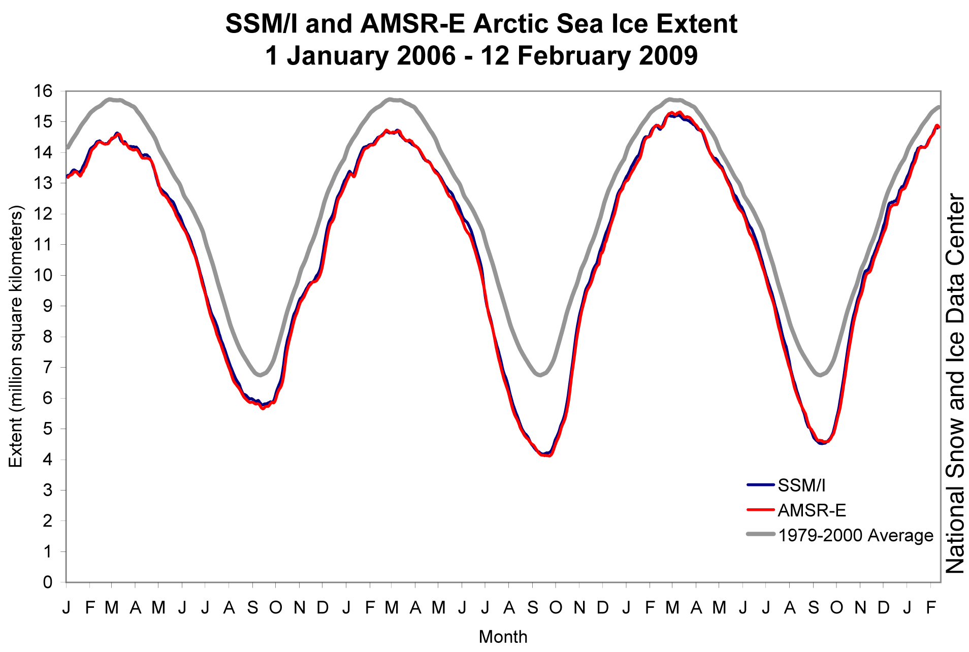 Figure 4. This time series of F13 SSM/I (blue line) versus AMSR-E (red line) Arctic sea ice extent from 2006 to February, 2009 shows how SSM/I and AMSR-E data match up over the last three years. The gray line shows the 1979-2000 average. —Credit: National Snow and Ice Data Center
High-resolution image
Cross-checking data
A number of other satellites can detect sea ice, and provide an independent check for consistency of the SSM/I data. The NASA Advanced Microwave Scanning Radiometer-Earth Observing System (AMSR-E) sensor generally serves as a good comparison for SSM/I data from the DMSP F-series satellites. Recent comparison shows that ice extent from F-13 tracks close to that from AMSR-E. AMSR-E and several other types of satellite and ground-based measurements have confirmed the long-term decline in Arctic sea ice extent over the past thirty years.
 Figure 5. This time series shows the difference between F13 SSM/I (solid green line) and AMSR-E (dashed pink line) Arctic sea ice extent from December 1, 2008 to February 12, 2009. AMSR-E starts out lower than SSM/I, but ends up higher, with differences of up to 100,000 square kilometers (38,600 square miles). Credit: National Snow and Ice Data Center
High-resolution image
SSM/I vs. AMSR-E
While the AMSR-E satellite can provide a good check on SSM/I data, scientists prefer not to use it to extend the long-term sea ice record. Although AMSR-E has a lower absolute error, continuing to use SSM/I provides a lower relative error, which is more important for tracking long-term changes in conditions.
Figure 5 illustrates the difference between AMSR-E and SSM/I sea ice extent. AMSR-E starts out lower than SSM/I, but ends up higher, with differences of up to 100,000 square kilometers (38,600 square miles). Experts expect this to be the case because of differences in the way the sensors detect sea ice. Thus, by comparing sea ice extent data from the same satellite sensor, we can build a more reliable picture of how extent has changed over the last three decades.
For previous analysis, please see the drop-down menu under Archives in the right navigation at the top of this page. Link to this page: http://nsidc.org/arcticseaicenews/index.html


No comments:
Post a Comment