by Tenney Naumer, June 4, 2009
------------------------------------------------------------------------------------------
UPDATE: OK, I panicked for nothing. The Cryosphere Today site is not including the land snow and ice coverage like it did last year and many prior years. If someone can point me to a site where these data are available, I would appreciate it. Nevertheless, the Arctic sea ice is set to go with the first good puff of warm air.
------------------------------------------------------------------------------------------
This morning, I had a bit of a shock when I looked at the Cryosphere Today's web page. This year, I have not been looking at it. I had forgotten that although the sea ice display was not up to the level I wanted, I had also been using the year-to-year comparison graphics to observe the land snow and ice coverage in northern Canada, Alaska, and Siberia.
First, let's look at a comparison of June 1, 2007, and June 1, 2008. If you click here or on the graphic, it will expand to full screen. For the link, click here.

We can see that even though 2007 was considered to be warmer than 2008, still, in 2008, we can see that the land snow and ice coverage was a bit less.
We know that in the Northern Hemisphere, for the winter of 2008-2009, temperatures were lower than average, especially in the northeastern region of the Canadian archipelago. But, a quick look at the graphic below shows that, even so, the snow and ice coverage in the Arctic was far lower than last year's. People, this means that the albedo is now significantly different, and with regard to both the land and the sea.
Here is the Cryosphere Today graphic for June 2, 2009 (click on the graphic to get the full page view):

If this isn't a scary sight, I don't know what is.
Link to the Cryosphere Today: http://arctic.atmos.uiuc.edu/cryosphere/
Back in late 2007 and all of 2008, I kept commenting in Andrew Revkin's New York Times blog, Dot Earth, about the incredible change in the patterns of global water vapor circulation. It was possible to actually see that most hurricanes in the Atlantic and typhoons in the Pacific were not reaching land and instead were being sucked up to the Arctic, thus transferring their heat and energy to the Arctic air and waters. At the time, I found it odd that I seemed to be the only person mentioning this, but nowadays, there are plenty of papers being published that mention a poleward diversion of storm tracks. [To read some of them, click here or here.]
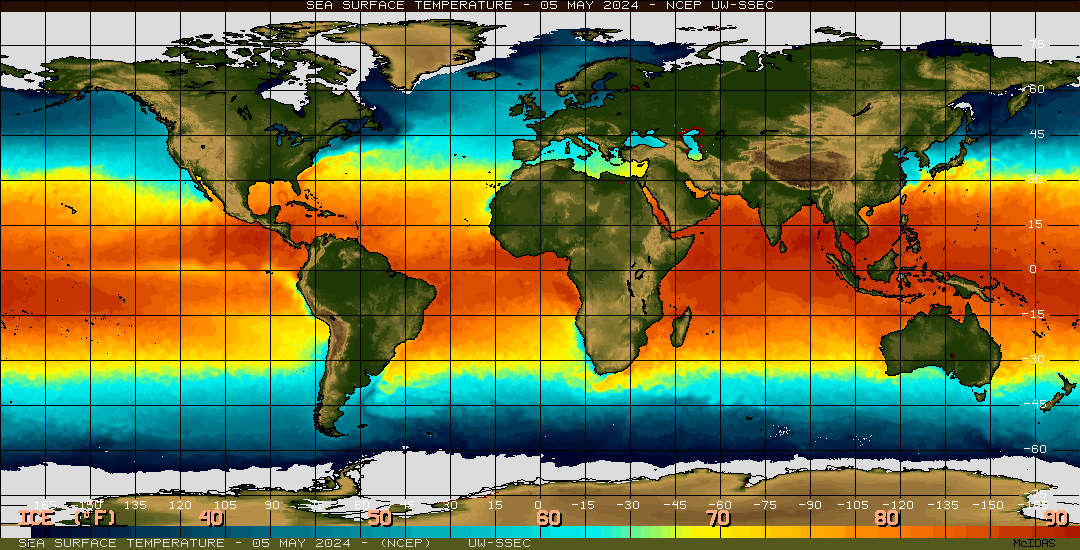
However, when the Pacific Decadal Oscillation (PDO) flipped, and cold ocean waters surfaced along the coast of Alaska and west to Siberia, this region of colder sea surface temperatures seemed to cut off the entrance of warmer Pacific waters, forming a type of barrier in front of the Bering Strait. Below is the graphic for sea surface temperature anomalies for October 30, 2008, showing how the PDO in the northern Pacific had cold waters barricading the Bering Strait.

I think we can see this effect in the higher concentration of sea ice inside the Arctic Sea near northern Alaska and eastern Siberia. Of course, that ice is so thin now that it may just be that prevailing winds and currents are causing it to pile up there.
But, look what is going on at the other end of the Arctic Sea between northeastern Greenland, Svalbard, and the Siberian coast. Yikes! No PDO to prevent warm waters from flowing in, and they are flowing in, based on observing the water vapor satellite images (ok, so what I am saying is that the winds that push the water vapor around the planet also strongly influence sea surface temperatures).
Even worse is what is going on with the Greenland Ice Sheet (GIS) along the southwestern coast of Greenland, especially near the Jakobshavn Glacier. But, that is grist for another post.


7 comments:
This is indeed scary, Tenney, as is the NSIDC daily graph of Arctic Sea Ice extent, now back online. It looks like within another few days, if the trend continues, the downward trajectory line will pass that of 2007.
I consider it outrageous that our govenmental leaders, including the IPCC, have the affrontery to tell us that the world will be "safe" as long as atmospheric CO2 doesn't exceed 400ppm or global temperature, 2C. What's happening in the Arctic right NOW is going keep happening unless we cool our planet down, FAST.
Well done for posting this.
Dorothy
http://westcoastclimateequity.org
BTW, in your sentence "Below is the graphic for sea surface temperature anomalies for October 30, 2008, showing how the PDO in the northern Atlantic had cold waters barricading the Bering Strait," don't you mean northern Pacific?
Thank you, Dorothy. Correction made. We need to get back to 280 ppm, IMNSHO.
http://psc.apl.washington.edu/northpole/index.html
The site provides daily updates of an on-ice camera that drifts during the season. Last year they had two; one of them failed in early August so save the pics while it lasts. They'll provide a local observation that's quite impressive; actually watching the season melt. They track air temperature as well - and that's actually harder to come by than ice data.
http://www.ijis.iarc.uaf.edu/en/home/seaice_extent.htm
This is the site that might be preferable to the NSIDC site. There's a better context to the seasonal melt, and the download CSV data set is very useful.
http://solarcycle24.com/
It's off-topic, but as long as the subject is waiting for teapots to boil, this site is especially rich in tracking solar activity.
What I find worrying is that the ice cover for 2007 and 2008 are represented differently from 2009, giving the illusion that the % ice cover is vastly different when on closer inspection it is not very different at all. For example, the yellow colour in 2009 represents 80-90% while in 2007-08 it respresents 40-45%.
Dear Anon,
I thought the color scale was odd, too, but if you think that this year is not very different from last year then you just don't know what is going on.
Dear Owl,
Thanks for the links. I often go to the composite satellite photos at the second link. I literally have hundreds of their images downloaded, but since the end of June last year, they were downloaded to my laptop and not my PC. My PC died and I am waiting to get the data off the hard drive so that I can make comparisons between last year and this year, because the differences are incredibly visible and stark.
This is not going to happen soon. I am waiting for a friend to bring me an external USB HD from the States.
Too bad the solar cycle is coming back. A new Maunder Minimum would have been just the thing.
Oops, no I use the Danish site for the satellite photos.
Post a Comment