Blog Archive

Showing posts with label Tamino. Show all posts

Sunday, August 16, 2015

tamino: July 2015 is the hottest month of any month in the record, not just July

by tamino, Open Mind blog, August 14, 2015

Now that NASA has released their data updated through July, we know that in that data set, this July was the hottest July on record with a temperature anomaly of 0.75 C, i.e., it was 0.75 C above “climatology” (which is what’s usual for the given month). It’s not the hottest temperature anomaly in the data set, however; that record still belongs to January 2007, at 0.96 C above climatology.
Yet it does seem that this July, while not the hottest temperature anomaly on record, is the hottest month on record.
Every year, the global average temperature goes through an annual cycle — not just the temperature at a given location. In the Northern Hemisphere, we tend to be hottest in July and coldest in January but, in the Southern Hemisphere, the seasons are reversed, hottest in January and coldest in July. The seasons are definitely hemisphere dependent.
But what about the global average? My first instinct, many years ago, was that the Earth would, overall, be hottest in January simply because we’re closer to the Sun (at the perihelion of our orbit). But it turns out (as was quickly pointed out by a blog commenter) the Earth is actually hottest in July. That’s because when the Southern Hemisphere is tilted toward the Sun in January, all that solar heat mainly strikes the oceans, which dominate the Southern Hemisphere rather than land. The thermal inertia of the oceans is much greater than that of the land masses, so it heats up more slowly, and just doesn’t get that hot even at the peak of summer.
But in July, it’s the Northern Hemisphere that’s tilted toward the Sun. The lower thermal inertia of land (mostly in the Northern Hemisphere rather than the Southern) means it can heat up quickly, so the Northern Hemisphere reaches higher temperatures at its summer peak than the Southern Hemisphere does at its summer peak.
Why not translate those temperature anomalies into actual temperature estimates?
The catch is that from thermometer records it’s hard to determine climatology— what the actual absolute temperature is, globally averaged. That’s why the major temperature data providers track the Earth’s temperature with anomalies; anomalies can be determined more accurately, and they give us just as good a picture of how temperature has changed (which is, after all, what we’re mainly interested in).
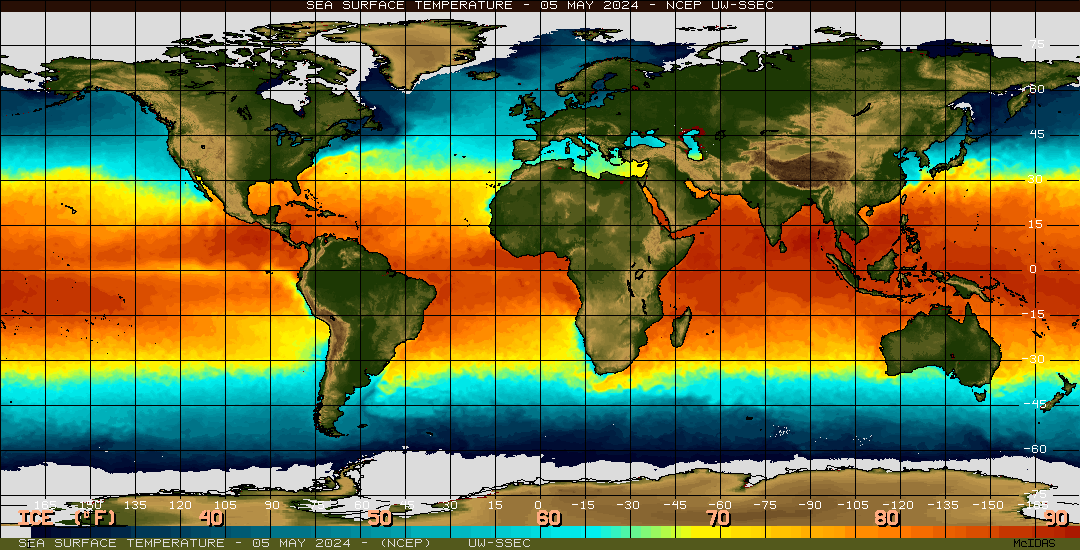
But there’s one source which seems to give pretty good estimates of absolute temperature — reanalysis data. I don’t think anyone would trust them to be precise enough to rank individual months, but they just might be our best source of data to estimate climatology.
There are two reanalysis products that are well-known and easy to get: an American version from NCAR/NCEP and a European version called “era-interim.” Let’s use both to define climatology, then add the anomaly values from NASA to estimate actual absolute temperature.

Thursday, July 2, 2015

Judith Curry suggests poor folks should buy air conditioners

Let them eat curry

by tamino, Open Mind blog, July 2, 2015
It has often been rumored that when Marie Antoinette was told that the people of France faced starvation because they had no bread, she replied “Let them eat cake.”
The story isn’t true, but it does encapsulate the kind of cavalier, thoughtless, arrogant thinking that makes people want to cut your head off.
If the people of India and Pakistan were facing starvation, what would we recommend? “Let them eat curry”? Fortunately, they aren’t presently facing terrible food shortages. But thousands of those people — human beings — died as a result of recent killer heat waves. What advice does Judith Curry offer? This:
Looks like they need more air conditioning in Spain and France and also South Asia.
Does it make more sense to provide air conditioning or to limit CO2 emissions. I vote for more air conditioning in these susceptible regions.
Let them buy air conditioners! Never mind that they’re poor and can’t afford it. Ignore the fact that the energy use would make global warming worse. And be sure to paint it as an “either/or” proposition whether it is or not. Just don’t make us do anything like limit CO2 emissions.

Wednesday, July 1, 2015

High temp record in Washington state broken by 15 degrees Fahrenheit!

by tamino, Open Mind, July 1, 2015
Sometimes I wonder whether Anthony Watts is trying to show how wrong he is about global warming.
In a recent post he shows some of the “hate mail” (although they seem like hateful comments) he’s received. One of them comes from an angry somebody in Washington state, which has recently suffered through a terrible heat wave and some ferocious wildfires.
What’s puzzling is Watts’s reaction: he reports recent record-tying and record-breaking temperatures from Washington state. What’s surprising is not that the recent heat wave tied or broke record highs for so many locations, but by how much.
Consider La Crosse, WA, for instance. On Friday (June 26), it broke the all-time record for that date, not just by a degree or even two, but by 5 degrees. That’s five degrees hotter than any other June 26th on record. The next day (Saturday June 27) it broke the record for that day too, exceeding the hottest June 27th on record, not by one, or two, or even five degrees, but by 9 degrees.
If you think that’s impressive, consider that on Sunday (June 28) it tied the all-time record for any day, not just for that date. And it was not even July or August (the usual hottest months) yet. As for the daily record, of course it broke that. Not by one degree, not by two, not by five, not even by nine. It broke the June 28th record by 15 degrees.
The list Watts displays is so impressive, I have to wonder: WTFUWT?
Maybe I should send him a “thank you” comment, for illustrating just how extraordinarily hot it’s been in Washington state recently.
UPDATE:
Jeff Masters has an excellent blog post pointing out that record-setting heat is now being felt on four continents.

Monday, June 23, 2014

WaPo: Matt Rogers' claim that global warming has “decelerated” is troubling, misleading

by Tim Di Liberto, Capital Weather Gang, The Washington Post, June 22, 2014

As a meteorologist, I am used to dealing with uncertainty. The atmosphere is complex and our models always paint an incomplete, but still useful picture of the weather. We strive to be as confident in our conclusions as possible, but are careful to avoid showing over-confidence by drawing conclusions that are simply not justified by the data itself.
I was therefore troubled by Matt Rogers’ recent Capital Weather Gang post, “Global warming of the Earth has decelerated.” A more accurate title might have been “A partial look at recent temperature data trends without quantifying significance or uncertainty.”
Ok. That title isn’t the catchiest, I admit, but it would have been more accurate.
While others have already taken a discerning look at some of the analysis’ technical flaws (see here and here), I want to focus on our ability to tease out conclusions in data as inherently noisy as global surface temperatures.
As you may have noticed, weather can be a bit chaotic. That can extend to the entire planet, where human-induced climate change from greenhouse gas emissions is operating right alongside natural variability. This is why climate scientists look at longer time frames (at least ~ 30 years) to determine trends. Effects can occur at smaller timescales, however, and that motivates plenty of research as well. And so we find ourselves here—discussing what some have called a “hiatus,” a “speed bump” or a “faux pause.” For his part, Rogers labels it a “deceleration.”
Rather than look at how global surface temperatures have changed over time (they’re increasing), Rogers computed how quickly global temperature has been rising, then calculated a trend line that showed a slight downward trend in the rate of warming during a relatively short time frame. From this, he concluded that, “… if current trends continue for just a few more years, then the mean change for the 2000s will shift to negative; in other words, the warming would really stop.”
That conclusion is incredibly problematic. Because we’re talking about acceleration here (a change in the rate), it’s akin to claiming that a driver who slows down as he or she gets stuck in traffic will never get to his/her destination. To put a finer point on it, nobody who drives from D.C. to New York City and gets stuck in Baltimore traffic just gives up and goes home.
Further, the evidence Rogers uses to make these statements are trend lines on a 13-year dataset. He did not share any test for statistical significance, nor an accounting of the inherent uncertainty prevalent in temperature time-series—where, importantly, weather variability can overwhelm climate signals, especially over such a short time-frame.
On climate, the blogger and statistician Tamino has several excellent posts illustrating this exact point.  In his post Uncertain T, he calculates global temperatures trends (i.e., the annual rate of change in temperature in degrees celsius) using different starting dates, ranging from 1975 to 2005. Although they use different data sets and metrics, this exercise largely mirrors the method used by Rogers. However, Tamino also included 95% confidence intervals on each trend line rate. These confidence intervals allow scientists to attach varying levels of certainty to their results. You can easily see that as the number of years in the dataset decrease, the 95% confidence intervals grow larger and larger. This makes sense. The less data you use for your analysis, the less confidence you will have in your results.
(Tamino)
For additional description, see Uncertain T  (Tamino)
Tamino also included a dotted line indicating the calculated trend rate since 1975. At no point is the rate of warming using the 1975 start date not within the range of possibilities calculated based off different starting years. Even the 13-year trend from 2000 to 2013 – the range Rogers used — has confidence intervals that would allow for the true trend to range all the way from negative to positive, a result that suggests it’s not a very useful time frame to examine.
So what does this mean? In contrast to his assertion of “Verifying the pause,” Rogers has simply provided incomplete information, on which it is impossible to draw firm conclusions.
But what about Rogers’ claims that climate scientists themselves have acknowledged the pause? In his post’s comments, Rogers notes that Dr. Kevin Trenberth and Dr. Michael Mann are “fully admitting [sic] the pause and are conducting research to account for it.” This didn’t mesh with my readings of their research. So I asked them.
Dr. Mann responded thusly:
“It is [a] misrepresentation of my work to suggest that I have ‘admitted to a pause.’ I have, in fact, argued the opposite (that global warming continues unabated, even if natural internal variability may have offset some warming during the past decade).”
Dr. Mann also directed me to his recent Scientific American piece about what he calls this “Faux Pause.”
Similarly, Dr. Trenberth told me his work is “in marked contrast to the blog.” He was quick to point out that a straight line fit from 1970 to 2013 is still pretty good, and while there has been a slowdown in the rise of global mean temperature, there has been no “pause” in the melt of Arctic sea ice, or global sea level rise, or global energy imbalance with the excess energy going deeper into the oceans.
Scientists can be many things, and curious is chief among them. But scientists also have a responsibility to communicate carefully. We must be disciplined in drawing conclusions that the data support, even when our curiosity demands more. And we need to be transparent about how confident we can be with the conclusions we do make.
Blog posts are great for exploring ideas, but they shouldn’t be used as an alternative venue in which to advance claims that aren’t strong enough to withstand scrutiny from other scientists.
As for climate change itself, I’m just a meteorologist. That’s why I go to scientific assessments from climate researchers like these, or these, or these, or these for their conclusions. They’re the experts. But if they want a five to ten-day forecast, they know who to call.
Tom Di Liberto is a meteorologist and science communicator who was named America’s Scientist Idol in 2013. The views expressed here are the author’s alone. Follow him on Twitter @TDiLiberto.

Friday, March 21, 2014

Tamino: Hansen’s 1988 Predictions [still good after all these years]

by Tamino, Open Mind, March 21, 2014

On another forum entirely, discussion arose of Jim Hansen’s 1988 computer model simulation and its prediction for future temperature change. Talk centered around a graph from this post by the GWPF (Global Warming Policy Foundation):
GWPF_NASA-Hansen_Graph
Hansen estimated future temperature based on three scenarios of possible greenhouse gas emissions, high emissions (scenario A), medium (scenario B), and low (scenario C). The GWPF states that
“… not only has the world matched the ‘BAU’ growth of the 15 years prior to the 1988 testimony, we have increased the CO2 emission tonnes growth from 1.8% per year to 2.2% (the 15 years prior to 2013). To put those numbers into context, from 1972 through 1987, humans emitted 302 billion tonnes of CO2; in contrast, from 1998 through 2012 humans produced 461 billion tonnes.”
Therefore, they suggest, temperature should have increased at least as fast as the fastest simulation. But it hasn’t. On that basis, one person concluded
“It seems that if CO2 was the culprit, then the temperature would have done what he predicted.”
I’m quite sure that’s exactly what the GWPF wants him to believe.
At the outset, it seems ridiculous to suggest that “Empirical evidence confirms failed performance of global climate models” based on one run each of three scenarios from 25 years ago. But that’s hardly the biggest problem with the GWPF presentation.
The biggest problem is that the GWPF has presented the ultimate simpleton’s viewpoint of the situation. They imply that temperature had to come closest to Hansen’s scenario A because CO2 increase has most closely matched Hansen’s scenario A. But global temperature is affected by a lot more than just CO2, it is affected by the entirety of climate forcing. CO2 is only one of many.
Here are the net climate forcings according to the 2005 IPCC report:
600px-Radiative-forcings.svg
Notice that even among man-made greenhouse gases, CO2 isn’t the only forcing. There’s also methane (CH4), NO2, and a variety of halocarbons. Then there are the aerosols, which have a cooling effect on climate.
How do their changes compare to the forcing used in Hansen’s 1988 predictions? Here’s a comparison of the methane concentration (the 2nd-most-important man-made greenhouse gas) used in those models, to observed methane concentration since 1983 (measured at the Mauna Loa atmospheric observatory):
ch4
It turns out that methane has increased more slowly than the slowest of the scenarios. If we do like the GWPF did and account for only one climate forcing, but use methane instead of CO2, then temperature should have increased less than the slowest of the scenarios. The GWPF certainly didn’t mention that. Just my opinion, but I wouldn’t put it past them to neglect mentioning it even if they knew. And I wouldn’t be at all surprised if they didn’t even know.
Let’s not play the one-climate-forcing-only game. Let’s look at data for all climate forcings, and compare what was used in Hansen’s scenarios to best estimates of what has actually happened since the prediction began. This was done 7 years ago on RealClimate, but we’ve learned more about climate forcing since then (and we have more data), so let’s update that comparison.
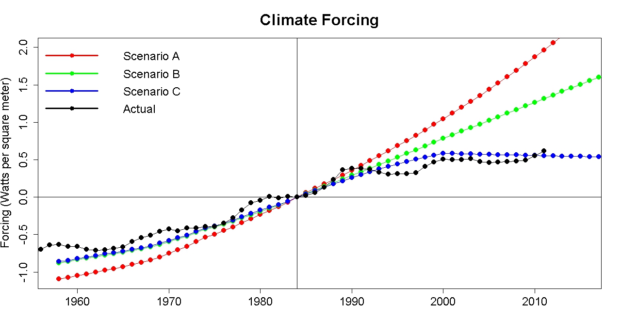
As in the RealClimate post, I’ll leave out volcanic forcing because it’s short-lived, and the prediction can’t be expected to forecast volcanic eruptions anyway. Here’s the climate forcing used in the three scenarios compared to actual climate forcing since the prediction began:
forcing
Notice that I aligned the forcing estimates at 1984, because that’s when the prediction began. The paper was published in 1988, but the models had to be run (which took a lot longer in those days) before that, the paper had to be written, and reviewed, then published. The actual prediction started in 1984.
Notice also that actual forcing follows scenario C more closely than the other scenarios. On that basis, we should expect observed temperature change to match scenario C more closely than the other scenarios. And it does.
In fact, the match of observed temperature to Hansen’s scenario is C quite good. Damn good. So good, that I suspect the match isn’t entirely due to the excellence of the model, in part it was coincidence. Regardless of that, to claim on the basis of these 25-year-old model runs that “Empirical evidence confirms failed performance of global climate models” is downright ludicrous. Really. Ludicrous.
Think about how much work I had to do to track down the data and produce this analysis. And I’ve been analyzing climate data for years! Now think about the guy in the discussion who is new to the climate issue. How easy would it be for him to ferret out the truth about this? Fortunately, he seems to have an open mind and to want to know the truth regardless of political considerations. But given the complexity of the situation, given the tremendous amount of information which the GWPF failed to mention (and maybe doesn’t even know), what chance does he have to get at the truth in this situation? The only thing that’s “easy” about this is how ridiculously easy it was for the GWPF to give the wrong impression.
But the ridiculously simplistic viewpoint about climate forcing isn’t the only problem with the GWPF presentation. Notice that at the top of their graph they state “The NASA/GISS 2012 “correction” revisions of +0.05° per year average increase adjusted for.” That’s their way of saying (with appropriate “scare quotes”) that they’ve subtracted 0.05° from the temperature data according to NASA/GISS. They changed the data to make observed temperature seem lower. That sounds like cheating to me.
Look also at the line stating “HadCRUT3 Observed Annual Temperature Anomaly – prior to 2010, every 5 years.” Does that make you wonder why they chose to plot it only for every 5 years?
Let’s compare the temperature data from NASA GISS to that from HadCRUT3 using all the years from 1880 through 2013:
giss_v_cru
Notice a difference? The HadCRUT3 data are consistently lower than the NASA GISS data. That’s because the two organizations use a different baseline — NASA data are the temperature difference from the 1951-1980 average while HadCRUT3 data are the temperature difference from the 1961-1990 average. Comparing the two, without compensating for the different baseline, is like comparing an infant’s height above the ground (which is a positive number), to my height above Shaquille O’Neil (which is negative because he’s taller than I am). Properly to compare our heights, you’d have to use the same baseline. Properly to compare NASA GISS and HadCRUT3 temperatures, you’d have to use the same baseline. The GWPF didn’t.
I find it very hard to believe that they didn’t know about this. If they truly didn’t, then they’re so ignorant about temperature data they have no business discussing the issue at all. If they did know, but failed to compensate or even to mention it because that makes the HadCRUT3 data look even lower, then … draw your own conclusion. I can’t be sure, but it certainly seems to me that this difference is the reason they only plotted HadCRUT3 data “every 5 years” before 2010.
If you’ve already imagined how hard it would be for an honest, but inexperienced, investigator of climate science to get at the truth about Hansen’s 1988 predictions, now imagine how much harder it is when data are plotted in misleading fashion.
Computer models of global climate are far from perfect. But they remain our best tool to predict future climate change. Even so, they are not the basis for concluding that climate change is really happening, that it’s mainly because of us, and that it’s dangerous. Very dangerous. Those conclusions are based on observation of past climate changes (including way back to the glacial cycles over the last million years and more), and those pesky little laws of physics.
But the fact remains that far too many people, and organizations, who really don’t have the knowledge to know what they’re talking about, bombard us with misleading claims. That’s one of the main reasons our society remains paralyzed, doing next to nothing to address what is really the defining issue of this century.
In the meantime, I advise everyone who hears anything at all from the GWPF to be skeptical. Be very skeptical.

Sunday, March 9, 2014

Tamino: California Drought

by tamino, Open Mind, March 10, 2014

Despite recent rains, California is still in the midst of crippling drought. In a recent opinion piece by Martin Hoerling the case is made that essentially, man-made climate change has nothing at all to do with the present California drought.
Thus, the scientific evidence does not support an argument that human-induced climate change has played any appreciable role in the current California drought.
I disagree.
Martin Hoerling is a smart guy, and I wouldn’t call him a “denier.” But we all know how easy it is for smart people to be stupid. It’s even possible for those who aren’t deniers, to deny. I think that’s exactly what Matt Hoerling has done.
20140304_CA_trd-638x501
There’s a lot of huffing and puffing in the article, but his argument basically boils down to this:
We can also say with high confidence that no appreciable trend toward either wetter or drier conditions has been observed for statewide average precipitation since 1895.
The ironic part is that Hoerling makes this the centerpiece of his argument in spite of emphasizing that drought is not just about precipitation.
It’s true that there’s no significant trend in California precipitation since 1895. Here’s precipitation anomaly, which reduces the counfounding influence of the annual cycle (it tends to be wetter during winter, especially January):
RR_anom
The estimate trend from linear regression (shown by the thick blue line) is decreasing, but not statistically significant even if you don’t correct for autocorrelation. If you do correct for autocorrelation, it’s definitely not statistically significant.
But as Hoerling himself states, drought isn’t just about precipitation. If we look at an actual measure of drought — the Palmer Drought Severity Index, or PDSI — then there is a decreasing trend (which means, toward more and/or more extreme drought) which is statistically significant, even after correcting for autocorrelation:
PD
The blue line shows the trend estimated by linear regression, the red line shows a lowess smooth. Yes, there’s a trend toward more drought in California. Yes, it’s statistically significant. Matt Hoerling’s claim that there’s “no appreciable trend … for statewide average precipitation” is true, but misleading. What’s worse, he reallyought to know better.
A similar, but weaker, trend shows up in a common measure of short-term drought, the Palmer Z-index:
PZ
Note that this last January (the last month for which data are presently available from the National Climate Data Center) is the lowest on record. We can see the trend more clearly if we just plot the smoothed version, together with the estimated linear trend.
PZ_smooth
After correcting for autocorrelation, the linear trend is not quite significant at the 95% confidence level. It’s “only” significant at the 94.8% confidence level. Statistically speaking, it’s one of those things that make you go “Hmmm…”
But instead of making Matt Hoerling go “Hmmm…” it seems to have made him go wrong. Or perhaps he hasn’t even looked at the PDSI or Z-index — in which case, what the hell is he doing pontificating about the California drought? He tries his best to assert that it’s definitely not the case that “human-induced climate change has played any appreciable role in the current California drought.” It sure reads to me as though he isn’t saying “Hold on, let’s not be so sure,” like a genuine skeptic— instead he’s asserting that he knows it ain’t so — like a denier.
What’s worse, for Californians, is that the snowpack in the Sierra Nevada mountains is so low that one can expect drought conditions to persist, possibly even worsen, throughout the year. An extreme example (yes it’s cherry-picked, in order to make a point) is the data from the SNOTEL site at Independence Creek:
SWE_IndependenceCreek1
Each line represents the snow-water-equivalent (SWE) in the snowpack throughout a single year. The thick red line is the SWE for this year. Notice anything striking about it? Here’s a close-up of the first three months, to make this year’s snowpack easier to compare to previous years’:
SWE_IndependenceCreek2
Given the current state of affairs, the outlook for California’s water supply this year isn’t just “not good,” it’s grim.
Maybe Marty Hoerling thinks he’s being the “honest broker” and arguing for some sort of “restraint” in assigning a role of man-made global warming. If he thinks that, he’s fooling himself, because he really doesn’t give the impression “hold on, let’s not be so sure,” he gives me the impression “there’s no connection at all and I’m sure of it.” And in that, he’s just plain wrong.
In my opinion, he’s also being irresponsible. Tremendously irresponsible. Man-made climate change is a huge threat to California, and this year’s drought is a perfect example why. It should be an alarm to “Wake up and smell the coffee,” but Matt Hoerling is saying “There is no coffee.”
One of the saddest aspects of this is that the present situation was predicted. The prediction was stunningly accurate — but I do realize that it’s possible to make a prediction which is stunningly accurate because you got lucky. Nonetheless, a stunningly accurate prediction is powerful evidence, and if correct, it means thatman-made global warming was actually the cause of the present California drought, because man-made global warming certainly did cause the disappearance of Arctic sea ice. According to the scientists who made the prediction, prospects for the future are not good. I’d go so far as to say “grim.”

Thursday, February 13, 2014

Tamino: Making Stuff Up about Sea Level Rise

Making Up Stuff

One of the most effective techniques by which deniers persuade people, especially policymakers, that it’s OK to do nothing about man-made climate change, is also one of the most reprehensible. To whit: just make up stuff.
A prime example is a paper about sea level rise by Albert Parker, M. Saad Saleema, and M. Lawson (2013; Sea-level trend analysis for coastal management, Ocean & Coastal Management, 73: 63-81). You may recall Parker as one of those who submitted a comment criticizing perfectly valid research by Shepard et al. (we dissected another of his travesties here). You may even recall that he submittedtwo comments about that paper under different names. You see, Albert Parker also goes by the name Alberto Boretti. What do you think — is it reprehensible to play games with names just so you can get two comments published as though they were from independent sources? I think so.
But Parker et al.’s 2013 paper absolutely takes the cake, because it’s a prime example of making stuff up. They got caught, which is why one of the authors (M. Lawson) has disavowed the paper and claimed his contribution was almost nil, certainly negligible. In other words, he threw his co-authors under the bus.
Parker et al. begin by claiming that
The sea-level scenarios of Ozcoasts (Australian Government/Geoscience Australia, 2012) translate into six greenhouse-gas emission ‘marker’ scenarios. Sea levels are supposed to follow over the period 1990-2100 an exponential curve:
y = y_o + A e^{R_o \cdot x} (1)
The problem is, they made that up.
In a response from J. R. Hunter it is pointed out that they just made that up. Nobody I know of has ever made such a claim, and certainly not the Australian Government/Geoscience Australia in their “sea-level scenarios of Ozcoasts.” Not only do they not make that claim, Hunter proves that the actual scenarios don’t follow Parker et al.’s equation (1). It’s really not that hard. Because Parker et al. just made it up. Hunter states:
Contrary to the authors’ claim, none of these scenarios involves any assumption about exponential growth. Each scenario involves four points in time (including the starting point of zero rise in 1990), and Equation (1) contains three constants. If a scenario was indeed exponential, then any three points from the scenario could be used to fit an exponential (as in Equation (1)) and the fourth point should necessarily fall on that curve. This is clearly not the case, as shown in Fig. 1, which contains a panel for each scenario.
Yes, he proved it. They made it up.
Parker (but not his co-authors) actually wrote a reply to Hunter’s comment. And what does he say about this? You have to look carefully to find anything relevant because the first half of Parker’s reply doesn’t address the issues raised by Hunter at all. When he finally gets around to it, Parker says this:
As final remark about equation (1) of the paper, it seems that Mr. Hunter has some issues also with mathematics in addition to sea levels.
Then, he starts talking about the other thing in their paper which Hunter shows is just plain wrong. The brazenness is really quite impressive.
Note also that Parker addresses his critic as “Mr. Hunter” (which he does throughout) and soon thereafter refers to Stefan Rahmstorf as “Mr. Rahmstorf,” while referring to someone he seems to like as “Dr. Scafetta.” Hunter and Rahmstorf got Ph.D. degrees the old-fashioned way — they earned them — and it is disrespectful to address them as “Mr.” when using the correct title for others. My opinion: the disrespect was deliberate. Also my opinion: the editors of the journal Ocean & Coastal Management should never have permitted such blatantly snide treatment of respected researchers. Shame on them.
The other issue which Hunter’s comment points out (he only mentions two because, frankly, there are too many to deal with them all) is the claim that according to some models (specifically, that of Rahmstorf) the acceleration of sea level should be proportional to CO2 concentration:
The most popular models used to estimate the impacts of climate-change are based on very simplistic assumption, as for example Rahmstorf (2007):
{dSLR \over dt} = a {dCO_{2-a} \over dt}  (2)
In this equation, t is the time, SLR the sea level rise, and CO2-a the anthropogenic emission of carbon dioxide. Equation (2) (and more in general the assumption that the anthropogenic emissions of carbon dioxide are the only forcing of sea level rises) lack so far of validation.
Hunter points out:
In fact, Rahmstorf (2007) gave two equations:
{dH \over dt} = a (T - T_o)
and an integrated version of this equation.
So what is Parker’s defense of their faulty equation (2), which by the way he gives after mentioning equation (1) without saying anything about that? It’s this:
Mr. Rahmstorf (www.nature.com/scitable/knowledge/library/modeling-sea-level-rise-25857988), obviously a reference contributor to the IPCC AR4 (www.ipcc.ch/publications_and_data/ar4/syr/en/main.html) claims dH/dt = a \cdot (T(t)-T_o) where H is the sea level, t the time, T the temperature, and a is a coefficient. To is a reference value of the temperature, selected as the temperature when the time t is equal to zero. The sea level rate of rise SLR is the sea level velocity dH/dt. Therefore, the sea level acceleration SLA = dSLR/dt = a ~ dT/dt. Considering the other authors of the IPCC AR4 claim that there is a perfect correlation between the atmospheric CO2 concentration and the surface temperature (www.ipcc.ch/publications_and_data/ar4/syr/en/main.html), then it is correct to write that according to Rahmstorf and the other authors of the IPCC AR4 is SLA = dSLR/dt = a ~ dT/dt = dCO_2/dt.
It’s not a minor mistake to claim that “other authors of the IPCC AR4 claim that there is a perfect correlation between the atmospheric CO2 concentration and the surface temperature.” He just made it up. It’s not just false, it’s ludicrous — even more ludicrous than Parker referring to “the assumption that the anthropogenic emissions of carbon dioxide are the only forcing of sea level rises,” which exists only in his imagination.
The blatantly obvious falsehoods in Parker et al. make it one of the biggest embarrassments in modern science. It’s an embarrassment to the journal Ocean & Coastal Management that Parker et al. was published in their pages. It’s an embarrassment to the reviewers that they allowed this trash through. But most of all, it’s an embarrassment to the authors. Perhaps that’s why the third author, M. Lawson (a senior journalist for the Australian Financial Review) has tried to distance himself from the work that bears his own name. “Crikey” reports that Lawson wants none of the blame for this fiasco, saying:
“I don’t think I actually saw the paper, to be honest,” Lawson said. “I think I contributed a paragraph … I was a bit surprised to see me listed as a joint author — my contribution was quite minimal. I’m a journalist, not a scientist.”
Evidently Lawson was also surprised to learn of Parker/Boretti’s dual identity, saying
“Is he the same guy? That’s what I was puzzling over … That’s why Parker was sending me emails — I had no idea who he was.”
Perhaps the most telling comment from Lawson was his endorsement of the paper’s main theme in spite of its lack of validity:
“I can’t comment on the details of the scientific analysis, but on a broader level it’s clear the increases to sea levels to date do not justify the responses we have seen from councils.”
It seems to me that the blame for just making up stuff belongs to Albert Parker. Or Alberto Boretti, depending on which day of the week it is. But before anyone lets Lawson off the hook, consider this: in spite of trying to abdicate responsibility by stating “I’m a journalist, not a scientist” and “I can’t comment on the details of the scientific analysis,” he still insists that “it’s clear the increases to sea levels to date to not justify the responses we have seen from councils.”
As for the policy-relevant conclusions of Parker et al., I’ll agree with the final sentence of Hunter’s comment regarding their “advice”:
Given the errors noted above, these statements represent quite dangerous and foolhardy advice.
Dr. Hunter, you were far too kind.

Saturday, February 1, 2014

Corrections to Curry's Erroneous Comments [Senate testimony] on Ocean Heating

by Dana Nuccitelli and Rob Painting, Skeptical Science, January 30, 2014

Committed to the Cause Pause

Recently, Georgia Tech climate scientist Judith Curry, along with Texas A&M climate scientist Andrew Dessler, testified before a US Senate committee on the subject of climate change.  While Dessler's testimony was excellent and well-supported by the body of scientific evidence, Curry's contained a number of errors (i.e., see The Guardian on global warming attributionEli Rabett on Antarctic sea ice, and Tamino on Arctic warming and sea level rise, for starters).
Curry's main and most flawed argument was that information in the latest IPCC report should decrease our confidence in human-caused global warming; an argument she based in large part on the supposed global warming 'pause,' which is itself a fictional creation.  While the warming of average global surface temperatures has slowed (though not nearly as much as previously believed), the overall amount of heat accumulated by the global climate has not, with over 90% being absorbed by the oceans.
A few days after her Senate testimony, Curry took to her blog to dispute these data, essentially arguing that the amount of heat absorbed by the oceans has also 'paused,' which would then support her arguments.  However, in evaluating the ocean heat content data and scientific literature, Curry made a number of mistakes.  This gives us an excellent opportunity to properly evaluate the science on rising ocean heat content and see what it tells us.  The key points are:
  • The deep oceans are warming rapidly in every data set that measures them (including those referenced by Curry).
  • Sea levels are rising consistent with rapid ocean warming.
  • The rate of ocean warming is consistent with the global energy imbalance.
  • The geographic distribution of ocean warming is consistent with natural variability superimposed on a warming background state forced by the increased greenhouse effect.
  • The global warming 'pause' is a fictional product of wishful thinking.

Deep Ocean Warming is a Reality

The following quote from her blog articulates Curry's primary misunderstanding on the subject of rising ocean heat content.
"The only data set that appears to provide support for ocean sequestration is the ocean reanalysis ... All in all, I don’t see a very convincing case for deep ocean sequestration of heat."
The ocean reanalysis Curry refers to is Balmaseda et al. (2013).  A reanalysis is a climate, ocean or weather model simulation of the past that incorporates data from historical observations.  However, as we recently discussed, the increase in deep ocean heat content is a robust result in data sets that do not include reanalysis.  In fact, in her blog post Curry discusses a new paper by Lyman and Johnson (2013) that directly contradicts her assertion.  The paper relies on observational, not reanalysis data, and concludes,
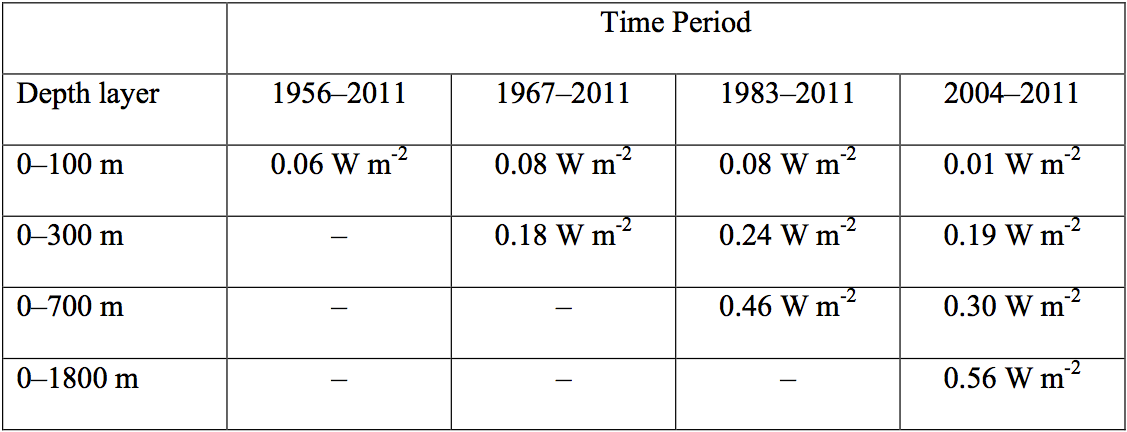
"In recent years, from 2004 to 2011, while the upper ocean is not warming, the ocean continues to absorb heat at depth (e.g., Levitus et al. 2012; von Schuckman and Le Traon 2011), here estimated at a rate of 0.56 W m-2 when integrating over 0–1,800 m."
The paper also includes this useful table illustrating that according to observational data, ocean heat content has indeed accumulated rapidly in the deep oceans in recent years.  Of the heat accumulating in the upper 1,800 meters of oceans for 2004–2011, 46% was sequestered in the deep oceans (below 700 meters).
LJ13 Table 1
To be clear, there's nothing wrong with using reanalysis data.  In fact, the Balmaseda et al. (2013) study fills in gaps in observations most comprehensively by utilizing all kinds of data, as well as using ocean models.  The fact that they're able to resolve volcanic eruptions and El Niño events suggests that the reanalysis may be more accurate than purely observational data sets that cannot resolve these events. However, the key point here is that the observational data, including Curry's own reference, contradict her point by finding substantial deep ocean heat sequestration over the past decade.

Science Isn't Done by Eyeball

Another problem with Curry's analysis is that she simply eyeballs the ocean heat content graph in Lyman and Johnson (2013) and concludes that since 2003, the data look flat. 
LJ13 OHC Figure
Time series of annual average global integrals of upper ocean heat content anomaly (1021 J, or ZJ) for (a) 0–100 m, (b) 0–300 m, (c) 0–700 m, and (d) 0–1,800 m.  Thin vertical lines denote when the coverage (Fig. 3) reaches 50% for (a) 0–100 m, (b) 100–300 m, (c) 300–700 m, and (d) 900–1,800 m.  From Lyman and Johnson (2013)
Scientists don't rely on their eyeballs because our senses can introduce bias and deceive us.  The data in the figure above may look relatively flat after 2003, but as the table above shows, they are not.  For 2004–2011, the data show the oceans accumulating heat at a rate of 0.19 W/m2 (3 x 10²¹ J/yr) in the upper 300 meters, 0.30 W/m2 (5 x 10²¹ J/yr) in the upper 700 meters, and 0.56 W/m2 (9 x 10²¹ J/yr) in the upper 1,800 meters.  The latter number is equivalent to 4.5 Hiroshima atomic bomb detonations per second – a far cry from a global warming 'pause.'

Ocean Heat Accumulation Consistent with Satellite Observations

We also know from satellite observations that the planet is accumulating heat due to a global energy imbalance (measured at the top of the atmosphere).  A new paper by Trenberth et al. (2014) notes that the amount of heat accumulating in the global climate (most of which is absorbed by the oceans) is generally consistent with the observed global energy imbalance (see the previous post for further details).  If the ocean were to stop warming as Curry suggests, it would require an explanation of where the energy from the global imbalance is going.
Curry also suggests that because they're not globally uniform, recent changes in ocean heat content "most likely reflects natural internal variability.  It doesn’t look like an AGW signal."  Again, if heat were simply shifting between ocean basins naturally, it would require an explanation of where the energy from the global imbalance is going.  The problem with breaking the data out into individual ocean basis as Curry does is that it's easy to then lose sight of the global picture.  The oceans as a whole are building up a lot of heat.  That long-term global ocean heat buildup has to be caused by an external forcing like the increased greenhouse effect.  The oceans aren't just going to naturally start accumulating zetajoules of heat – that heat has to come from somewhere.
As for the variation in heat content gain in each basin; this is no great surprise, as there is an exchange of water masses between the ocean basins. Most of the deep ocean warming is occurring in the subtropical ocean gyres  vast rotating masses of water in each ocean basin where near-surface currents converge and are forced downward into the ocean interior. When the tropical easterly trade winds strengthen, as they have from the year 2000 onwards, this whole wind-driven ocean circulation becomes more vigorous, the South Pacific subtropical gyre spins up, and the western arm of the gyre exports more tropical water through the Indonesian archipelago into the Indian Ocean. Likewise, the more vigorous ocean circulation forced by stronger trade winds forces more heat to be exported from the Indian Ocean, around the southern tip of Africa, into the South Atlantic.
Although it cannot be discounted that long-term warming is affecting this circulation in some way, a large part of this recent behavior is likely to be natural variation associated with the vigorous or sluggish phases of the ocean circulation. Whenever the wind-driven ocean circulation switches phase in the future, the current basin-scale warming pattern will change. Weak export of tropical water out of the Pacific during that phase should see a build-up of heat in the Pacific basin.  In other words, what we are seeing is probably natural variability in this circulation against a warming background ocean state forced by the increased greenhouse effect.
OHC by region  
Ocean heat content by region in the ORAS4 reanalysis by Balmaseda et al. (2013). NXTRP = northern extratropics, SXTRP = southern extratropics, TROP = +/30° latitude, TRATL = tropical Atlantic, TRPAC = tropical Pacific, and TRIND = tropical Indian ocean. Units are in 1022 Joules. Despite short-term variability in ocean heat content storage, each region has experienced long-term warming.

Early-Mid 20th Century Ocean Heat Content and Sea Level Rise

Curry also argues that the rate of sea level rise during 1930–1950 was similar to that in recent years, according to the IPCC, which suggests that ocean heat content was increasing at a similar rate to today.  She then argues that this can't be attributed to human-caused global warming, which presumably implies something about the current rise in ocean heat content.
First, while the early 20th century warming was likely predominantly naturally-caused (i.e. low volcanic activity and increasing solar activity), there was also a significant human contribution as greenhouse gasemissions began to ramp up.  Second, according to most estimates, the rate of sea level rise today is higher than the rate during 1930–1950 as shown in the IPCC report and Rahmstorf et al. (2012).  Third, tide gauge coverage 70 years ago was not as good as today's, and much of the variability is simply due to noise and factors like coverage bias, as discussed by Rahmstorf et al. (2012) and Tamino.
Fourth and most importantly, the argument is a non sequitur – the conclusion doesn't follow from the premise of the argument.  Yes, global warming events have occurred naturally in the past, and sea level rose as a consequence, but that doesn't tell us anything about the causes of the current global warming.  This is akin to seeing a dead body with a knife sticking out the back and arguing that it must have been a natural death because people have died naturally in the past. 

The Pause is Imaginary, Real Heat Will Come Back to Haunt Us

The bottom line is that all available ocean heat content data show that the oceans and global climate continue to build up heat at a rapid pace, consistent with the global energy imbalance observed by satellites.  In recent years, much of that heat has accumulated in the deep oceans.  Curry misunderstands the importance of this fact.
"even if the heat from surface heating of the ocean did make it into the deep ocean, presumably the only way for this to happen involves mixing (rather than adiabatic processes), so it is very difficult to imagine how this heat could reappear at the surface in light of the 2nd law of thermodynamics."
Nobody is arguing that the heat sequestered in the deep ocean will suddenly return to the surface.  Some fraction of it, from the upper ocean, may reappear as an El Niño event, but some is irreversibly mixed and forms part of the inevitable warming and equilibration of the ocean to a warming climate.
While the warming of global surface temperatures in recent years has slowed in large part due to the more efficient heat transfer to the deep oceans, that can't last forever.  When that trend reverses, as past observations suggest it will, we'll experience an acceleration of warming at the Earth's surface.