Blog Archive

Showing posts with label Eli Rabett. Show all posts

Sunday, May 25, 2014

Andrew Gelman, WaPo: Richard Tol's gremlins and the more likely seriously detrimental economic impacts of higher global temperatures

The gremlins did it? Iffy statistics drive strong policy recommendations

(Christopher Ziemnowicz)
Adam Marcus reports that an influential paper from 2009 on the economic effects of climate change was recently revised because of errors and omissions in the data. According to the paper’s author, Richard Tol:
Gremlins intervened in the preparation of my paper “The Economic Effects of Climate Change” . . . minus signs were dropped from the two impact estimates . . . [also there were] two overlooked estimates . . .
I’m not sure what is up with the gremlin, but in my own work I’ve introduced major errors into the analyses on occasion. Sometimes it happens when I’m copying numbers from a printed source into a typed document, or even when editing a document. So I could definitely see how minus signs could disappear.
Carmen Reinhart, professor of economics at Harvard Kennedy School. She was a professor at the University of Maryland in 2010, when this photograph was taken. (Andrew Harrer/Bloomberg News)
I’m reminded of the recent case of Reinhart and Rogoff who introduced major errors in data processing and analysis into an influential paper on macroeconomic policy. The errors were undiscovered for years.
In both these cases, I think the problem is not so much the errors — mistakes will happen, and it’s understandable that researchers will be less likely to catch their errors if they go in the direction that support their views — but rather that there are many fragile links in the chain that connects data to policy recommendations. This is one reason that many people are starting to recommend that the “paper trail” of the statistical analysis be more transparent, so that researchers (including me!) simply aren’t able to make mistakes such as accidentally removing a minus sign in a computer file or losing a column of data in an Excel spreadsheet.
  FILE - In this March 7, 2008 file photo, Kenneth Rogoff, Professor of Economics and Public Policy at Harvard, delivers a speech at the International Symposium of the Banque de France, in Paris.(AP Photo/Jacques Brinon, file)
Kenneth Rogoff, professor of economics and public policy at Harvard.(Jacques Brinon/AP)
The other problem is that people who are caught out in their mistakes often go on and on about how the mistakes don’t really alter their conclusions. For example, here’s Richard Tol the effects of his missing minus signs and new data (in addition to adding the overlooked estimates, he added five more recent estimates that had appeared after the 2009 paper had been written):
Although the numbers have changed, the conclusions have not. The difference between the new and old results is not statistically significant. There is no qualitative change either.
But then he also says:
The assessment of the impacts of profound climate change has been revised: We are now less pessimistic than we used to be.
Also this:
The original impact curve projects an impact of −15 (−7 to −33) percent of income for a 5°C warming, whereas the corrected and updated curve has −6 (−3 to −21) percent. This is relevant because the benefits of climate policy are correspondingly revised downwards.
I’m a little bit worried because this last sentence contains so many minus signs, but I’ll assume they’ve all been checked carefully.
In any case, I think Tol needs to get his story straight: in one place he said the qualitative conclusions did not change; in another place he points to some changes and say they are relevant for policy.
Okay, so all this got me wondering: What exactly was being claimed here? Here are the two graphs from Tol’s revised paper:
Tol1
Figure 1 shows the estimates based on the corrected data (with the minus 1's restored) and the overlooked previous studies. Indeed, the curves aren’t very different, but . . . what is that big positive point at 1.0 degrees? This point seems to be (a) singlehandedly keeping the estimate above zero, and (b) driving a big curve in that fitted quadratic line. This point is credited to this 2002 paper by Tol. The list also includes a negative estimate of the impact of a 2.5 degree warming, also from Tol  in 1995. Lots of research got done between 1995 and 2002, I assume — indeed, the 2002 paper reports “a new set of estimates” and “two methodological improvements,” so I’m surprised that the 1995 estimate was just kept in as is.
Here’s the point. In his 2002 paper, Tol found a positive economic effect of a small increase in temperature. But, assuming he still stands by his 1995 paper, he finds a big drop in economic performance as temperature rises still more: the estimated effect (compared to no warming) is plus 2.3 percent of gross domestic product for a 1 degree increase, and then drops to minus 1.9 percent for a 2.5 degree increase. So there’s some major nonlinearity in his model. This could well be correct, but I think it would make sense for him to explore what in his model is driving this result.
Okay, now here’s Tol’s Figure 2 which shows the estimates including the new studies:
Tol2
That point at (1, 2.5) remains, and now there’s a new outlier at (3.2, minus 11.5). I don’t know what’s the story with these, but of course either of them could be correct; the whole point of this sort of meta-analysis is a recognition that different studies are using completely different methods with completely different sets of assumptions.
That quadratic curve
But I want to go back to one point, which is Tol’s remark that the revised estimate based on the new data “is relevant because the benefits of climate policy are correspondingly revised downwards.”
What’s going on here? The green curves in Figure 2 look reasonable in the sense that they go through the data, which really is all I have to work with here. The real weirdness comes in Figure 1, not so much with the curve going above 0 but with the steep declining slope which leads to huge negative impacts when extrapolating beyond the range of the points on the graph. This seems to be coming from the assumption that the curve is a quadratic (that is, a curve of the form y = ax – bx^2). But why must it be quadratic? Where’s that coming from? The answer (I’m pretty sure): nowhere at all. It’s just an extrapolation.
If you want to extrapolate, I think it would make more sense to extrapolate within the contexts of the individual reports rather than to draw a curve through the estimates obtained by different authors at different times.
Outliers
One problem which Tol didn’t note was the role of the changing minus signs in interpreting the estimates that were not garbled. In particular, his estimate of a big positive impact at 1 degree is a clear outlier in his analysis. Did he look into that in the original paper? I took a look, and here’s what he wrote, back in 2009:
Given that the studies in Table 1 use different methods, it is striking that the estimates are in broad agreement on a number of points—indeed, the uncertainty analysis displayed in Figure 1 reveals that no estimate is an obvious outlier.
In this way, a misclassification of a couple of points can affect the interpretation of a third point.
Tol also wrote:
The fitted line in Figure 1 suggests that the turning point in terms of economic benefits occurs at about 1.1 degrees Celsius warming (with a standard deviation of 0.7 degrees Celsius).
This turning point has disappeared in his new Figure 2, so, again, I do think the new analysis has changed his conclusions in a real way.
P.S. Discussion of global warming has of course become politicized (see this post by Bob Ward for some background), and indeed Tol used the scare-word “shrill” in his 2009 article. So I should probably emphasize that in that paper he also wrote of “considerable uncertainty about the economic impact of climate change … negative surprises are more likely than positive ones. … The policy implication is that reduction of greenhouse gas emissions should err on the ambitious side.”

Comments:


alchemistfrombristol
"Scientists have known about global warming for decades. It's real. Let's move on to what we can do about it." http://clmtr.lt/c/HC10cc0cMJ
Richard Tol
@Andrew 
Fair points all, but errata are rather restricted in length and content. A quadratic curve fits well for the original data, but fails badly for the expanded data-set. So in a new paper, accepted earlier today for Computational Economics, I look at alternative curves, including non-parametric ones. The qualitative insights of the JEP paper are then restored. 
 
The initial positive impacts indeed largely hinge on Tol (2002), although Mendelsohn et al. (2000) still foresee net positive impacts at 2.5K. Both papers have stood the test of time. The initial positive impacts are driven by three factors: reduced costs of winter heating; reduced cold-related deaths; and carbon dioxide fertilization. These have been confirmed in later studies. 
 
Anyway, the initial benefits are sunk benefits, irrelevant for policy, so I don't understand why people get so excited. 
 
People who think that change is necessarily bad would be well-advised to read David Hume.
 
Finally a third point, the Tol 2009 analysis cascades into the DICE (Nordhaus') model which uses it as a part of the calibration of the damage function. SO you probably can move some of those other points down. 
 
Quicksand
Tom Curtis had a fine response to why a non=llinear fit was appropriate, from and then there is physics 
-------------------- 
In response to Eli’s concerns, we know that some where between 5 and 15 C above preindustrial, welfare loss approaches 100%. No linear fit to the data, whether Tol 2002 is included or not, is compatable with that. Therefore the fit must at least be quadratic, and may be worse than that. 
 
If that is not enough, we also know that welfare loss at 0.6 C above preindustrial (ie, 0 C above the 1986-2005 average) is 0% by definition; and that welfare loss at -0.6 C is likely to be greater than 0%. Further, it is likely very large at -6 C (glacial conditions). Again these facts are inconsistent with a linear fit. 
--------------------- 
 
In this respect quadratic is only parsimony, and yes, the implications of terminating the two outliers has been discussed. Richard is not on board. 
As Eli wrote over at Retraction Watch a couple of days ago (May 21) 
 
What Tol is saying is that if one includes his outlier even with corrections the curve is rather banana like with a net positive benefit at modest warming. As Frank Ackerman has shown this is a result of the curious way in which Tol’s FUND model calculates agricultural effects, the positive benefit is large and completely different from every other study. 
 
If you do not include the Tol and Anthoff result, then you pretty much get a simple aX^2 fit which is negative everywhere, rather than what Tol shows (see And Then There is Physics for a long discussion of this). If you force the fit using Tol’s data, then to encompass the other results the curve has to descend more rapidly past 3 C of warming taking into account the other models including the questionable Tol mode. This means that Tol’s fit predicts more damage at higher warming than the aX^2 fit however, as the IPCC AR5 points out, Integrated Assessment models (IAMs) past 3C warming are economic fiction, because the damage would be so great and from so many directions not included in the IAMs that the models lose validity. 
 
But what does Eli know, he's only a bunny. Perhaps the good Professor Tol will accept this better from thee.

Wednesday, April 9, 2014

Eli Rabett: The Mysterious Mr. Revkin

by Eli Rabett, Rabett Run, April 9, 2014

With all the goings on, Eli was poking through Dot Earth, you know, today's edition where Andy Revkin is against "Years of Living Dangerously" after he was for "Years of Living Dangerously."

The background to that is the Breakthrough Boys are against it and with someone perhaps to be named later in an interesting way, managed to jackhammer their hate it into the New York Times Op-Ed page.

Well, for one reason or another Eli Yahooed  -Andy Revkin and Breakthrough Institute -, and what do you think came up?
  1. thebreakthrough.org/people/profile/andrew-revkin   Cached
    Andrew Revkin Environmental writer, The Times. Download Hi-Resolution Picture. Andrew C. Revkinis an American, non-fiction, science and environmental writer.
Interesting said the Bunny, and followed the link.  Well, what do you know, a picture of Mr. Fair and Balanced with a blurb:


This file is in the part of the Breakthrough Institute web site which gives little bios of the Breakthrough People, folks like Roger Pielke, Jr., Dan Sarewitz, Bruno LaTour, bunnies know the types, but you only find Andy's Page (btw, Eli has a webcite) hanging out there without a link to it. 

Now, some, not Eli to be sure, might think that it a bit curious that Andy Revkin flacks for the Breakthrough Guys on a NY Times Blog.  Others might ask why he did not disclose in the post that he is or was one of the Breakthrough People, although evidently under deep cover.  That there might be a bit of a conflict of interest even if it were printed in a deep footnote on some obscure web page.

Still others are wondering why Andy is truncating comments that have already been posted on the current post with extreme prejudice, you know the ones that call him, Teddy and Mike S out for their acts.  Perhaps some of those questions are now answered.

Eli has inquired of the New York Times Public Editor.  Perhaps she will reply.

http://rabett.blogspot.com/2014/04/the-mysterious-mr-revkin.html

Sunday, March 30, 2014

Eli Rabett: Stealth Issue Advocate Pielke

Sorry, readers, I just can't help it -- this one is pretty funny, what with Roger the Dodger being skewered on his own words, as it were:

by Eli Rabett, Rabett Run, March 29, 2014

Roger Pielke Jr's turn on the pole has not been pleasant, either for Roger, or Nate Silver and bunnies can go here there and everywhere to read about it.  Some of the reads are funny, some are.... . well they just are. but Eli and Ethon (who is looking remarkably fat and sleek recently) would like to point to an interesting thing that Nate Silver wrote over at 538:
Roger’s article also contained an implicit policy recommendation in its closing paragraph. Whether or not the recommendation was justified by Roger’s thesis and evidence, we generally prefer to avoid these kind of recommendations, and instead allow readers to draw any policy conclusions for themselves.(em added ER)
That last paragraph reads:
When you next hear someone tell you that worthy and useful efforts to mitigate climate change will lead to fewer natural disasters, remember these numbers and instead focus on what we can control. There is some good news to be found in the ever-mounting toll of disaster losses. As countries become richer, they are better able to deal with disasters — meaning more people are protected and fewer lose their lives. Increased property losses, it turns out, are a price worth paying.
You don't have to be a bunny to see that Nate is right. So where does this put Roger, in Roger's taxonomy of the pure scientist, the science arbiter, the honest broker, the issue advocate and the stealth issue advocate, which he describes as follows:
"stealth issue advocacy" occurs when scientists claim to be focusing on science but are really seeking to advance a political agenda. When such claims are made, the authority of science is used to hide a political agenda, under an assumption that science commands that which politics does not. However, when stealth issue advocacy takes place, it threatens the legitimacy of scientific advice, as people will see it simply as politics, and lose sight of the value that science does offer policy making.
And he does not consider "Stealth Issue Advocacy" a good thing.  Nonono.  And he is not shy about saying whom he considers such, c'mon down Mike Mann, and you Gavin Schmidt, and the Real Climate Crew, and Roger is not right complimentary about this.

Roger and friends have long tried to pose as the "honest brokers," but as Eli has long pointed out, this is empty rhetoric no matter how many books it sells.  What it really is is an attempt to control the Overton Window.  But, of course, what Roger and the rest of the Impact Denialists (Roger, Tol, Lomborg, etc.) have been doing all along is preparing the fall back position for when the fact that the climate is changing because of what people are doing becomes clear to the public and governments.

Nate may not be the innocent waif he plays of TV.

http://rabett.blogspot.com/2014/03/stealth-issue-advocate-pielke.html

Saturday, February 1, 2014

Corrections to Curry's Erroneous Comments [Senate testimony] on Ocean Heating

by Dana Nuccitelli and Rob Painting, Skeptical Science, January 30, 2014

Committed to the Cause Pause

Recently, Georgia Tech climate scientist Judith Curry, along with Texas A&M climate scientist Andrew Dessler, testified before a US Senate committee on the subject of climate change.  While Dessler's testimony was excellent and well-supported by the body of scientific evidence, Curry's contained a number of errors (i.e., see The Guardian on global warming attributionEli Rabett on Antarctic sea ice, and Tamino on Arctic warming and sea level rise, for starters).
Curry's main and most flawed argument was that information in the latest IPCC report should decrease our confidence in human-caused global warming; an argument she based in large part on the supposed global warming 'pause,' which is itself a fictional creation.  While the warming of average global surface temperatures has slowed (though not nearly as much as previously believed), the overall amount of heat accumulated by the global climate has not, with over 90% being absorbed by the oceans.
A few days after her Senate testimony, Curry took to her blog to dispute these data, essentially arguing that the amount of heat absorbed by the oceans has also 'paused,' which would then support her arguments.  However, in evaluating the ocean heat content data and scientific literature, Curry made a number of mistakes.  This gives us an excellent opportunity to properly evaluate the science on rising ocean heat content and see what it tells us.  The key points are:
  • The deep oceans are warming rapidly in every data set that measures them (including those referenced by Curry).
  • Sea levels are rising consistent with rapid ocean warming.
  • The rate of ocean warming is consistent with the global energy imbalance.
  • The geographic distribution of ocean warming is consistent with natural variability superimposed on a warming background state forced by the increased greenhouse effect.
  • The global warming 'pause' is a fictional product of wishful thinking.

Deep Ocean Warming is a Reality

The following quote from her blog articulates Curry's primary misunderstanding on the subject of rising ocean heat content.
"The only data set that appears to provide support for ocean sequestration is the ocean reanalysis ... All in all, I don’t see a very convincing case for deep ocean sequestration of heat."
The ocean reanalysis Curry refers to is Balmaseda et al. (2013).  A reanalysis is a climate, ocean or weather model simulation of the past that incorporates data from historical observations.  However, as we recently discussed, the increase in deep ocean heat content is a robust result in data sets that do not include reanalysis.  In fact, in her blog post Curry discusses a new paper by Lyman and Johnson (2013) that directly contradicts her assertion.  The paper relies on observational, not reanalysis data, and concludes,
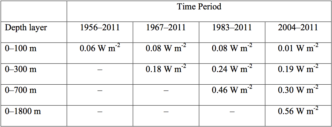
"In recent years, from 2004 to 2011, while the upper ocean is not warming, the ocean continues to absorb heat at depth (e.g., Levitus et al. 2012; von Schuckman and Le Traon 2011), here estimated at a rate of 0.56 W m-2 when integrating over 0–1,800 m."
The paper also includes this useful table illustrating that according to observational data, ocean heat content has indeed accumulated rapidly in the deep oceans in recent years.  Of the heat accumulating in the upper 1,800 meters of oceans for 2004–2011, 46% was sequestered in the deep oceans (below 700 meters).
LJ13 Table 1
To be clear, there's nothing wrong with using reanalysis data.  In fact, the Balmaseda et al. (2013) study fills in gaps in observations most comprehensively by utilizing all kinds of data, as well as using ocean models.  The fact that they're able to resolve volcanic eruptions and El Niño events suggests that the reanalysis may be more accurate than purely observational data sets that cannot resolve these events. However, the key point here is that the observational data, including Curry's own reference, contradict her point by finding substantial deep ocean heat sequestration over the past decade.

Science Isn't Done by Eyeball

Another problem with Curry's analysis is that she simply eyeballs the ocean heat content graph in Lyman and Johnson (2013) and concludes that since 2003, the data look flat. 
LJ13 OHC Figure
Time series of annual average global integrals of upper ocean heat content anomaly (1021 J, or ZJ) for (a) 0–100 m, (b) 0–300 m, (c) 0–700 m, and (d) 0–1,800 m.  Thin vertical lines denote when the coverage (Fig. 3) reaches 50% for (a) 0–100 m, (b) 100–300 m, (c) 300–700 m, and (d) 900–1,800 m.  From Lyman and Johnson (2013)
Scientists don't rely on their eyeballs because our senses can introduce bias and deceive us.  The data in the figure above may look relatively flat after 2003, but as the table above shows, they are not.  For 2004–2011, the data show the oceans accumulating heat at a rate of 0.19 W/m2 (3 x 10²¹ J/yr) in the upper 300 meters, 0.30 W/m2 (5 x 10²¹ J/yr) in the upper 700 meters, and 0.56 W/m2 (9 x 10²¹ J/yr) in the upper 1,800 meters.  The latter number is equivalent to 4.5 Hiroshima atomic bomb detonations per second – a far cry from a global warming 'pause.'

Ocean Heat Accumulation Consistent with Satellite Observations

We also know from satellite observations that the planet is accumulating heat due to a global energy imbalance (measured at the top of the atmosphere).  A new paper by Trenberth et al. (2014) notes that the amount of heat accumulating in the global climate (most of which is absorbed by the oceans) is generally consistent with the observed global energy imbalance (see the previous post for further details).  If the ocean were to stop warming as Curry suggests, it would require an explanation of where the energy from the global imbalance is going.
Curry also suggests that because they're not globally uniform, recent changes in ocean heat content "most likely reflects natural internal variability.  It doesn’t look like an AGW signal."  Again, if heat were simply shifting between ocean basins naturally, it would require an explanation of where the energy from the global imbalance is going.  The problem with breaking the data out into individual ocean basis as Curry does is that it's easy to then lose sight of the global picture.  The oceans as a whole are building up a lot of heat.  That long-term global ocean heat buildup has to be caused by an external forcing like the increased greenhouse effect.  The oceans aren't just going to naturally start accumulating zetajoules of heat – that heat has to come from somewhere.
As for the variation in heat content gain in each basin; this is no great surprise, as there is an exchange of water masses between the ocean basins. Most of the deep ocean warming is occurring in the subtropical ocean gyres  vast rotating masses of water in each ocean basin where near-surface currents converge and are forced downward into the ocean interior. When the tropical easterly trade winds strengthen, as they have from the year 2000 onwards, this whole wind-driven ocean circulation becomes more vigorous, the South Pacific subtropical gyre spins up, and the western arm of the gyre exports more tropical water through the Indonesian archipelago into the Indian Ocean. Likewise, the more vigorous ocean circulation forced by stronger trade winds forces more heat to be exported from the Indian Ocean, around the southern tip of Africa, into the South Atlantic.
Although it cannot be discounted that long-term warming is affecting this circulation in some way, a large part of this recent behavior is likely to be natural variation associated with the vigorous or sluggish phases of the ocean circulation. Whenever the wind-driven ocean circulation switches phase in the future, the current basin-scale warming pattern will change. Weak export of tropical water out of the Pacific during that phase should see a build-up of heat in the Pacific basin.  In other words, what we are seeing is probably natural variability in this circulation against a warming background ocean state forced by the increased greenhouse effect.
OHC by region  
Ocean heat content by region in the ORAS4 reanalysis by Balmaseda et al. (2013). NXTRP = northern extratropics, SXTRP = southern extratropics, TROP = +/30° latitude, TRATL = tropical Atlantic, TRPAC = tropical Pacific, and TRIND = tropical Indian ocean. Units are in 1022 Joules. Despite short-term variability in ocean heat content storage, each region has experienced long-term warming.

Early-Mid 20th Century Ocean Heat Content and Sea Level Rise

Curry also argues that the rate of sea level rise during 1930–1950 was similar to that in recent years, according to the IPCC, which suggests that ocean heat content was increasing at a similar rate to today.  She then argues that this can't be attributed to human-caused global warming, which presumably implies something about the current rise in ocean heat content.
First, while the early 20th century warming was likely predominantly naturally-caused (i.e. low volcanic activity and increasing solar activity), there was also a significant human contribution as greenhouse gasemissions began to ramp up.  Second, according to most estimates, the rate of sea level rise today is higher than the rate during 1930–1950 as shown in the IPCC report and Rahmstorf et al. (2012).  Third, tide gauge coverage 70 years ago was not as good as today's, and much of the variability is simply due to noise and factors like coverage bias, as discussed by Rahmstorf et al. (2012) and Tamino.
Fourth and most importantly, the argument is a non sequitur – the conclusion doesn't follow from the premise of the argument.  Yes, global warming events have occurred naturally in the past, and sea level rose as a consequence, but that doesn't tell us anything about the causes of the current global warming.  This is akin to seeing a dead body with a knife sticking out the back and arguing that it must have been a natural death because people have died naturally in the past. 

The Pause is Imaginary, Real Heat Will Come Back to Haunt Us

The bottom line is that all available ocean heat content data show that the oceans and global climate continue to build up heat at a rapid pace, consistent with the global energy imbalance observed by satellites.  In recent years, much of that heat has accumulated in the deep oceans.  Curry misunderstands the importance of this fact.
"even if the heat from surface heating of the ocean did make it into the deep ocean, presumably the only way for this to happen involves mixing (rather than adiabatic processes), so it is very difficult to imagine how this heat could reappear at the surface in light of the 2nd law of thermodynamics."
Nobody is arguing that the heat sequestered in the deep ocean will suddenly return to the surface.  Some fraction of it, from the upper ocean, may reappear as an El Niño event, but some is irreversibly mixed and forms part of the inevitable warming and equilibration of the ocean to a warming climate.
While the warming of global surface temperatures in recent years has slowed in large part due to the more efficient heat transfer to the deep oceans, that can't last forever.  When that trend reverses, as past observations suggest it will, we'll experience an acceleration of warming at the Earth's surface.